
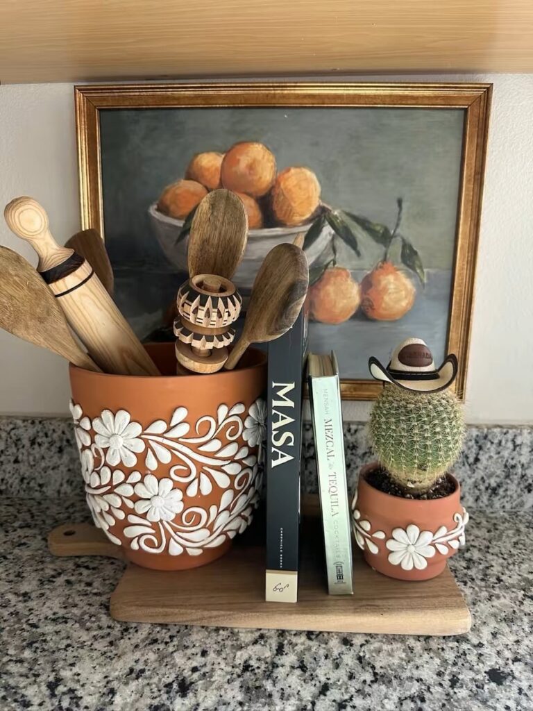
These ideas range from a lunch-sized budget to a full weekend project, and the right one depends on whether you need something permanent or something you can take down before the landlord notices.
1. Bold Colors
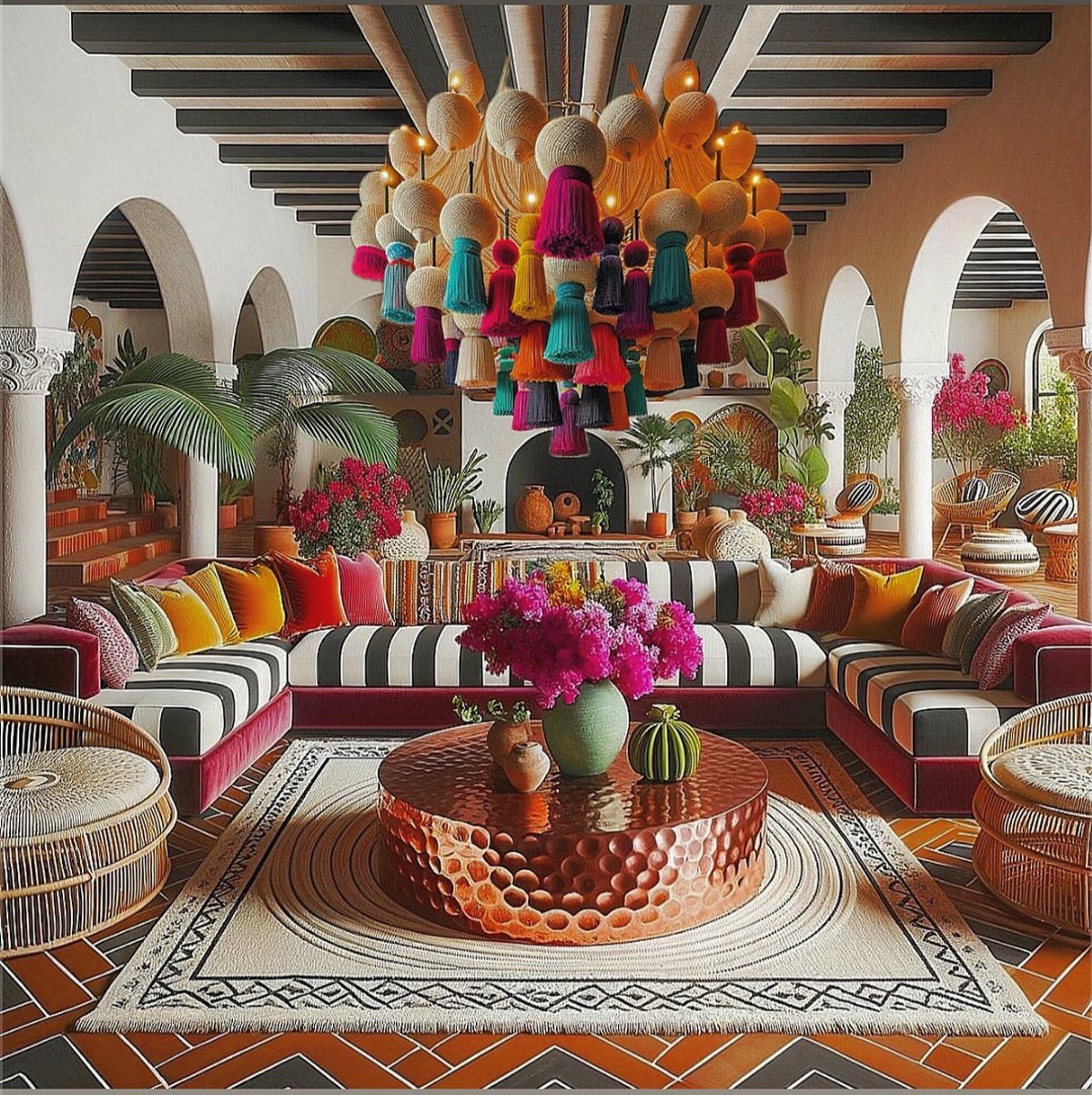
A living room this saturated only works when the architecture gives it room to breathe. Arched doorways and hammered copper already carry visual weight, so bold color lands as warmth rather than noise.
I start with a neutral base, warm beige or soft gray, then layer in terracotta, cobalt, or sunflower yellow where the eye travels naturally. A door painted turquoise against stucco, a tassel chandelier that pulls the whole palette together.
Commitment matters; one bold piece reads as an accident, three read as intention. Check your light first.
South-facing rooms can handle deeper reds without closing in, but a dim space needs the lighter, earthier side of the range.
2. Handcrafted Accessories
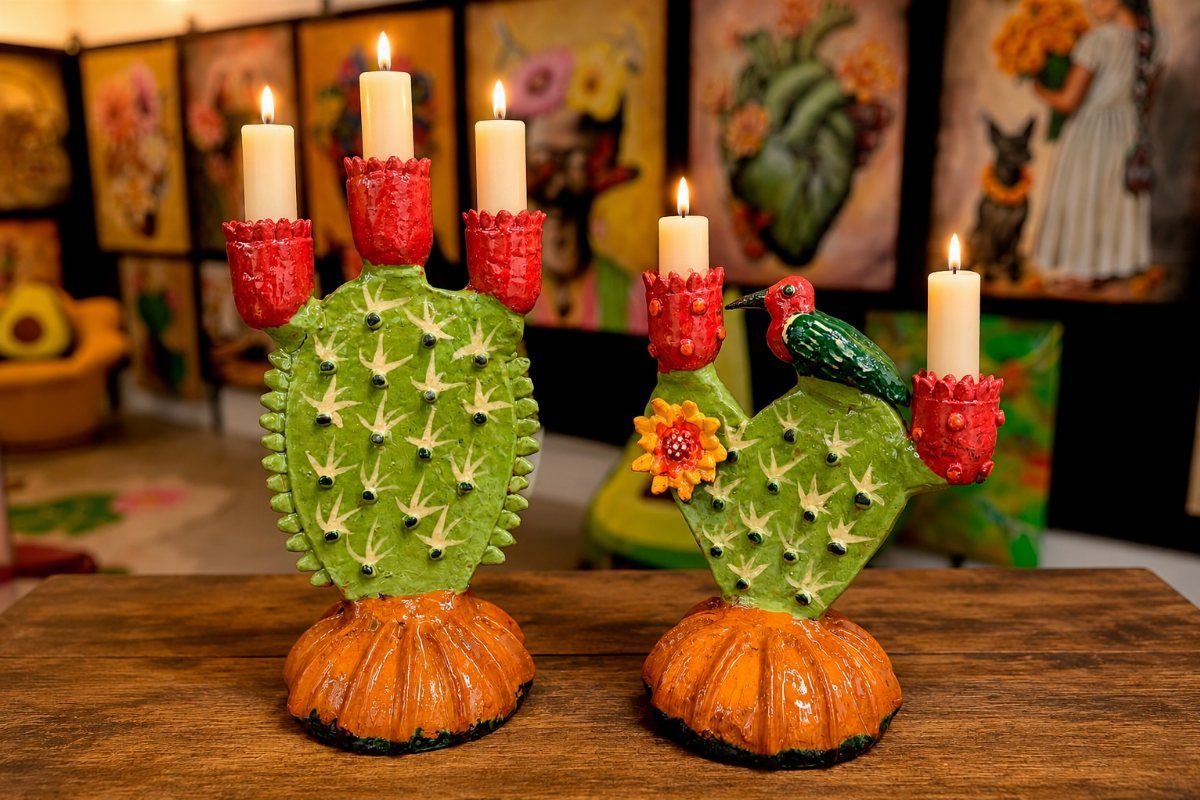
Cactus candelabras sit where useful and strange overlap, which is where I like my accessories to live. Woven baskets for corralling remotes or magazines, handblown glassware that catches afternoon light, wooden carvings with the tool marks still visible.
A maker’s hand matters more than any finish, so I skip anything that looks factory-weathered. For a first purchase, I’d pick one piece with real presence, something conversation-sized, rather than scattering small items that compete.
Tin mirrors work especially well in bathrooms or entries where you want scale without weight. Budget-wise, one or two artisan pieces outlast a shelf of imports, and the hunt itself is half the pleasure.
3. Talavera Pottery
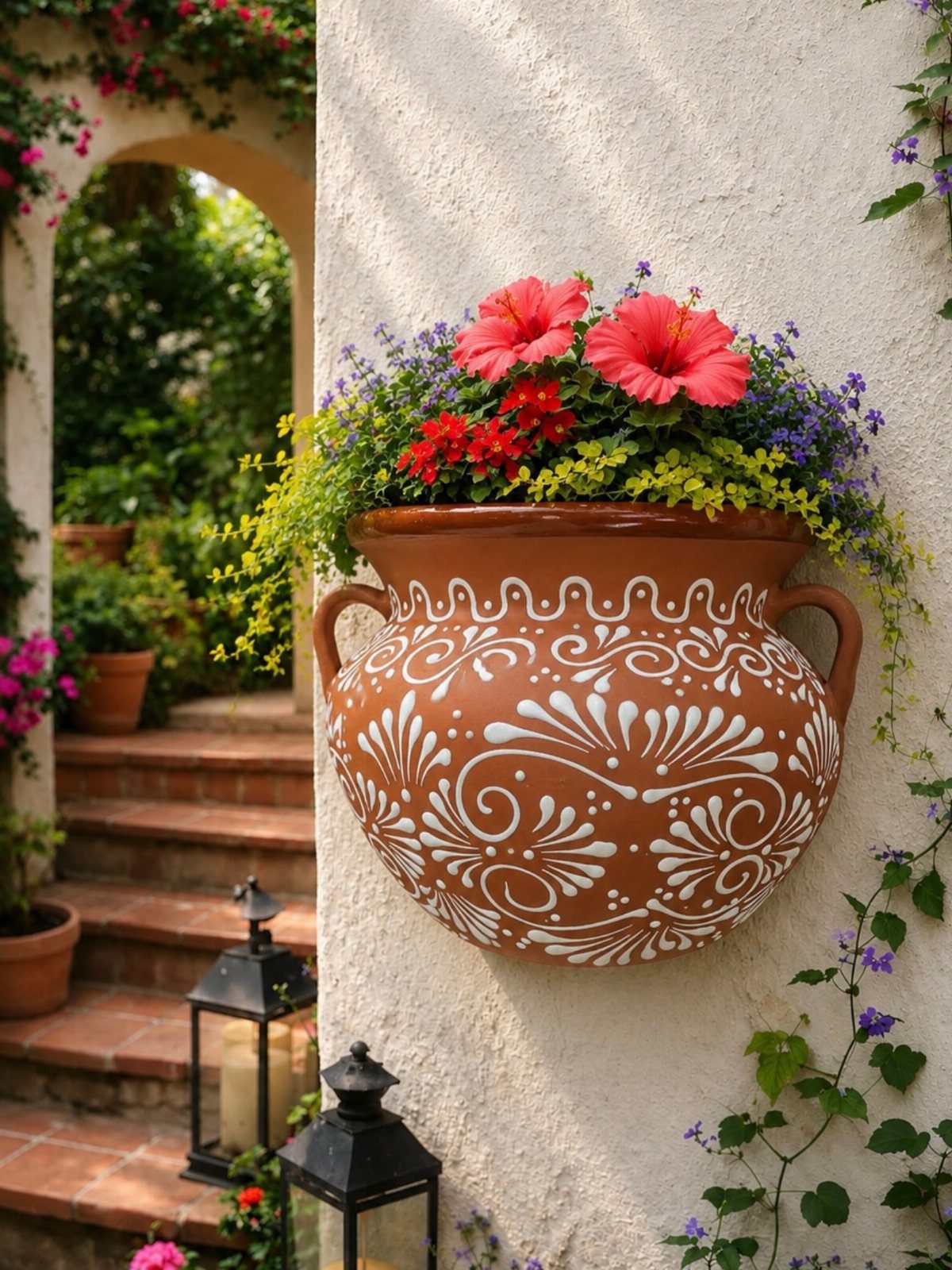
Talavera lives somewhere between pottery and painting, which makes it useful in almost any room.
A wall planter like this one turns a blank stucco exterior into a garden, but the same piece on a kitchen counter holding wooden spoons works just as well.
I look for the raised, slightly imperfect brushwork that distinguishes the real thing from printed imitations.
The color range is fixed by tradition, cobalt and ochre and green on cream, so it mixes with itself more easily than with modern solids. For indoors, I’d use one large piece as anchor rather than clustering small ones.
Outdoors, the glaze handles weather but the terracotta body can crack in hard freezes, so I bring planters under cover before the first serious cold.
4. Intricate Patterns
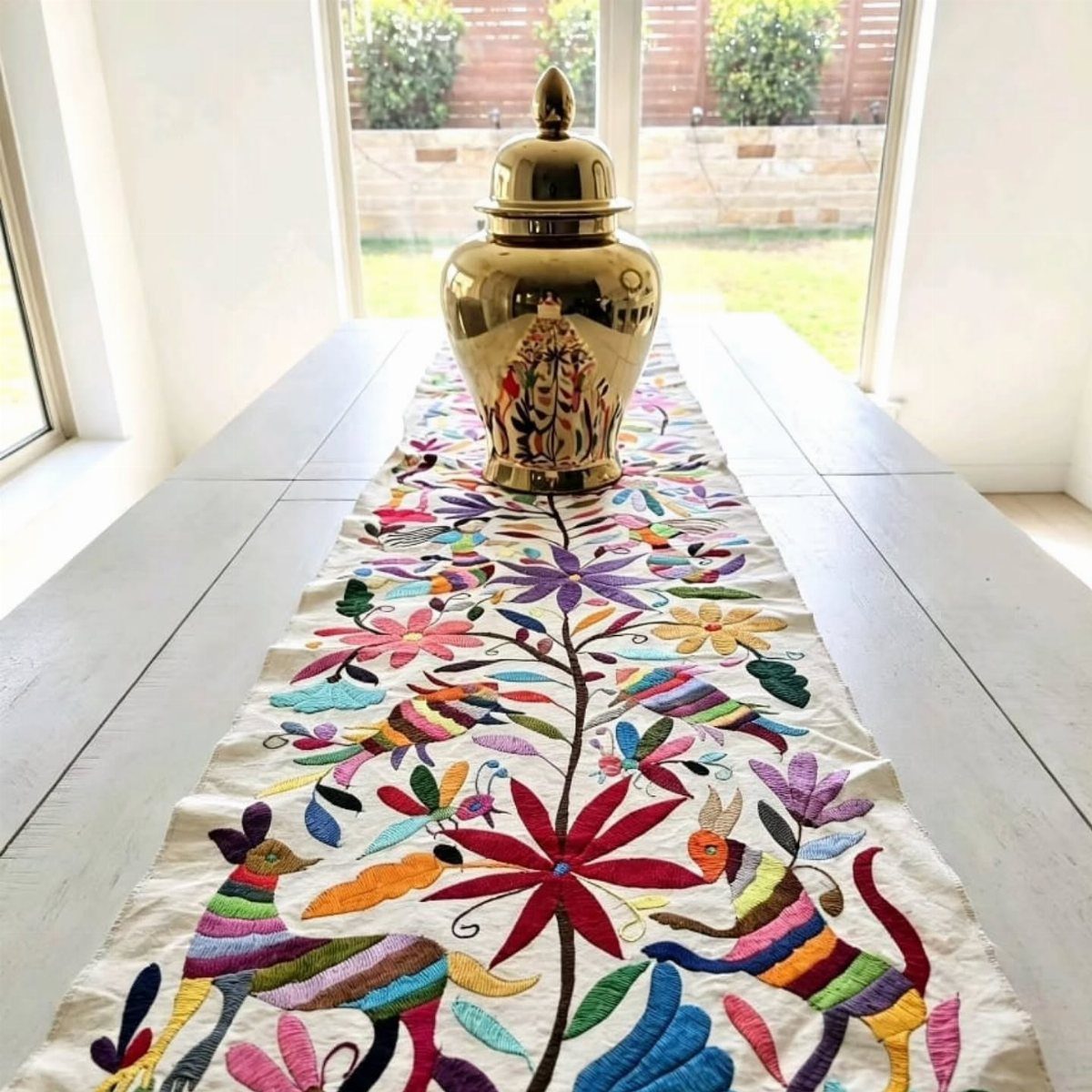
Otomi embroidery this dense reads as folk art in a modern room and as heritage in a rustic one, which is a rare kind of flexibility.
The animals and florals are specific to the tradition, so I let one textile carry the pattern load rather than fighting it with competing prints.
A runner on a clean table, a single pillow on a leather sofa, a wall hanging where the scale makes sense. Stripes and geometrics from the same tradition mix in more quietly if you want layers.
The risk is sweetness, too much color and curve in one place. I balance with raw wood, plain linen, or a single dark solid that lets the embroidery be the event.
5. Rustic Furniture
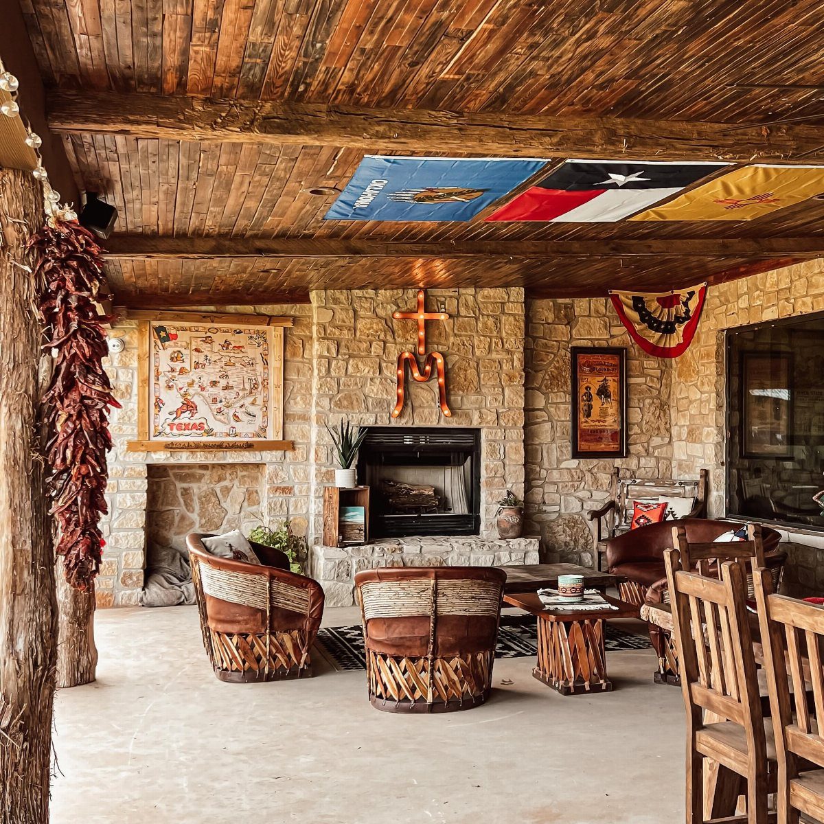
Equipale chairs with their woven leather seats and barrel backs are the piece I point to when someone asks what Mexican rustic actually means.
The wood is heavy, the construction visible, the leather darkens and softens with use rather than wearing out.
In a covered patio like this one, they handle weather better than upholstery would, though I bring cushions in if rain blows sideways.
For indoor use, I’d pair one or two with a cleaner-lined sofa rather than building the whole room around them; the contrast is what makes both sides interesting.
Metal hardware in dark iron, on drawers or door pulls, extends the same material story without repeating the form.
6. Hand-Painted Tiles
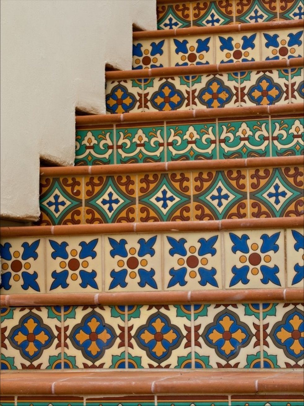
Stair risers are the most forgiving place to use hand-painted tiles because you see them in passing, not in prolonged study, so a pattern that might overwhelm a whole wall becomes a rhythm you notice and forget.
Talavera on the vertical face, terracotta on the tread itself, keeps the wear surface practical and the visual interest where it shows.
For kitchens, I’d limit it to a small backsplash section behind the range, or a single fireplace surround, rather than wrapping a whole room.
The cost runs higher than plain ceramic, so I measure carefully and order a few extra for future repairs.
Grout color matters more than you’d think; a warm gray recedes and lets the pattern speak, white grout frames each tile separately and busies the whole effect.
7. Woven Textiles
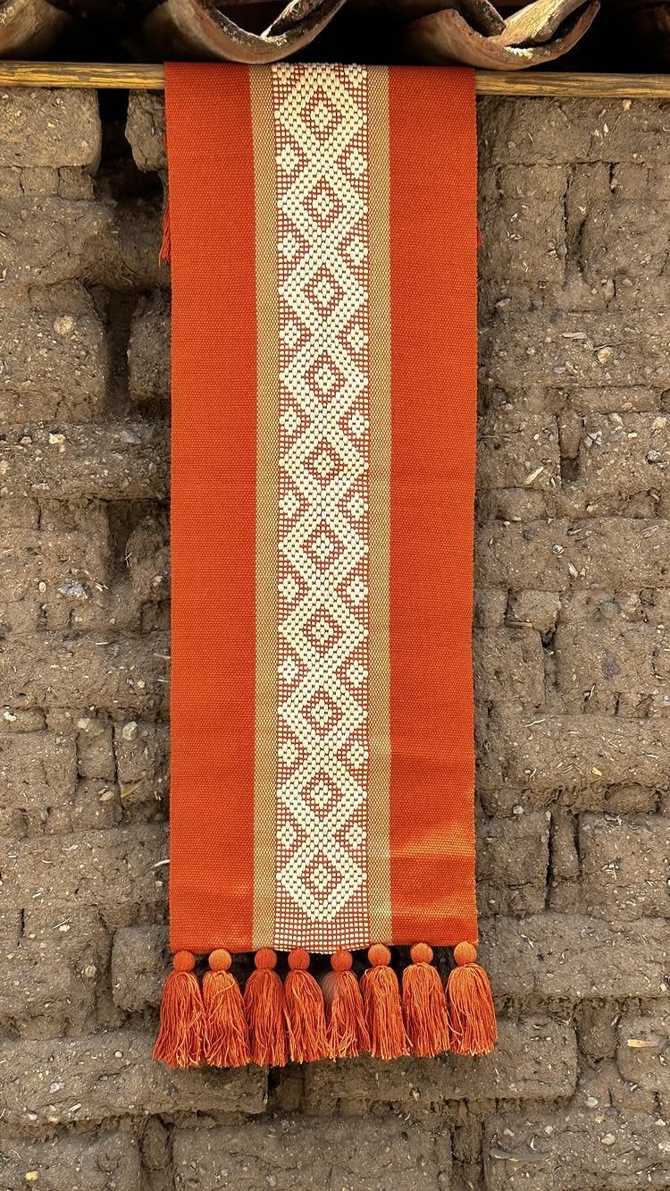
An Otomi textile or a thick striped blanket turns a plain wall into the warmest spot in the room.
I hang mine with a simple wooden dowel and two nails, which costs pocket change and takes less time than making coffee.
The weight matters more than the pattern. A heavy weave holds its shape against a wall and muffles sound slightly, which helps in apartments with thin walls.
Lightweight fabrics sag and need constant straightening.
For cushions, I look for wool or cotton with a tight weave that survives a washing machine on gentle. Synthetic blends look similar but pill within a season.
This suits renters who cannot paint and anyone whose rooms run cold in tone. Dust collects fast; I shake mine outside every few months.
8. Papel Picado
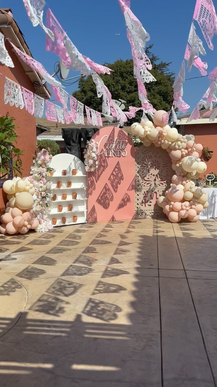
Papel picado works because it is temporary. I buy a small handful of strings for the price of lunch, hang them with clear tape across a doorway or patio edge, and take the whole thing down when the mood passes.
The plastic versions survive rain and reuse for years. Paper looks richer in afternoon light but lasts one damp evening outdoors.
I keep paper inside, plastic for the yard.
A pair of colors reads as intentional; a whole rainbow reads as leftover party supplies.
This suits anyone who wants celebration without storage. Wind is the real enemy here; even plastic tears in a strong gust, so I check the forecast before I hang it.
9. Terracotta Breeze Block Wall
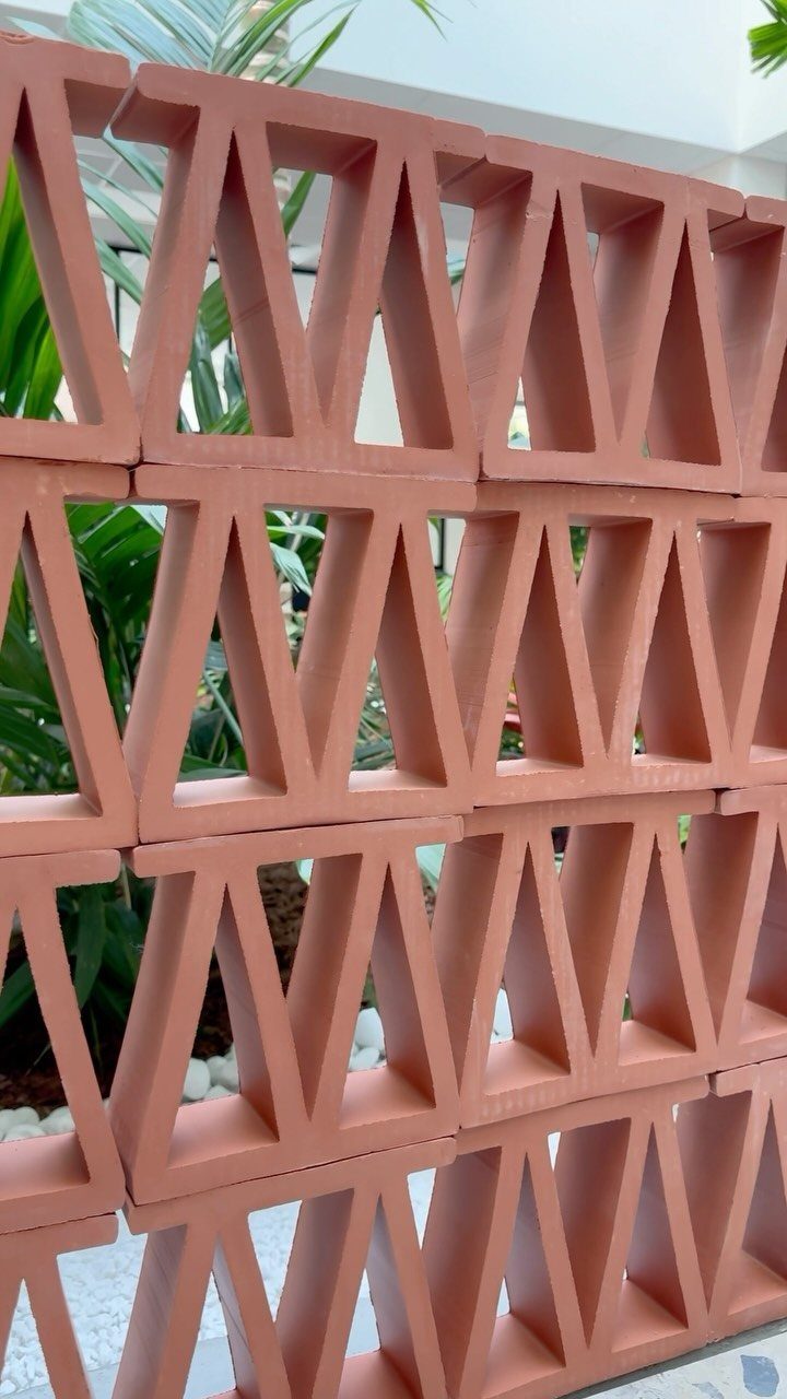
A breeze block wall lets light and air pass through while still marking a boundary, which makes it ideal for a patio edge or a garden room divider where you want some enclosure without losing the view.
The terracotta color comes from iron oxide in the clay, and it deepens slightly as it weathers, so the wall will look more settled in a year than it does the day it goes up.
The blocks run a few dollars each, and a short wall section takes roughly fifteen. You’ll want to check local codes; some areas require reinforcement or a footing depth that changes your trench work.
I laid mine on a gravel base with a spirit level and a rubber mallet, no mortar between blocks, just tight fit and gravity.
That works in dry climates; anywhere with freeze-thaw needs a bonded wall and probably an engineer’s eye.
This suits renters only if the landlord agrees, since it reads as landscaping, not furniture. For a weekend project with staying power, though, the block wall trades nothing away.
10. Moravian Star Tin Lantern
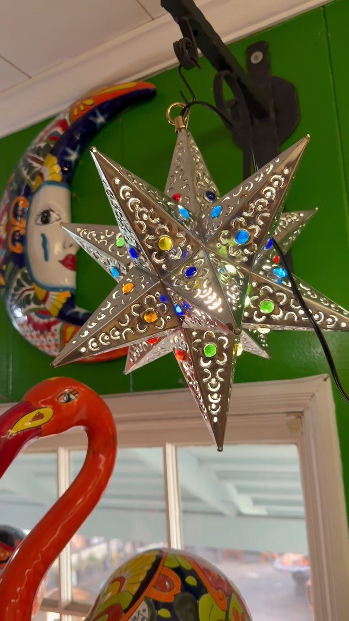
The Moravian star shape started in German craft traditions, but Mexican tinworkers adapted it with punched patterns and colored glass that throws spots of light across a wall like a slow disco.
Silver tone against warm green paint fights just enough to keep either from going flat.
Tin stars come sized small enough for a porch post to large enough for a two-story entry.
The smaller ones work in clusters of three at staggered heights; a single large one wants a corner or a doorway to anchor it.
Wiring varies, so check whether you’re buying a lantern with a socket or just a shell to fit over your own fixture. I’ve found the punched patterns cast better shadows with a clear bulb than with frosted.
For a renter, a battery-operated LED puck inside skips the electrician. What you lose in brightness you gain in atmosphere; this is not task lighting.
Someone with a covered porch and a weekend to spend on installation gets the most from this piece.
11. Gold Milagro and Sacred Heart Wall
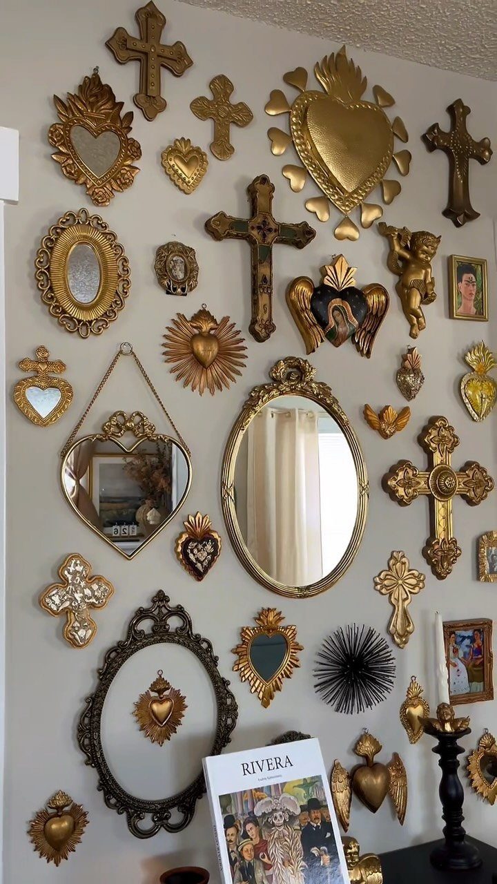
Gold milagros and sacred hearts read as devotional art, but grouped on a white wall they function as texture and warmth without requiring any particular faith from the viewer.
The crosses vary in scale and ornament, which keeps the grid from looking like a store display; the mirrors bounce light back into the room and double the visual weight of the arrangement.
Start with one large piece dead center at eye level, then build outward in an oval rather than a strict grid. Mixed shapes, crosses, hearts, and ovals keep it from looking assembled by a single hand.
Flea markets and estate sales turn these up singly; assembling a wall this full takes patience, or buy a starter set from a Mexican import shop and fill gaps as you find them.
Renters can use Command strips on the smaller pieces; anything large enough to catch a sleeve needs a nail. This wall suits someone patient more than someone decisive.
12. Patterned Terracotta Patio Pavers
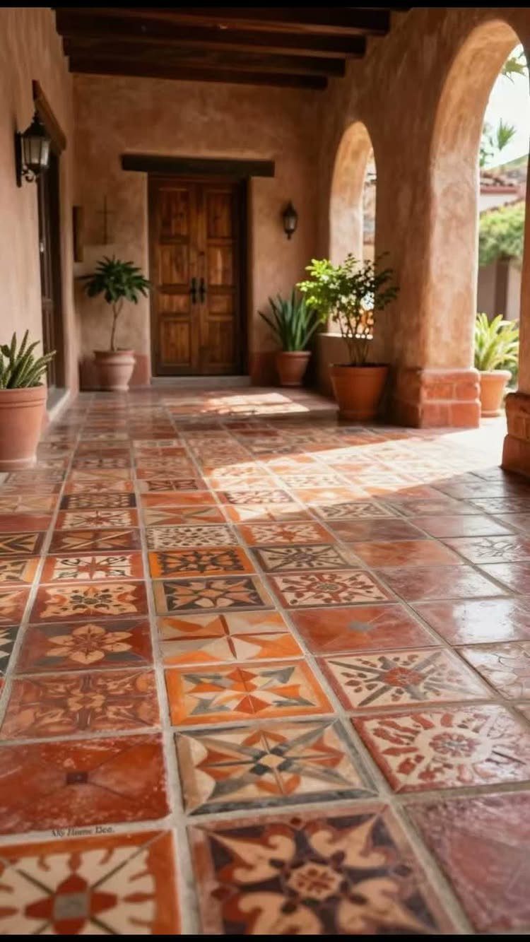
Patterned terracotta pavers carry color underfoot without the maintenance of painted concrete, and the patterns hide the dirt that plain tiles show inside a month of outdoor living.
Repeating geometric designs, each tile a single color, the variation coming from which pattern sits next to which.
Sealing is the step most people skip and regret. Unglazed terracotta drinks oil, wine, and plant runoff; a penetrating sealer applied after installation and again once the surface starts looking thirsty keeps it cleanable.
Expect to reseal again when water stops beading on the surface. The tiles themselves run a few dollars per square foot for standard sizes, more for handmade or larger formats.
This floor wants a covered area or a climate without hard freezes; water trapped in the pores cracks the tile when it expands. A weekend of layout and a day of grouting, then wait before you walk on it.
A patterned patio looks finished without furniture on it, which matters if your budget spreads over time.
13. Terracotta Wall with Sun Folk Art
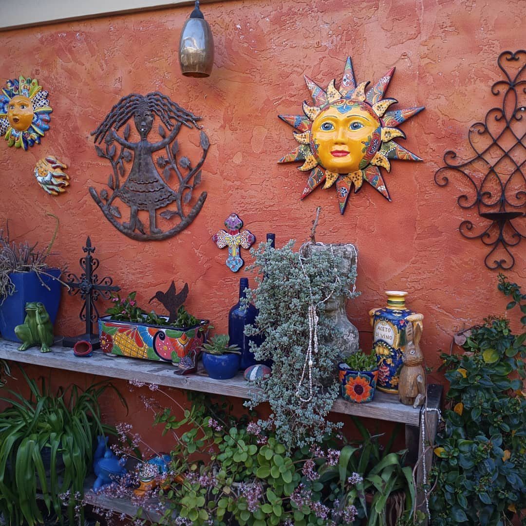
Terracotta paint on a single wall gives you the warmth of clay without the weight of actual adobe, and the sun masks add the folk art reference without requiring a full collection.
Ceramic sun faces in blue and yellow, metal figures, and a lower shelf crowded with pots and bottles; the layering is what makes it feel gathered rather than decorated.
A true terracotta, something with orange in it rather than brown, reads as Mexican or Southwest rather than generic earthy.
I painted a test patch and lived with it through a few mornings; the light flattened it to peach, and I had to go one shade deeper.
The masks and metal pieces are light enough for picture hooks; the shelf needs studs or heavy-duty anchors if you’re loading it with terra cotta pots.
This suits someone with more objects than space to display them. What you gain in warmth you lose in dusting time; a crowded shelf needs more attention than a sparse one.
14. Festive Wrought Iron Balcony Accents
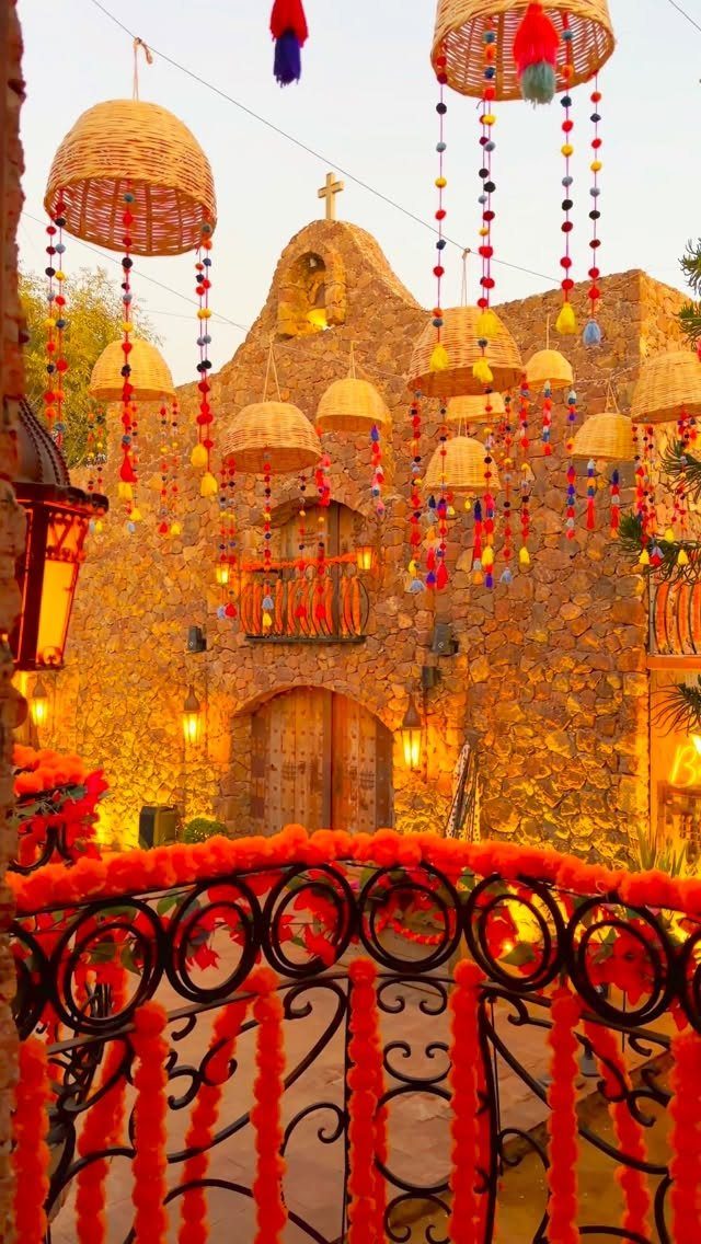
Wrought iron railings are structural, not optional, which makes them a fixed point to build celebration around rather than a blank surface to fill.
Orange marigold strands, the flower of Día de los Muertos, but the technique works with any seasonal material: paper chains in January, dried lavender in July, string lights in December.
The hanging woven baskets with pom-pom fringe are the detail I’d copy first. They add height above the railing line and draw the eye up from street level; the pom-poms move in breeze, which makes the whole facade feel alive.
Making them takes a basket, a drill, and nylon cord rated for outdoor use; the pom-pom fringe comes by the yard from most trim shops.
Battery lights inside the baskets, on a timer, give you the evening glow without an outdoor outlet.
This is renter-friendly only if your landlord doesn’t mind holes in the ceiling of a covered balcony. For a homeowner, it’s an afternoon’s work that reads as a month of planning.
Sustainable Practices
Natural materials age better than synthetic ones, and the makers behind them matter. I look for pieces built from raw or recycled stock: cotton and wool in textiles, terracotta and copper in objects, wood left close to its original grain.
These wear in rather than wearing out.
A single piece from a known hand carries more story than a shelf of anonymous imports. Fair compensation for the craft keeps the skill alive, which matters if you want the same quality available down the line.
The cost runs higher upfront, but a handblown glass pitcher or a handwoven rug outlasts three factory versions.
For a first step, I’d replace one mass-market item you touch daily with its handmade equivalent. A cooking spoon, a bath towel, a planter.
The difference in weight and finish teaches your hand what to look for next.
Creating a Cohesive Look
The balance between old and new works best when each side knows its job. I let traditional pieces carry the visual interest and keep modern ones quiet on line and color.
A carved wooden mirror above a console with hidden drawers; a leather equipale chair beside a sofa with clean arms and no skirt.
Space between objects matters more than the objects themselves. Three strong pieces in a room with breathing room around each one beats a dozen crowded together.
The eye needs somewhere to rest.
Color ties the mix together. I pull one tone from the traditional piece and repeat it in the modern one, even in a small dose.
Cobalt from Talavera echoed in a solid throw pillow. Ochre from a textile picked up in a lampshade lining.
The connection is subtle; the room reads as considered rather than collected.
Layering Textures
Texture works in threes: one smooth, one rough, one soft. A glazed ceramic vase on a stone surface with wool nearby.
The contrast lets each material read as itself.
I keep the color range tight when the textures vary. Clay, limestone, and undyed wool share an earthy family even while their surfaces fight and reconcile.
Add a fourth competing texture and the room starts to feel like storage.
Plants bridge textures without adding another material. A smooth pot with a rough trunk rising from it, leaves softening the angle between wall and floor.
Natural light does similar work, catching the weave of a textile or the pitting of forged metal and changing it through the day.
The limit is pattern, not texture. Layer all the grain and weave you want, but hold the printed or embroidered pieces to one per sightline.
Cultural Significance
I use the Aztec calendar, milagro hearts, or Day of the Dead imagery only where the story matters to me, not as generic atmosphere.
A ceramic wall piece with a known motif belongs in a room where I can answer a guest’s question about it.
Catholic iconography runs deep in Mexican craft, from punched-tin nichos to painted retablos. I treat these as art from a living tradition rather than decoration from a distant one.
The maker’s practice and the object’s use in its original context deserve that respect.
For a lighter touch, animal figures from Otomi embroidery carry specific regional meaning: the rabbit, the deer, the armadillo each belong to a particular story. I choose the ones that connect to something I actually know or care about.
The alternative is a home that reads as costume, and the guests who recognize the source will notice.
The style left a treasure trove of small houses in urban centers, possibly more than anywhere else in the world, due to Mexican architecture’s extensive use of concrete construction and decorative applications.