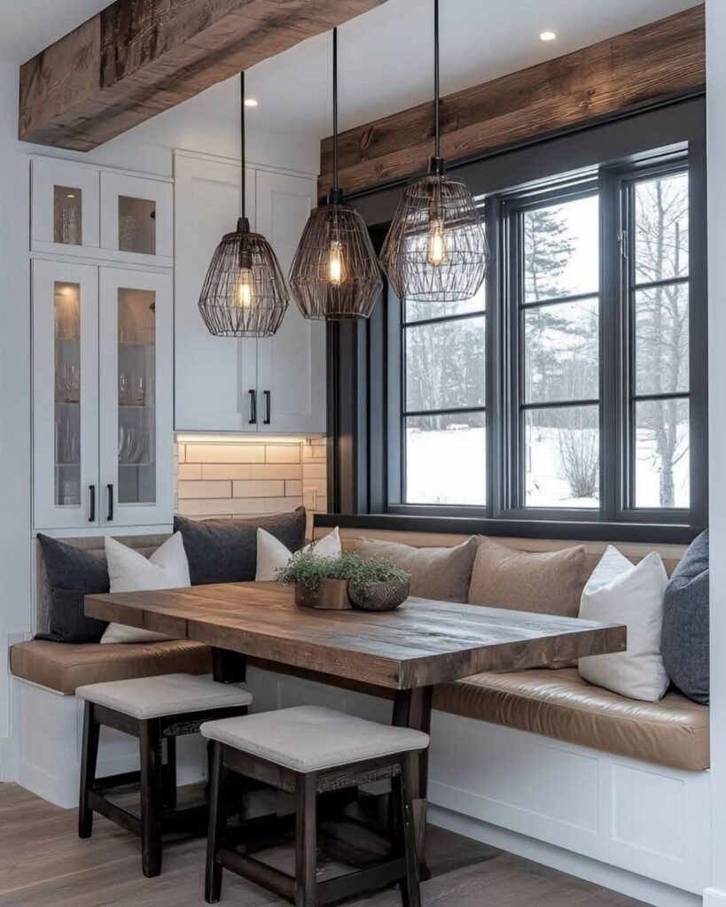
These ideas run from a weekend paint-and-pillow refresh to a built-in bench that needs a landlord’s permission or a contractor’s call.
The right one depends on whether your kitchen has a dead corner, a bay window, or just a wall that gets morning light.
1. Built-In Bench
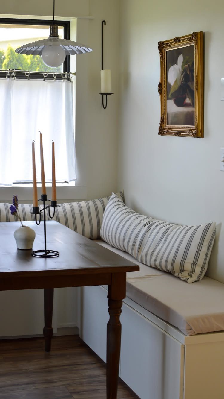
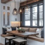
A built-in bench turns dead corner space into actual seating without stealing floor area from the kitchen.
I like the L-shape for squeezing around a small table; two sides of seating means you skip chair legs on two sides and gain walking room.
Storage underneath comes from lift-up lids or drawers, though I’d pick lids for anything bulky and drawers for the flat stuff you reach for daily.
Paint it the same color as your cabinets and it reads as original to the house, not an afterthought.
This idea suits renters only if their landlord agrees to something screwed into the wall; otherwise a freestanding bench with the same footprint gets you close.
2. Storage Solutions
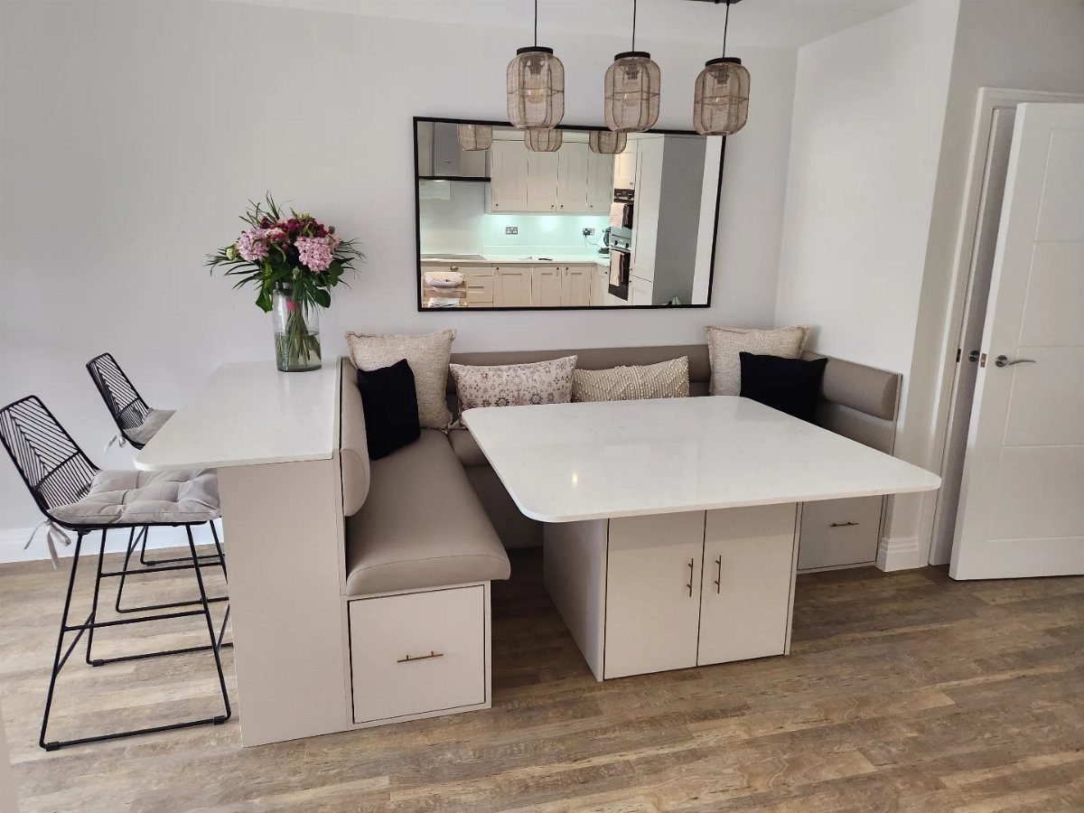
Drawers under the bench seat hide the stuff that otherwise ends up stacked on the table.
A cabinet-base table with a peninsula bar gives you more storage than most nooks need, but it shows how far you can push the idea.
For a lighter approach, I’d add floating shelves or a slim sideboard within arm’s reach for napkins and placemats; the bench itself can swallow linens or cookbooks you rarely open.
Lift-up seats need clearance to swing, so measure your wall and table spacing before you commit. Best for kitchens where the pantry is already full and the junk drawer is overflowing.
3. Round Table Design
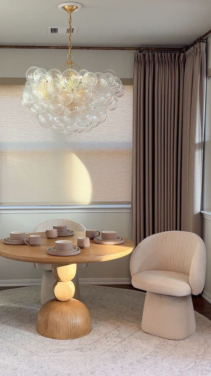
A round table lets people slide past without the corner-bump you get with squares. A pedestal base with one center leg means no feet to dodge, and the chairs tuck flush when you’re not eating.
I’d check that the diameter leaves enough walk space on every side; any tighter and you’re squeezing behind seated guests. Curved chair backs help, since they don’t jut into the room when pushed in.
This shape works especially well in bay windows or corners where a rectangle would fight the walls. You get less surface for spreading out projects; this is for eating and conversation, not for homework or folding laundry.
4. Cozy Pillows and Cushions
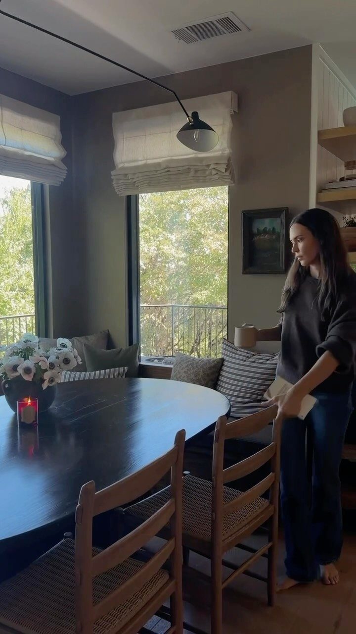
Pillows and cushions are the cheap part that makes a hard bench somewhere you’ll actually sit for a second cup of coffee.
A mix of patterns and solids is the safer way; I’d rather see one bold print with quiet companions than everything competing. Removable covers are non-negotiable if you eat there regularly, and a fabric that wipes clean beats something precious.
The downside is that pillows read as clutter to some people, and they do need fluffing. For a cleaner look, I’d stick to a single bench cushion in a tough upholstery fabric and skip the throw pillows entirely.
5. Lighting Fixtures
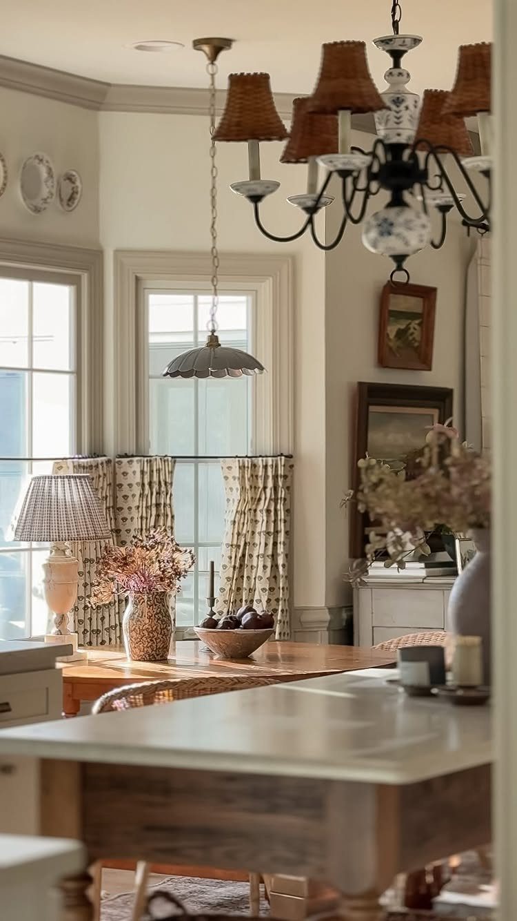
Layered lighting keeps a nook usable from dawn coffee to evening cards.
The photo hangs a pendant low over the table, adds a chandelier for the room, and slips in a table lamp; that’s three sources at three heights, which is the formula.
I’d make at least one dimmable, since breakfast at full brightness feels like an interrogation and dinner by a single harsh bulb feels like a cafeteria.
A cluster of small pendants works if your ceiling is high enough; in a standard kitchen, one larger shade keeps head clearance.
The table lamp is optional but worth it if your nook sits away from windows and needs warmth after dark.
6. Use of Natural Light
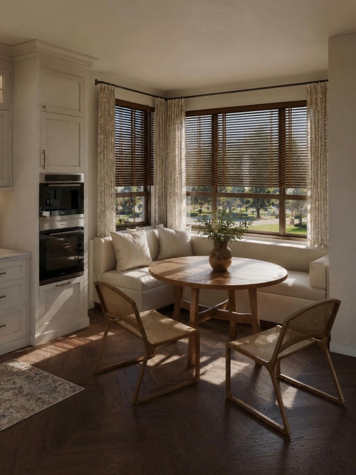
Morning light changes whether a nook gets used or ignored.
A corner of windows is ideal for a banquette; if your kitchen layout doesn’t give you that, I’d fight for the brightest wall available even if it means a smaller table.
Light-filtering shades let you cut glare without turning the room into a cave, and they’re worth the upgrade over bare windows or heavy curtains that never quite open.
A skylight is the move if you’re already replacing a roof, but it’s a big cost for just this spot. I’d skip it unless the kitchen as a whole needs more sun.
7. Bay Window Nook
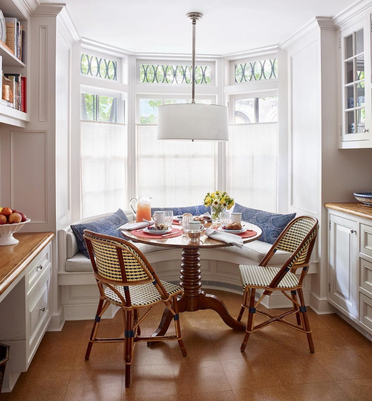
A bay window already hands you the architecture; the job is filling it without killing the light.
A round pedestal table in the center keeps sight lines open, and two small chairs on the outer edge finish the seating without crowding the room behind.
Sheer shades filter glare while the view stays visible. If the bench is built-in, hinged lids turn the dead space underneath into storage for linens or bulky serving pieces.
This setup suits anyone whose kitchen faces something worth looking at. The fixed location is the real commitment; you are tied to that wall and that light.
8. Compact Table and Chair Set
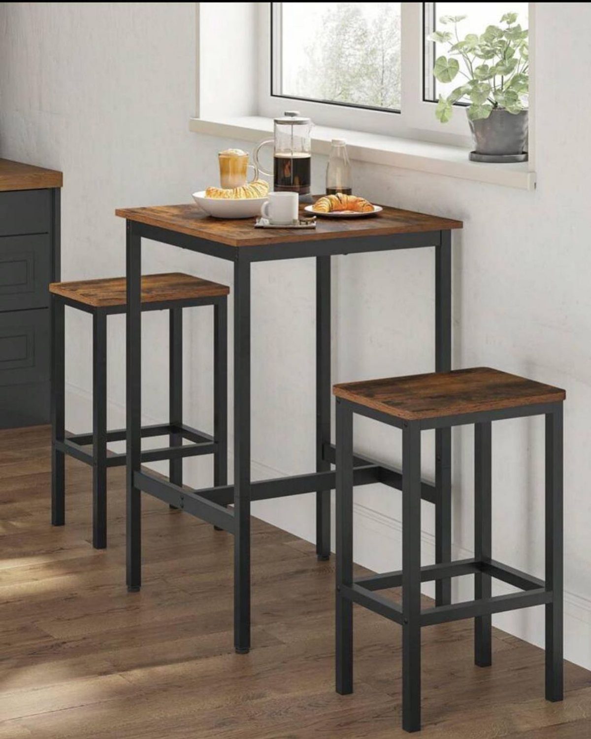
Small corners force you to choose between seating and walking space. A compact set with curved chair backs solves both; the chairs push flat against the table when no one is sitting, and the whole footprint shrinks to almost nothing.
I have seen these work in apartment kitchens where a full table would block the refrigerator door.
Look for a bar-height version if the nook sits against a counter or pass-through; standard height feels cramped underneath. The metal-and-wood mix reads casual, but the same proportions come in painted finishes that blend with white cabinets.
Skip this if you regularly seat more than two. The charm is the small scale, not stretching it.
9. Sculptural Table
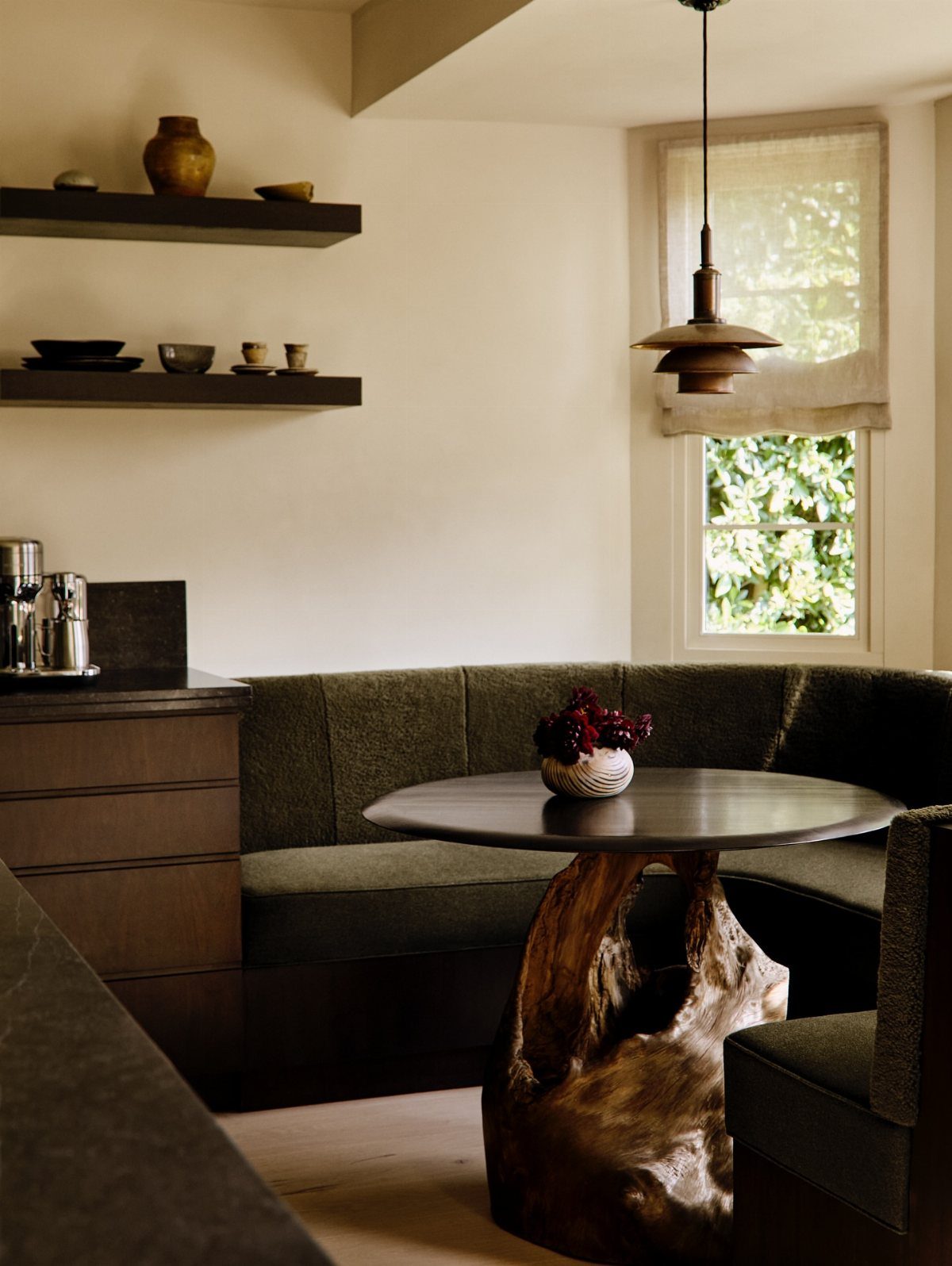
A sculptural base turns the table into the room’s artwork without hanging anything on the wall.
A root-formed pedestal in one piece of finished wood is heavy enough to steady a round top without wobbling when someone leans on the edge. I would pair it with simple seating; let the base carry the visual weight.
Round tops work especially well here because the unusual base already draws the eye, and a round shape keeps traffic moving around it. A green curved banquette echoes the organic feel without competing.
Cost runs higher than standard four-leg tables. If the budget is tight, a plain top with one striking base is where I would spend the money.
10. Colorful Artwork
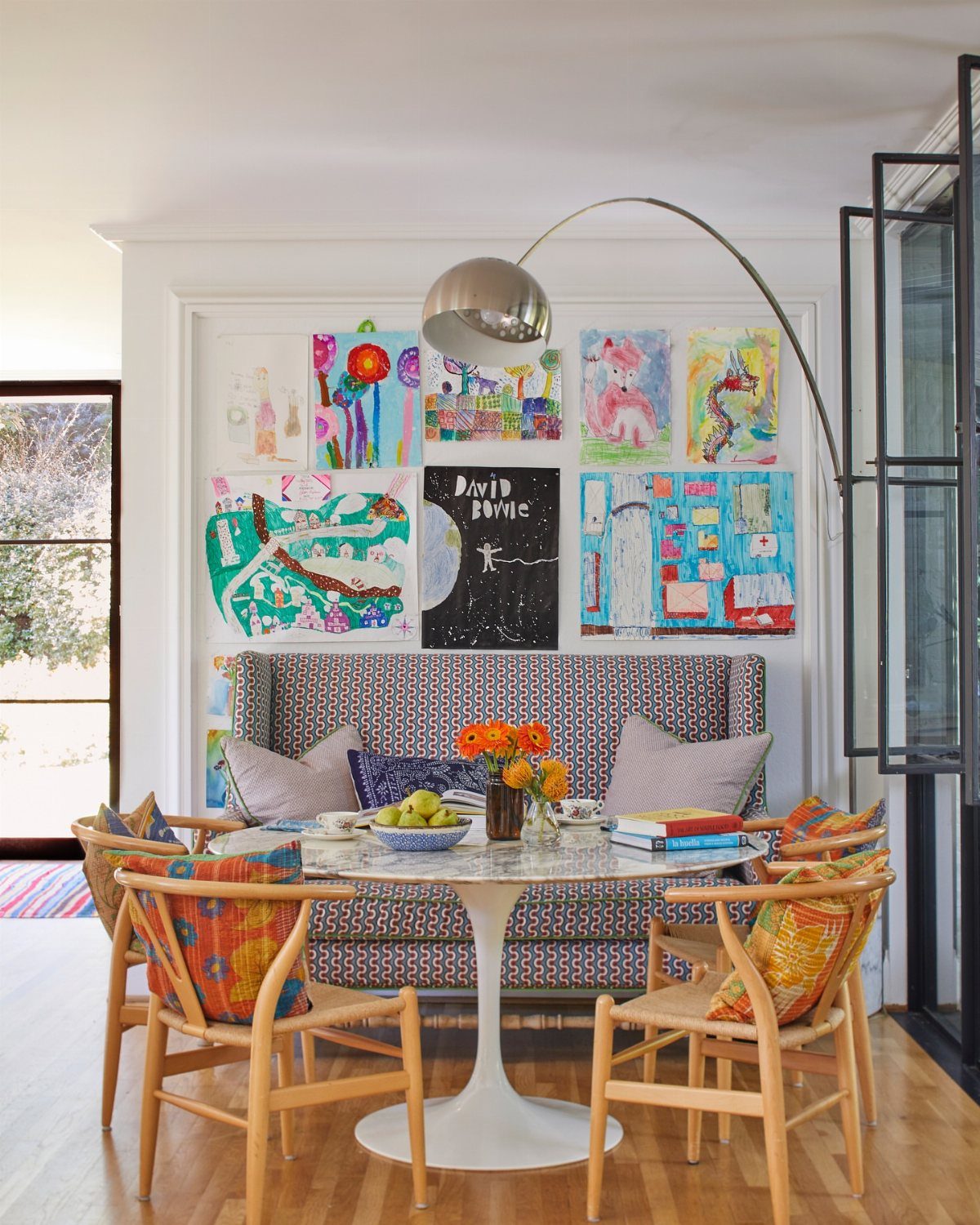
Children’s art, concert posters, or your own paintings all work if the colors talk to each other.
The "David Bowie" piece sits next to other bright work because the whole wall shares the same saturated palette, not the same frame or the same artist.
Navy, gray-green, and warm wood tones underneath keep it from looking like a bulletin board.
I would hang at eye level for someone seated, not standing; this is a dining wall, not an entry.
Mix frame styles or skip them entirely and clip pieces to a thin shelf rail, which also lets you swap without new nail holes.
The risk is clutter. Too many pieces and the nook starts to feel like a classroom hallway.
11. Incorporate Curves
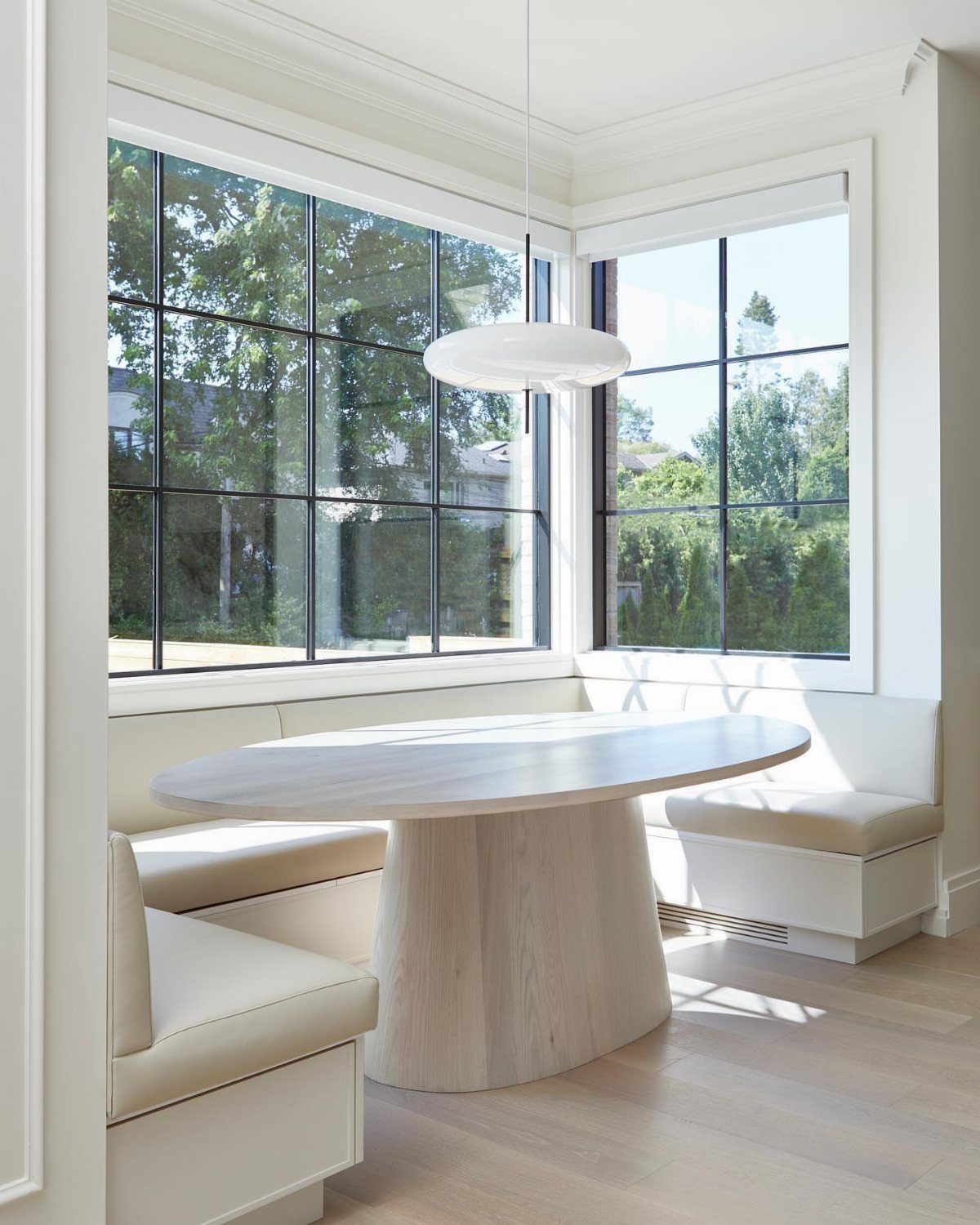
Curves soften the boxy lines most kitchens inherit from cabinets and appliances. An oval table seats a crowd without the pointed corners of a rectangle, and the white built-in banquette curves to meet it.
I would add curved chair backs or a rounded cushion on the bench before I would add a second curved table; too many competing arcs look accidental.
Black window frames give the geometry some discipline, which keeps the whole thing from going soft.
This approach needs space to breathe. In a tight nook, one curved piece is plenty; start with the table or the seating, not both.
12. Leather Banquette Seating
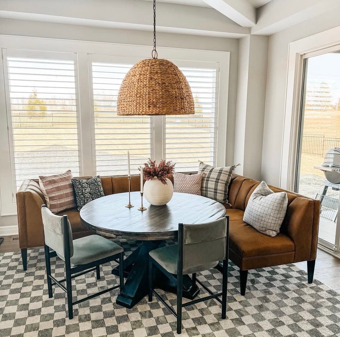
Brown leather on a banquette reads as furniture that has already aged into itself. It costs more up front than fabric, but it survives coffee spills and the scrape of dog nails without showing every mark.
A corner unit tucked into two walls leaves the center open for a round table. I’d put the leather on the fixed bench and save upholstered seats for the chairs, where the wear is lighter and replacement is easier.
The leather develops a patina; the fabric stays replaceable.
This suits someone who wants the warmth of a pub corner without the dark wood that usually comes with it. Skip it if you prefer to swap colors seasonally.
13. Window Seat Dining Setup
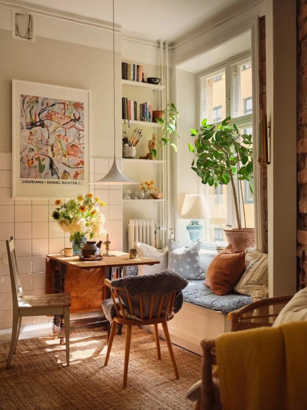
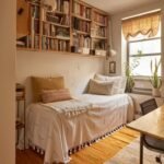
A window seat built for sitting can double as dining seating if the cushion is firm enough that a plate doesn’t wobble. Bookshelves framing the seat turn the whole wall into a reading spot once the meal is over.
The depth matters more than the width. Leave enough depth for a cushion and a seated adult without the table edge crowding your knees.
Storage underneath is standard in older builds but easy to add with a hinged lid and a plywood box.
Mixed chairs on the open side keep it from looking like a restaurant booth. I’d pick one wood tone and let the other chair introduce a different material entirely.
14. Decorative Plate Wall
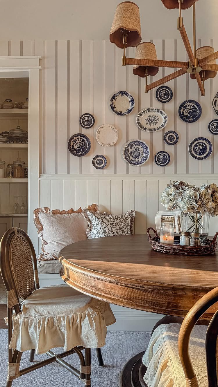
Plates on a wall work best when the wall itself is simple. Horizontal beadboard lines give the plates something to interrupt; busy wallpaper behind them would turn the arrangement into noise.
Start with one plate you already own and build outward. A blue-and-white palette reads as traditional, but a collection of mismatched transferware or even restaurant china in one color looks intentional rather than accidental.
Command strips work for lightweight pieces; anything heavier needs a proper hanger and a stud finder.
This is a slow project by nature, which makes it cheap.
The risk is that it looks like a gift shop; avoid that by keeping the plates in one size range and hanging them closer together than feels safe at first.
15. Built-In Bookshelf Backdrop
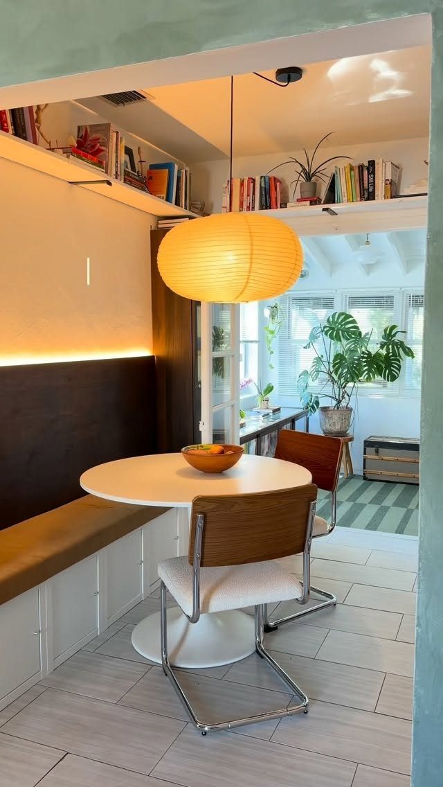
Bookshelves above a banquette turn a dining corner into the most lived-in spot in the house. Shelves set high, above head height, keep from crowding the table while still filling the vertical space.
I’d keep the books to one color family or arrange them by spine shade if the rest of the nook is quiet.
The alternative is a deliberate jumble, but that takes more confidence than most of us have before the first coffee.
The bench below can still store linens or board games in its base; the shelves are for display, not daily use.
A paper lantern is the right scale for a low ceiling where a pendant with hard lines would feel like an obstacle. It also costs less than most flush mounts and gives better light.
16. Patterned Fabric and Wallpaper Accents
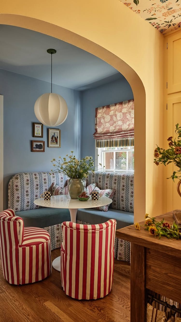
Pattern this dense needs a commitment most of us make once and live with for years. A floral banquette, striped chairs, and wallpapered ceiling can share a palette so every piece pulls from the same few colors instead of fighting.
The safer move is one loud element and quiet companions. A patterned banquette against white walls and solid chairs still reads as cheerful without the risk of claustrophobia.
If you want the full version, test it first: tape fabric swatches to the wall and live with them for a week in morning light, which is when you’ll actually use the space.
Roman shades in a matching pattern work because they repeat at a distance. I’d skip the matching valance and let the window stay simpler; the eye needs somewhere to rest.
17. Wood Paneling Backdrop
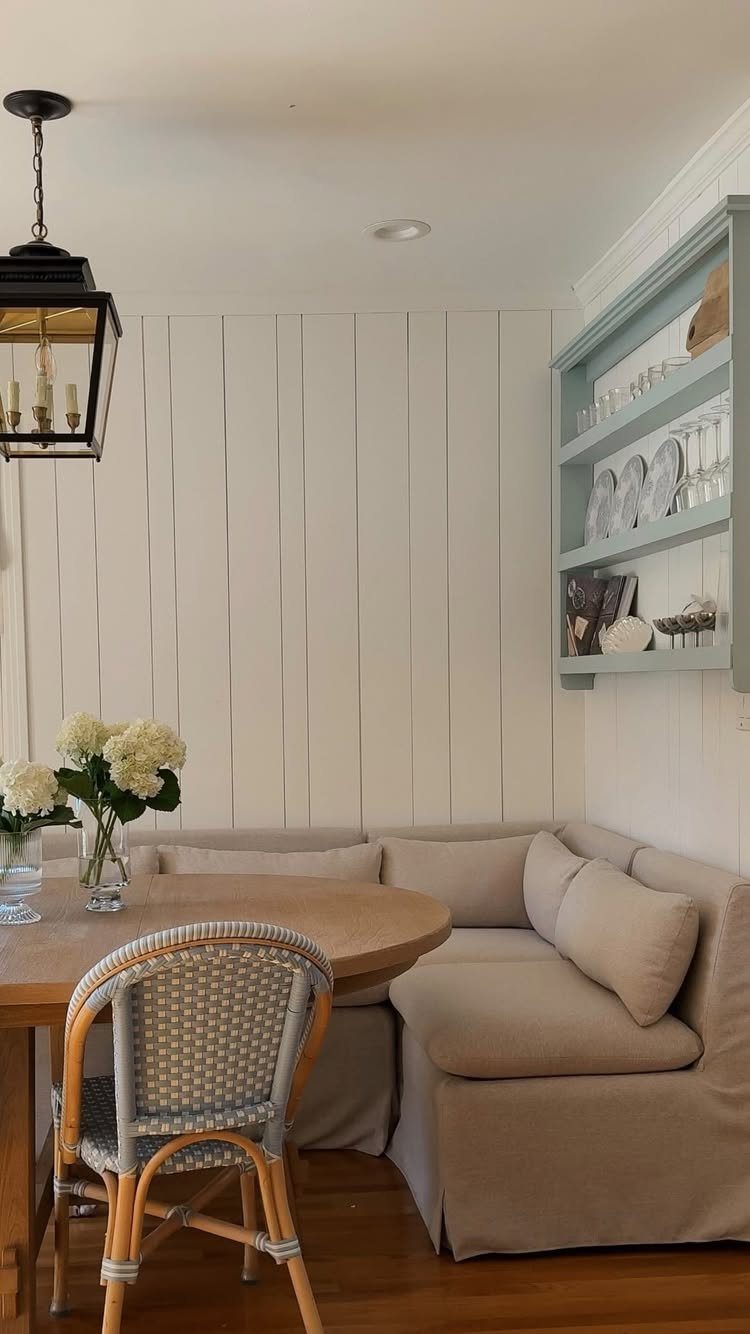
Vertical paneling draws the eye up, which helps a nook with a low ceiling feel intentional rather than cramped.
White paint keeps wood paneling bright, but the same boards in a warm stain would shift the whole room toward a cabin mood.
The L-shaped banquette here is upholstered in a tone that disappears against the wood, which makes the paneling the point.
I’d add texture through a woven chair or a pendant with some weight to it; without that contrast, the space can feel like a furniture showroom set.
Installation is straightforward if the wall is flat: 1×4 boards, quarter-inch gap, painted after hanging. In an older house with plaster waves, the boards will telegraph every bump unless you strap the wall first or accept a more rustic result.
18. Woven Chair Accents
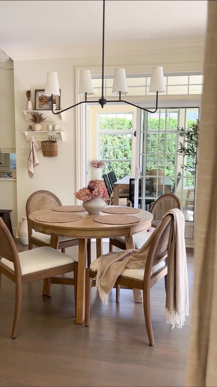
Woven cane backs on dining chairs give a breakfast nook instant texture without adding bulk. The open weave keeps sightlines clear in a small space and the natural tone warms up whatever wood finish sits on the table.
Chairs with cane held in a solid wood frame hold up better to daily sliding in and out than cane glued to a metal rim. Mixing woven-back and upholstered-seat chairs at the same table works when the wood tones match.
Woven seats need more upkeep than solid wood or upholstery. Cane snags and it fades in direct sun, so this suits a nook that gets morning light rather than all-day exposure.
For renters, lightweight woven chairs move with you and read as warmer than metal folding alternatives.
19. Breakfast Bar Extension
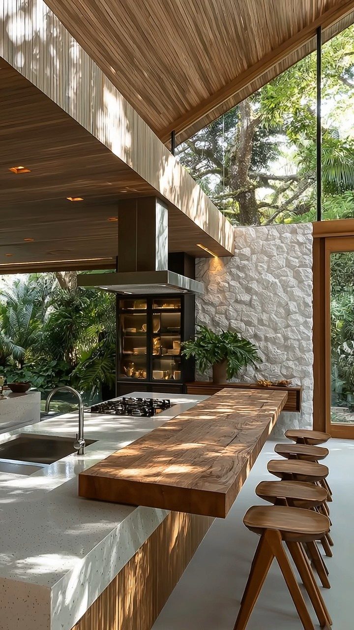
Extending a kitchen island with a cantilevered wood bar turns prep space into seating without building a separate nook.
I would stick with a single wood species that appears elsewhere in the room, ceiling beams or stool seats, so the bar reads as connected rather than random.
Stools tuck underneath when the space gets tight, which matters in open-plan kitchens where traffic passes through.
This setup trades the enclosed feeling of a built-in bench for flexibility. It suits households where breakfast is catch-as-catch-can rather than a seated ritual, and where the cook wants company without surrendering the counter.
If your island faces a wall, skip the extension; the view out or across the room is what makes it worth having.
Comfort and Functionality
A breakfast nook earns its keep when guests have somewhere better than bar stools to land.
The bench-and-table setup is looser than a dining room; kids spread homework, someone preps a salad, and the same space works for coffee at 7 AM and cards at 8 PM.
I would plan for at least two activities from the start, since a spot that only holds breakfast gets ignored by Wednesday. Banquette seating keeps people facing each other, which matters more than the table shape.
If the kitchen already has an island for prep, let the nook be the soft place; if it does not, pick a tabletop that can take a cutting board without heartbreak.
Breakfast nooks come in all shapes and sizes. There are massive 15 foot long breakfast nooks, but most are squeezed into much more compact spaces.
Maximizing Small Spaces
A corner you cannot fit a full table into is exactly where a nook belongs.
Furniture that works twice makes the difference: a tabletop that doubles as prep space when no one is eating, or drawers built into the table itself for silverware and napkins.
I would measure the swing of every door, including the refrigerator, before buying anything; a chair back that blocks the dairy drawer kills the setup.
In a studio or galley kitchen, the smallest round pedestal with two curved-back chairs shrinks to almost nothing when pushed in.
Personalization
A small plant or a pot of herbs on the table does more than decoration; it gives the eye somewhere green to rest among cabinets and appliances. I would pick something that tolerates morning sun and the occasional coffee splash.
For the walls, one mirror where it catches window light stretches the space without adding color. The rest is whatever you already collect: concert posters, children’s drawings, a single painting.
The frame styles can mix if the palette stays in range; navy and gray-green with warm wood underneath holds together without looking planned.
Lighting Importance
Layer three heights if the ceiling allows: something overhead, something at eye level, something low on the table or a side shelf.
A pendant hung low over the table anchors the space, but keep head clearance real; a shade that forces ducking gets moved within a week.
The fixture itself is a place to spend a little; it is the one thing you and your guests look at directly while sitting there.