
Wallpaper ideas run from a single afternoon with leftover scraps to a full weekend cutting MDF tongue-and-groove, and the right one depends on whether you’re covering a wall you own or dressing a surface you can peel away later.
A drawer lined in gold hexagon paper stays hidden until pulled open, while a mural needs a clear focal wall and a second person for anything wide enough to fight you.
1. Floral Prints
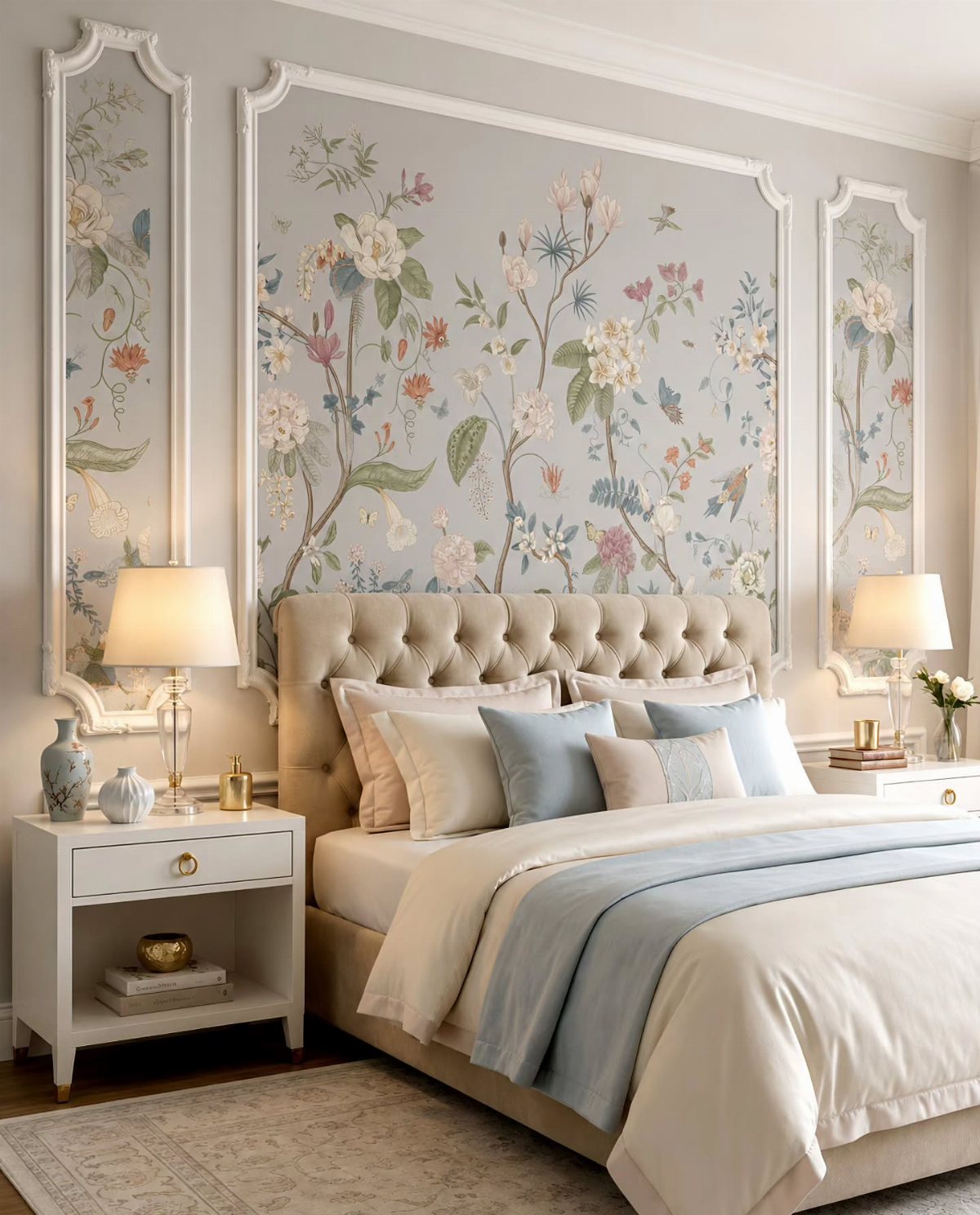
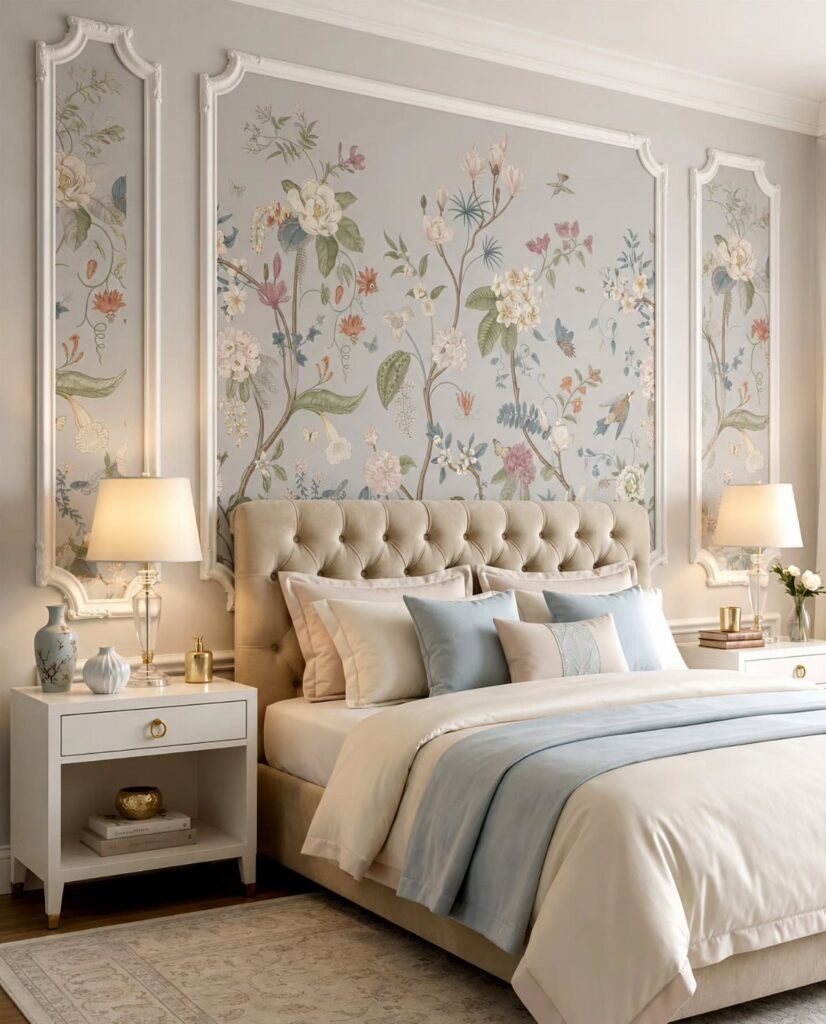
A floral print behind molding panels gives you the look of framed botanical art without the gallery price.
I’d pick a large-scale pattern in soft grey-green tones for a bedroom; the scale reads as modern, and muted colors keep it from feeling like grandma’s guest room.
Peel-and-stick rolls are cheap enough to buy a spare, and most patterns go up in an afternoon. For a calmer sleep space, skip high-contrast blooms and look for tone-on-tone or washed backgrounds.
This suits renters who want one wall with personality and an easy reversal at move-out.
2. Accent Walls
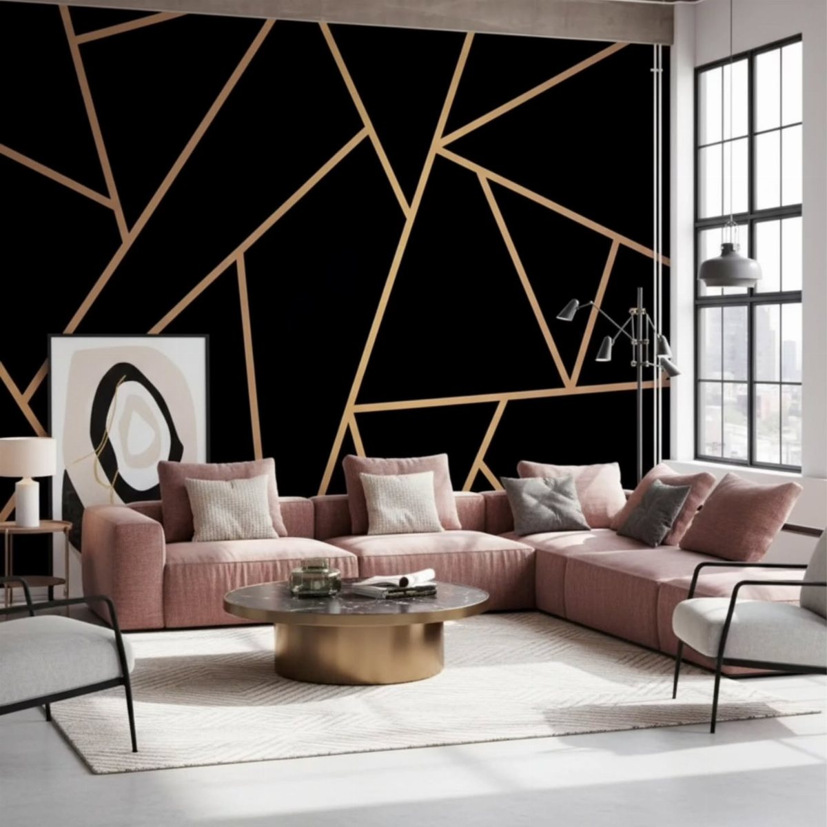
One bold wall lets you try a pattern you’d never commit to for a whole room.
Measure carefully: one accent wall in a small living room needs two double rolls, and decent peel-and-stick is still cheaper than hiring out paint. Start behind the bed or the sofa, where the eye goes anyway.
Best for anyone mid-project who wants impact this weekend without the labor of full coverage.
3. Bold Geometric Patterns
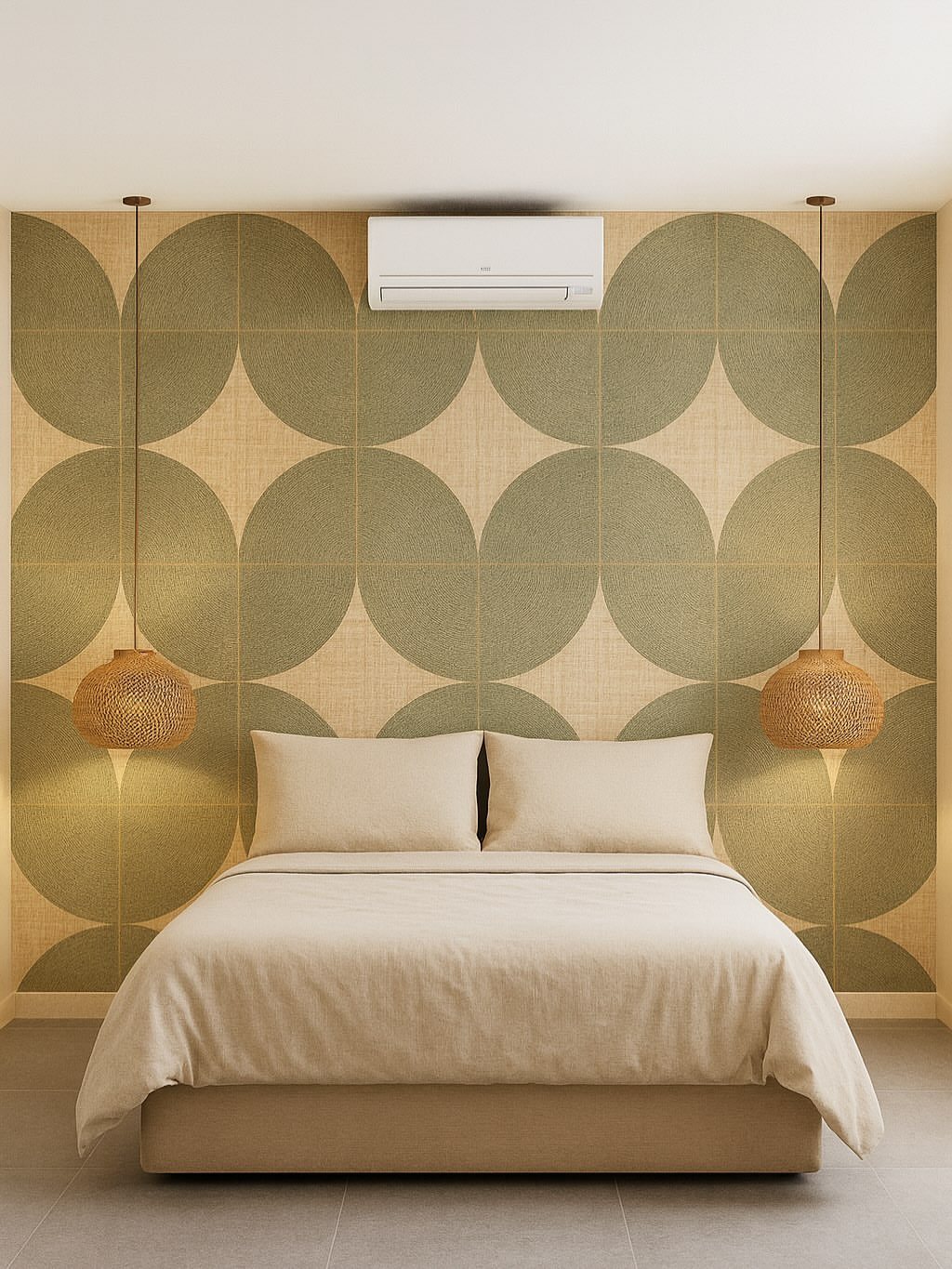
Overlapping circles in sage and tan read softer than sharp angles, which matters in a bedroom where you want the pattern to recede at night.
Look for vinyl-coated paper in high-traffic spots; it wipes clean. A geometric accent wall takes an afternoon including prep, less if you’re working over a smooth painted surface.
I’d steer mid-century modern fans toward this one. The clean lines play well with tapered legs and warm wood, and the pattern does the decorating work so you don’t need much wall art.
4. Textured Walls
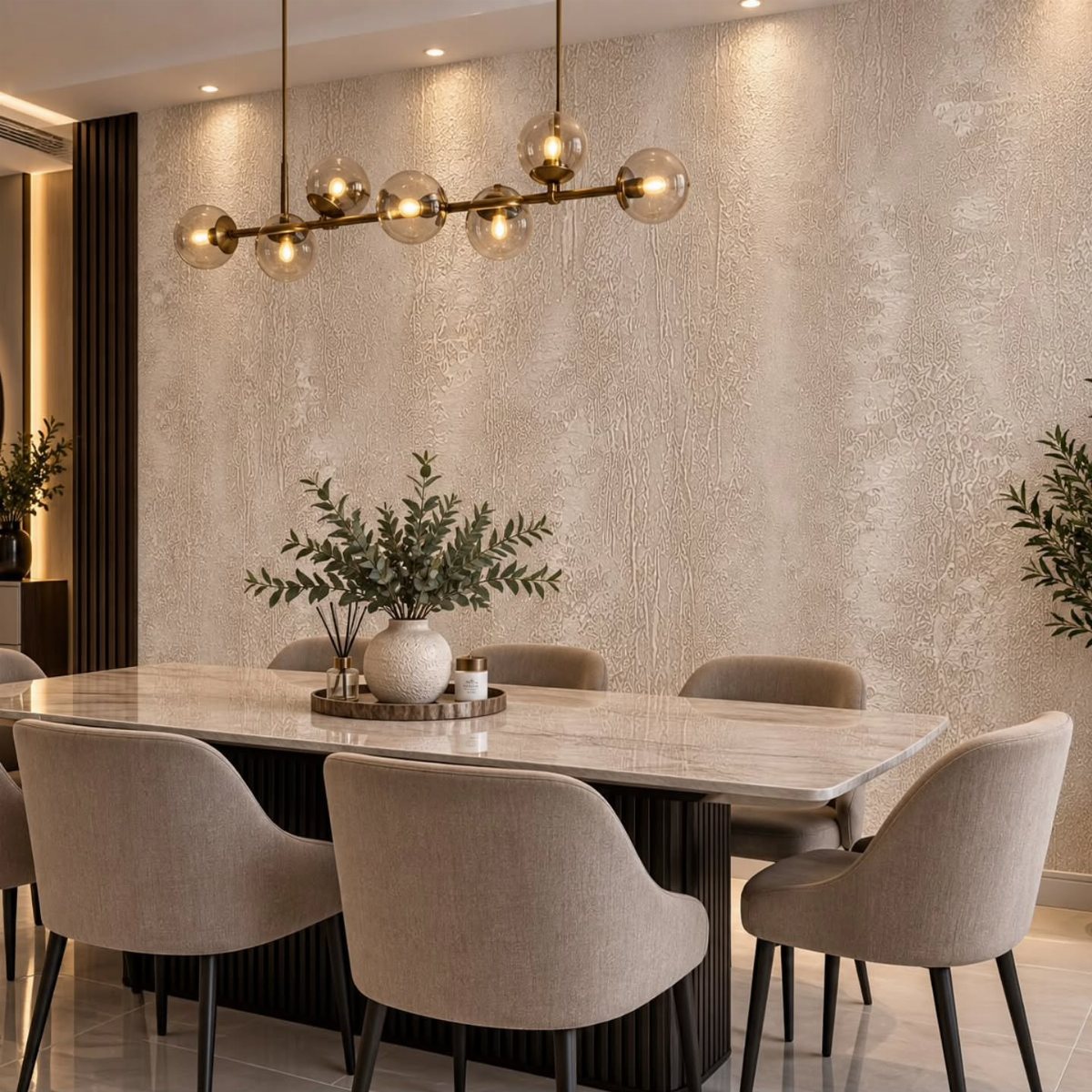
Plaster-like texture in warm beige adds depth without demanding attention, which makes it practical behind a dining table where conversation matters more than the walls. Marble and brass read richer against a quiet textured surface.
Faux concrete or linen textures come in paintable versions if you want to adjust the tone later. Plan for patching and priming one day, hanging the next; uneven texture shows every flaw underneath.
This works when you need the wall to do something but you don’t want to look at pattern all the time.
5. Murals
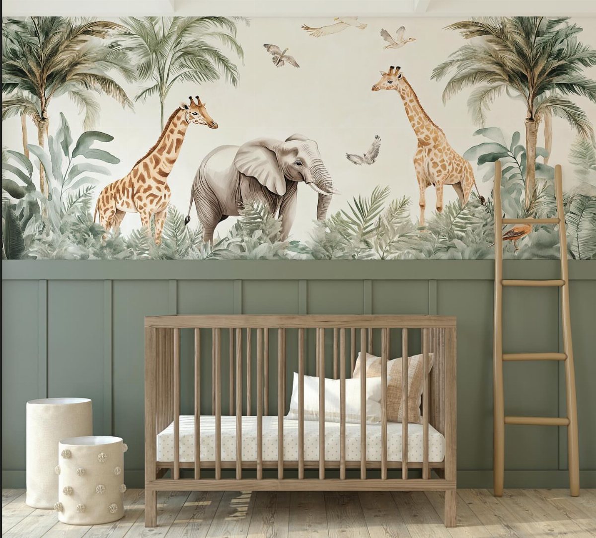
A single mural wall turns a nursery into a contained world without the clutter of dozens of framed prints.
A jungle scene above wainscoting keeps the imagery at a child’s sightline while the solid base handles chair scuffs and kicking feet.
Custom murals cost more than off-the-shelf rolls but less than a full room of designer paper; printed-to-size panels ship flat and install like standard paper.
Prepasted versions save a step, but you’ll still need a second person for anything wide enough to fight you.
I’d only do this in a room with a clear focal wall. A mural needs breathing room, and wrapping it around corners breaks the illusion.
6. Metallic Accents
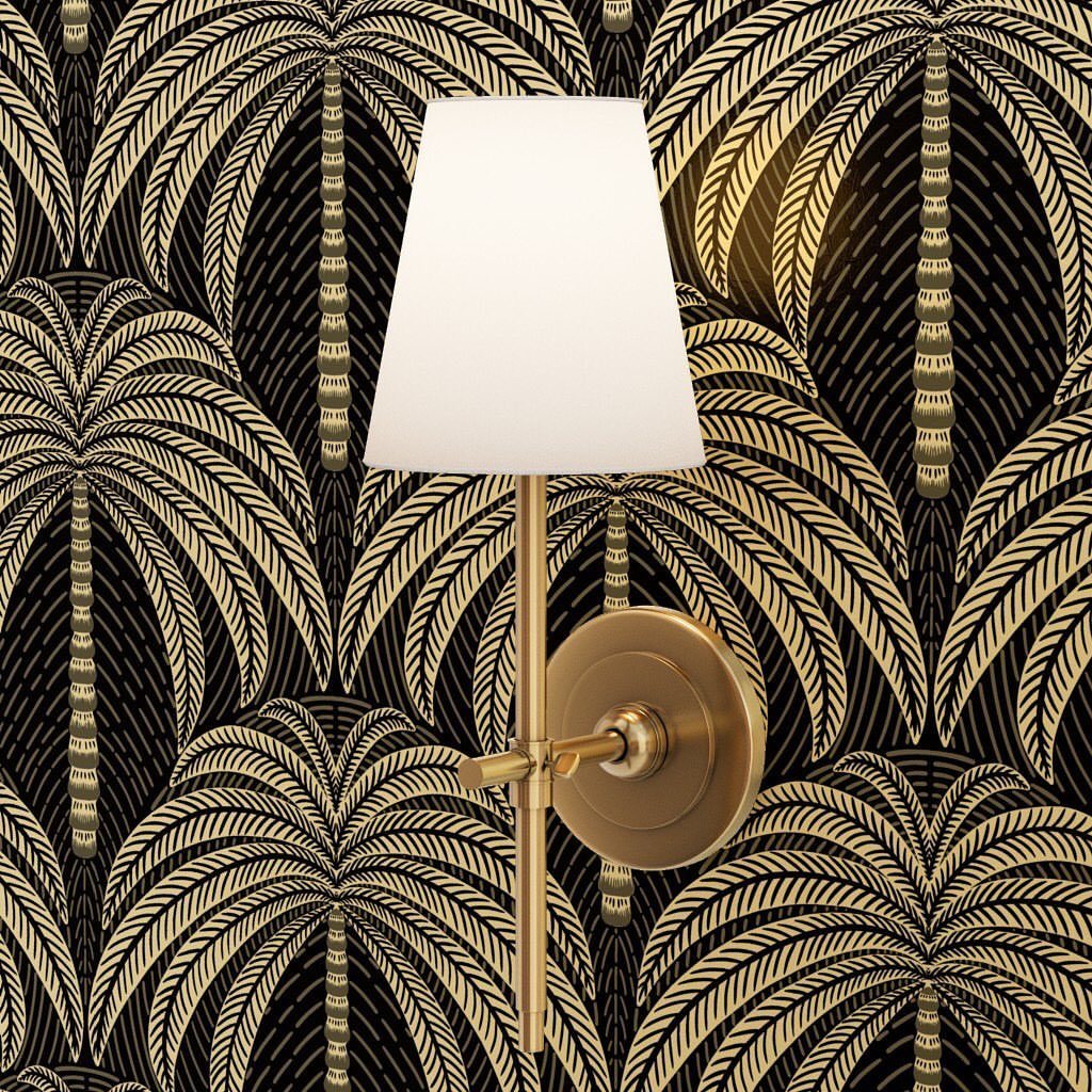
Gold palm fronds on black read as evening wear for a wall; a brass sconce doubles down, so this works best where you already have metal finishes to echo. Without that coordination, the shimmer looks stranded.
Metallic inks show every seam, so buy extra for pattern matching and expect to waste more than usual. One roll covers less than the square footage claims; the texture eats up overlap.
Small spaces like powder rooms handle this best. The confined area keeps the glamour from exhausting you, and the light bounce helps where there’s no window.
7. Vintage and Retro Prints
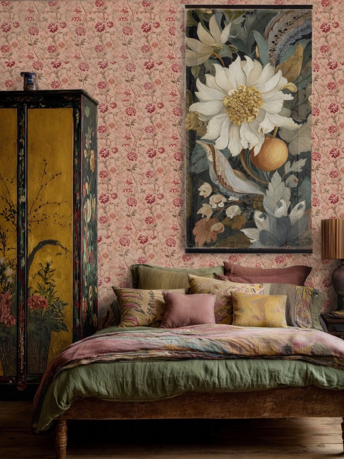
Vintage and retro prints carry the bold geometry of the 1960s or the cleaner lines of mid-century modern into a room without requiring period furniture to match.
Pink floral paper works best when the bedding and cabinet already share its palette; nothing fights.
For a weekend project, I’d start with one wall behind a bed or sofa and keep surrounding paint in a tone pulled from the paper itself. Grasscloth in a similar retro print adds texture if true vintage feels too busy.
This suits renters who want character they can peel away later, and first-home owners building an eclectic mix piece by piece. A 1960s-scale pattern reads as costume if the room lacks one other old piece to anchor it.
8. Wallpapering Ceilings
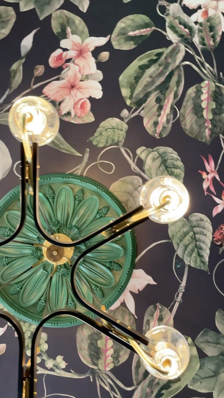
Ceilings swallow more paper than you’d expect; buy extra to handle the angles and the fixture cutout.
A dark botanical ceiling works when the green medallion and gold fixture repeat its colors, so the eye travels up and rests there rather than jolting back down.
I’d match the paper’s background tone to the wall paint below for the transition the eye needs; a stark white crown line makes the ceiling feel dropped on, not grown.
Performance vinyl or a coat of clear sealant matters here since kitchen steam and bathroom moisture rise. Best for rooms where you already own the statement light fixture; the paper and the fixture split the work of drawing attention upward.
9. Wallpaper in Bookcases
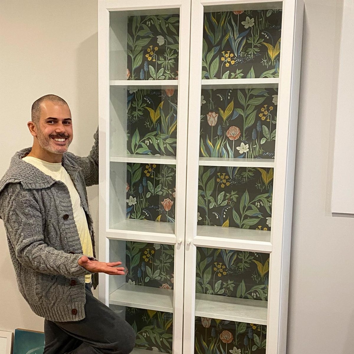
The back of a bookcase is the safest place to try a bold print: small square footage, low commitment, and the books themselves break up the pattern so it never overwhelms.
Grasscloth works especially well because its texture reads as depth, not noise, and the weave hides the small seams you’ll have at cabinet depth. Measure each opening individually; even IKEA cases vary by a quarter inch.
Peel-and-stick holds fine on the laminate backs most shelves ship with, though I’d rough the surface lightly with fine sandpaper first.
Charcoal and other dark grounds make spines pop, but a warm white grasscloth brightens a dim corner without stealing from what’s displayed.
Skip this if your shelves hold mostly paperbacks; the visual weight needs the heft of hardcovers or objects to balance.
10. Wallpapering Drawers
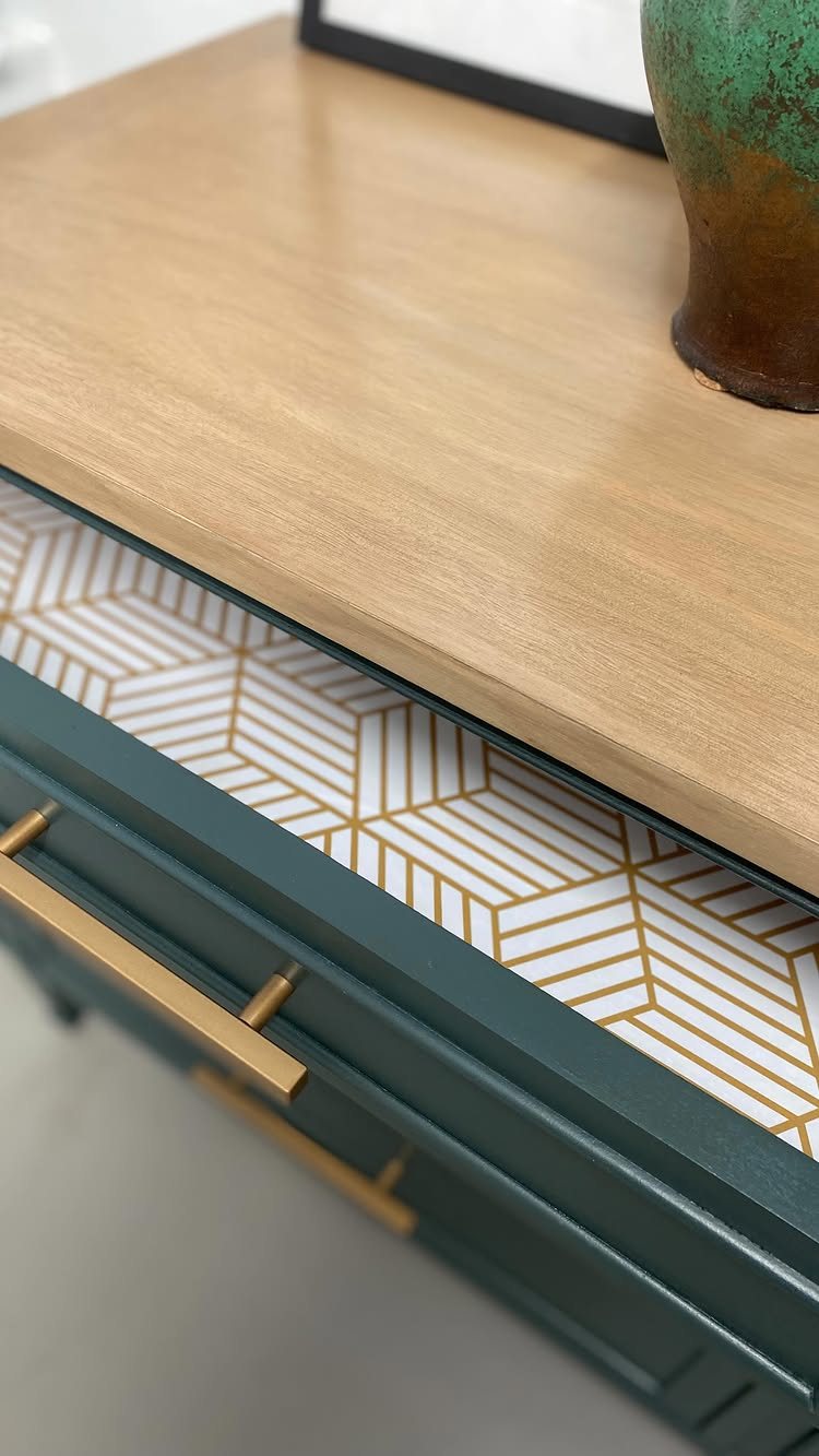
Drawer lining is where leftover scraps and sample rolls finally earn their keep. Gold hexagon paper inside a drawer shows itself only when pulled open, so the pattern can be louder than you’d risk on a wall.
Peel-and-stick is the practical choice; standard paste paper buckles at drawer-bottom corners where contents slide. Cut a template from newspaper first, notch for hardware, and lay the paper face down to trace.
A single roll of remnant often covers a dresser and a nightstand if you plan the cuts. I’d avoid anything with a raised texture here; smooth wipes clean, and drawers see more grime than walls.
The surprise matters most in pieces guests open, like a bathroom vanity or a guest room dresser, not your own daily clutter catch-all.
11. Wallpaper Backsplash
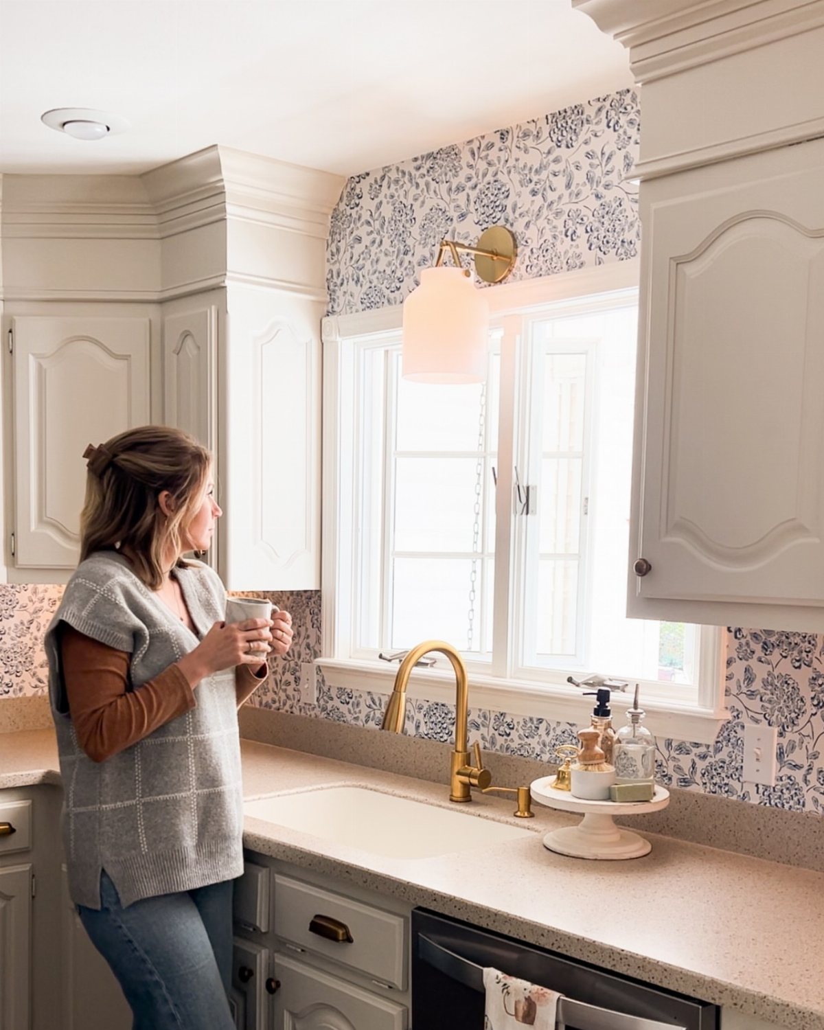
A wallpaper backsplash costs less than tile once you factor in grout, sealant, and the labor of either. Standard paper behind a range lasts months, not years, without a glass pane or at minimum a washable vinyl rated for kitchens.
Blue floral paper at a sink, away from grease and direct heat, makes for a safer first try. I’d order two extra rolls minimum; water splashes demand quick replacement of damaged strips, and dye lots shift.
For a rental, removable vinyl buys you the look with a security-deposit safety net. Coffee stations and bar areas suit wallpaper backsplashes best, where splatter is occasional and the reward is daily.
12. Combine with Panelling
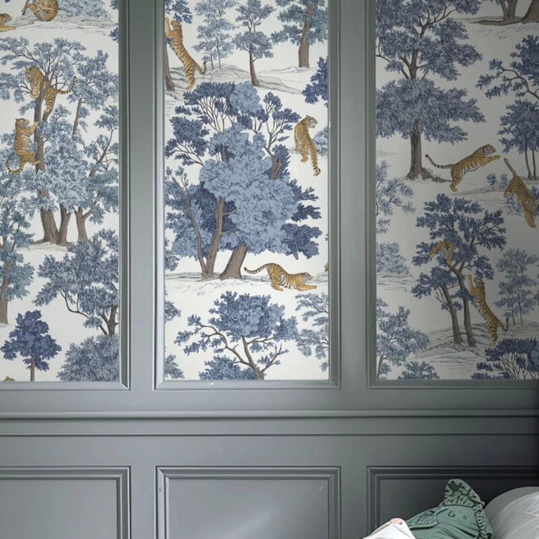
Paneling frames wallpaper the way a mat frames a print: it controls how much pattern reaches the eye and protects the lower wall where chairs scrape and bags swing.
Grey boards set tiger toile into discrete panels, so the pattern reads as collected art rather than wrapping paper run amok.
Paint the wood in the wallpaper’s darkest tone and the whole wall compresses visually while still giving the print room to breathe.
I’d use MDF tongue-and-groove for cost, prime it well, and expect a full weekend for cutting and fitting around existing trim. Once the panels are up, changing the paper means removing wood, not just peeling.
Best for a dining room or entry where the furniture stays put and the wall sees traffic, not a bedroom where you might want the freedom to shift.
13. Use Playful Prints in a Nursery
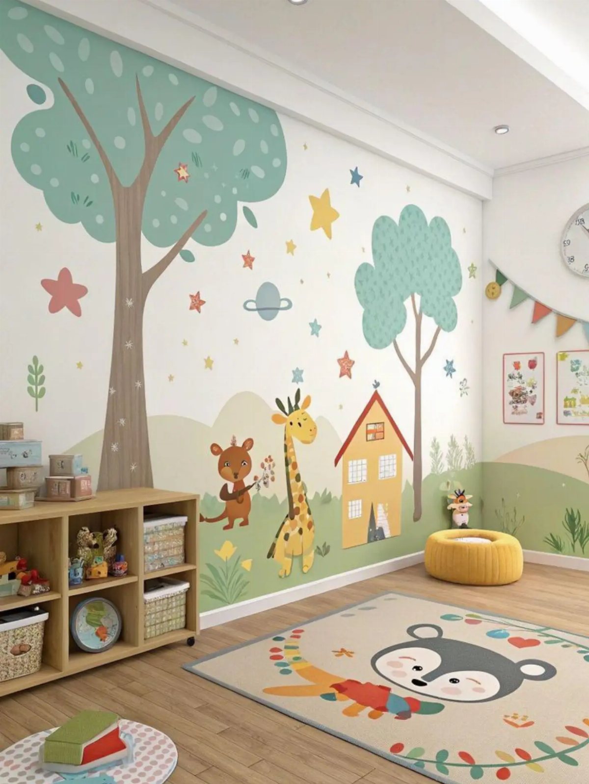
A nursery is the one room where you can go full whimsical and nobody raises an eyebrow.
Soft pastels, storybook animals, or ditsy florals behind the crib give a baby something to stare at during late-night wake-ups, and the print still reads as calming to adult eyes if you keep the scale small.
Peel-and-stick is the friend here: it goes up fast, comes down clean when tastes change, and survives the occasional scrub.
Designer Paloma Contreras chose a chinoiserie peacock for her daughter’s room specifically because it would age with her, not against her. That is the move.
Pick something that works at two and at ten, and you wallpaper once.
14. Upgrade Your Wardrobe with Wallpaper
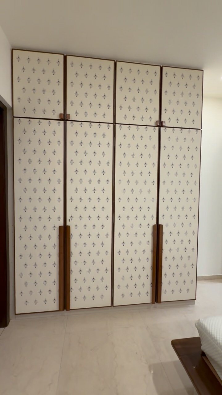
The outside of wardrobe doors takes pattern surprisingly well, especially when the panels are already broken up by trim or framing.
What reads busy on a full wall looks intentional when you cut it down to a cabinet panel or closet door.
Inside is where the real surprise lives. A stripe or small-scale print behind a closet back panel turns opening the door into a small surprise you get to keep private.
The fabric or paper softens all that hard joinery and ties the storage back to the bedroom palette.
Leftover rolls from another project cover this with zero extra cost. Peel-and-stick makes it a single-afternoon job, and the only tool you need is a straightedge and patience for the corners.
15. Wallpaper Stair Risers
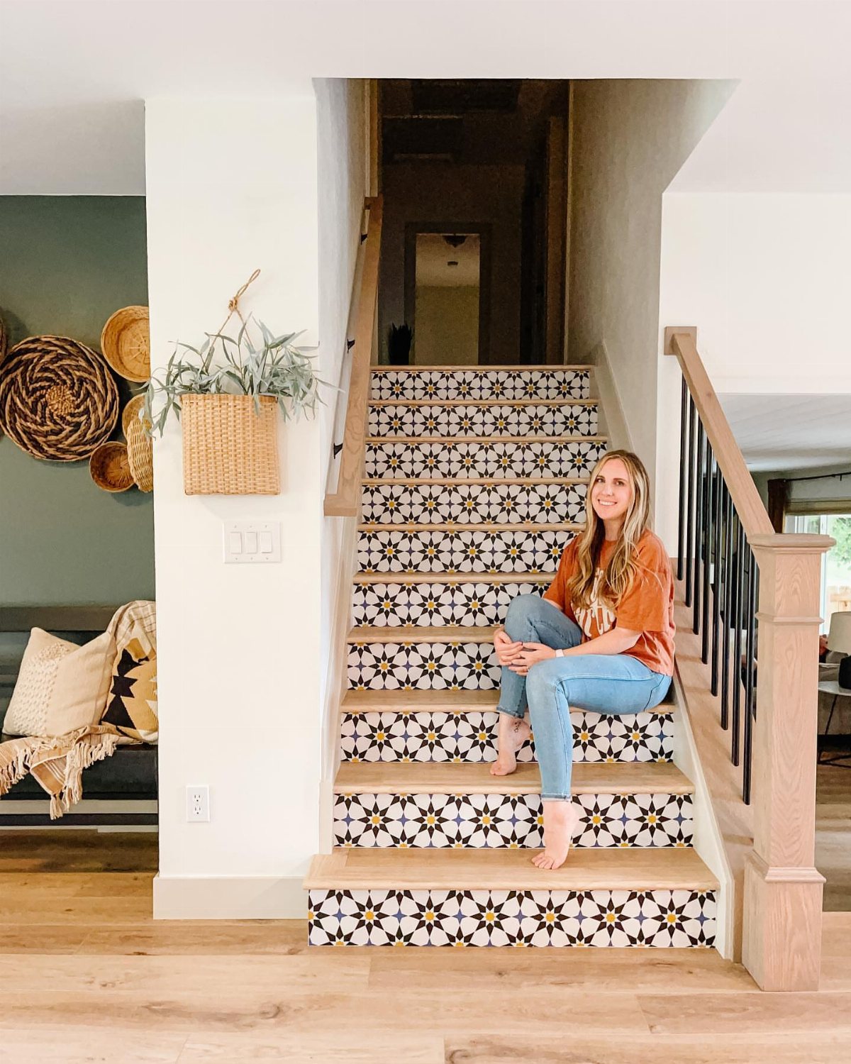
Hardwood stairs with the carpet finally torn out are a blank grid waiting for something. The riser, that vertical slice between treads, is exactly the right size for a pattern: small enough that bold reads as playful, not overwhelming.
Spoonflower’s peel-and-stick rolls are cut to fit each riser like a drawer liner. A geometric starburst or small repeat pulls the eye upward without fighting the wood grain underfoot.
Grasscloth works too if you want quieter texture, though it needs proper paste and a top coat for scuff protection.
Count the risers before you order; odd numbers mean the pattern alternates, which some people love and others cannot unsee.
I would test one roll on the bottom three steps and live with it for a week before committing the full flight.
Choosing the Right Wallpaper
Samples keep you from buying three rolls of something that turns muddy under your light. Tape a full sheet at eye level and live with it through morning and evening; the color shifts more than you’d guess.
Designer Kathy Kuo suggests this as standard practice, not just for the hesitant. Behind a bed or sofa, one wall reads as intentional art, not leftover paper.
Small rooms handle dark or busy prints better when they hit only one plane. The rest stays quiet and the eye has somewhere to rest.
Mixing Patterns and Colors
Opposite colors on the wheel, burnt orange against powder blue or forest green against soft pink, carry a room when nothing else competes. Designer Beata Heuman used three blues in one space, varying the shade so the contrast stayed controlled.
A small yellow braid on the arm kept it from going flat.
Three pieces in one color family, each a different depth, do more work than matching sets. The eye reads the relationship without knowing why.
Pattern mixing needs the same discipline: share one color between papers, or keep scales different enough that they don’t fight. Two mediums and a small print can live on adjoining walls; two larges cannot.
Temporary Wallpaper Solutions
Good peel-and-stick vinyl now passes a close look. It costs more per square foot than standard paper but saves the labor of priming, pasting, and steaming off later.
For a rental, that math is simple.
Modern patterns, nature themes, and textures all come in removable now. The range used to feel narrow; it doesn’t anymore.
The real advantage is speed. A smooth painted wall, a straightedge, and an afternoon replace a weekend of prep and cure time.
Removal takes a hairdryer and patience, not a steamer and scraped knuckles. For anyone who changes taste yearly or moves at lease-end, that convenience is the point.
Using Wallpaper in Unexpected Places
Cabinet interiors turn functional storage into something you notice only when using it. Designer Bethany Adams lines built-ins and backs as a way to add pattern without overstimulating the whole room.
A coat closet, small and visited briefly, handles a print you’d never risk at scale.
Framing a single roll as art is another low-commitment path. A stretched section behind glass gives you the designer look without the labor of full installation.
Move it when you move; the wall underneath stays untouched.
A bathroom vanity interior, a guest room dresser, the back of a china cabinet: these reward the curious without demanding attention from the daily user. That restraint keeps it from feeling like a theme park.