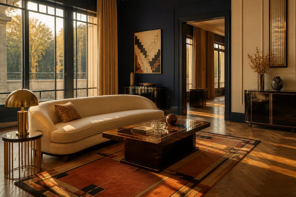
Art Deco interior design is a style that combines bold geometric patterns with symmetrical, streamlined forms and luxurious materials like chrome, glass, and lacquer. The catch is that its pre-war glamour costs real money to replicate today, while the more accessible Depression-era versions lose some of that original opulence. The 1925 Paris Exposition Internationale des Arts Décoratifs, where designers deliberately broke from Art Nouveau’s flowing curves, marks the moment this machine-age aesthetic went public.
What Art Deco Is
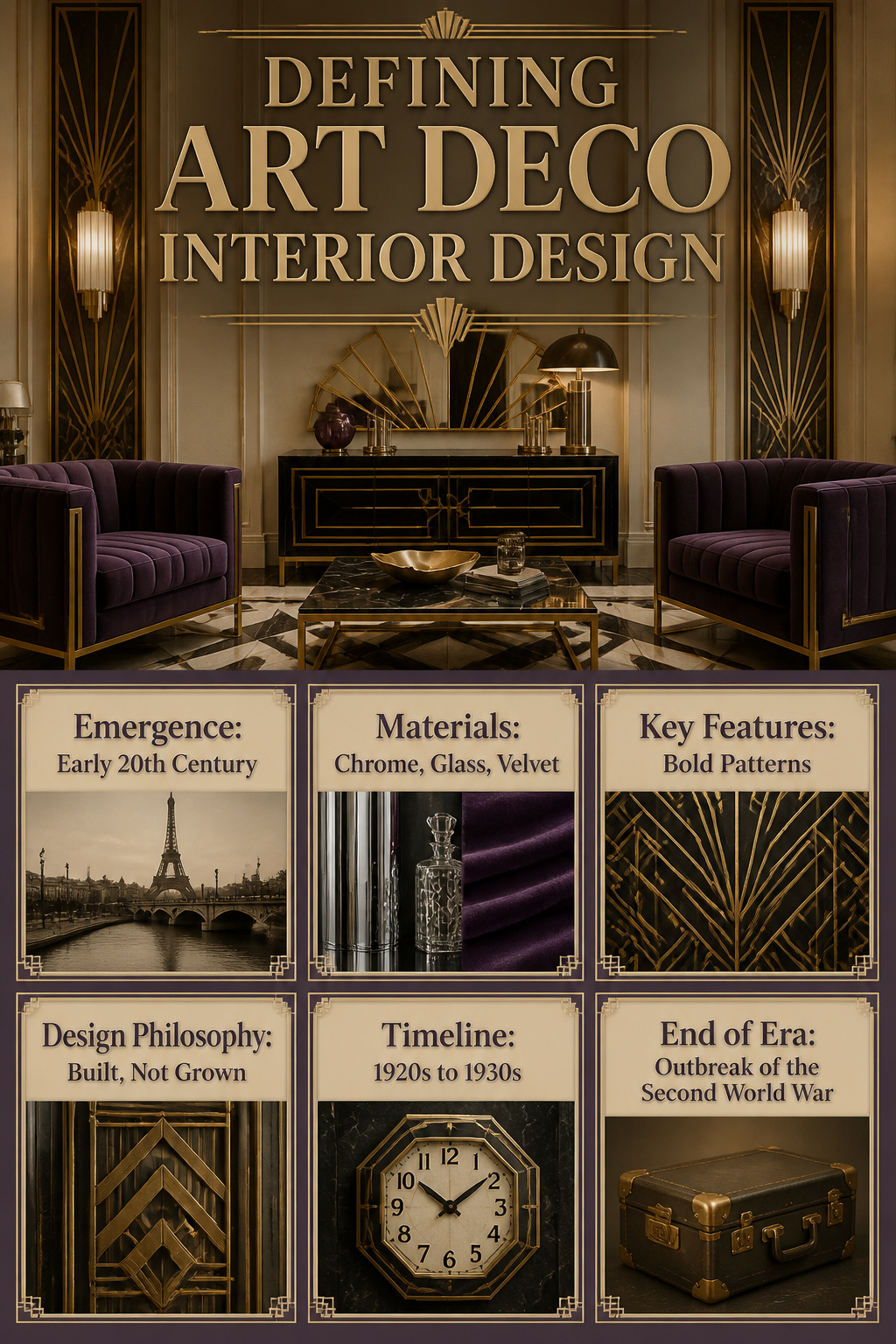
Art Deco interior design is a style that marries bold geometric patterns with streamlined, symmetrical forms, and it emerged in the early 20th century, reaching its height during the 1920s and 1930s. The look relies on luxurious materials: chrome, glass, lacquer, velvet, marble, and gold, often arranged in sharp, repeating shapes that feel both modern and opulent. What distinguishes it from other period styles is that manufactured quality, the sense that precision and glamour were built, not grown.
Some histories mark its start in Paris just before the 1920s; others place the true flourishing in the mid-1920s, after the First World War ended and optimism returned. Either way, the movement ran until the outbreak of the Second World War, when austerity and shifting tastes pushed it aside. The core vocabulary stayed consistent through that span: sleek lines, rich color, geometric symmetry, and a deliberate, almost machine-age polish.
Where Art Deco Came From
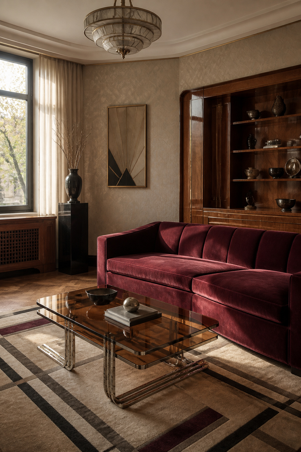
The seeds of Art Deco interior design were planted in France in the mid-to-late 1910s, just before World War I swept across Europe. The style found its defining moment at the 1925 Exposition Internationale des Arts Décoratifs et Industriels Modernes in Paris, where designers unveiled a look that deliberately broke from the organic, flowing curves of Art Nouveau. Where Art Nouveau grew like vines, Art Deco stood like geometry made solid.
The movement borrowed freely. Cubism’s fractured planes and abstract forms left their mark, as did the bold color theories of Fauvism and Orphism. Designers also reached beyond European traditions, pulling shapes and motifs from ancient Egyptian art, African sculpture, and Aztec design. The result was a style that felt simultaneously modern and timeless, machine-made and hand-wrought.
By the 1930s, Art Deco had crossed the Atlantic and taken root in American cities, but its original principles faced strain. The Wall Street Crash of 1929 split the movement into two phases: an early era of expensive materials and optimistic ornament, followed by a more austere Depression-era version that substituted plastics and cheaper finishes for lacquer and exotic woods. World War II finished what economics had started. The Bauhaus diaspora brought functionalist ideas to American shores, and by the postwar years, the unornamented clarity of midcentury modern had largely replaced Art Deco’s exuberance.
The revival came in the 1960s, and it never really left. What attracts me to the style now is exactly what made it radical then: the confidence to mix influences without apology, to make a room feel built rather than decorated.
Geometric Shapes
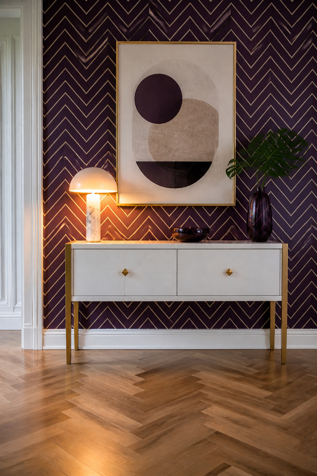
The zigzag, the triangle, and the sunburst are the three shapes most people picture when Art Deco comes up, and for good reason. Sources across the period treat them as the style’s visual signature, the quickest way to signal glamour without saying a word. A single sunburst mirror or one wall of geometric wallpaper does the work of a dozen accessories; the pattern itself becomes the ornament.
Where to put it matters more than how much. The 1920s originals went all in, but a room wrapped top to bottom in chevrons now feels like a set piece. The better move for a weekend project is one statement surface: a herringbone oak floor to ground the space, or a console backed by vertical stripes and metallic finish. Let the geometry do its job in one place, then stop.
Wallpaper was the historic carrier for these motifs, often in jewel tones like amethyst or peacock blue, sometimes in monochrome. The metallic versions were especially popular, catching lamplight across zigzags and Egyptian-inspired hieroglyphics alike. For a renter, peel-and-stick geometrics in a bathroom or entry deliver the effect without the commitment. The pattern carries the room; you do not need to layer in much else.
Luxurious Materials
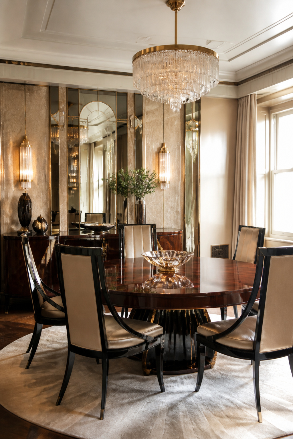
The materials themselves were the statement in Art Deco interiors. Chrome plating arrived fresh from machine-age factories, and designers treated it as jewelry for whole rooms rather than trim for appliances. Glass showed up in thick slabs and mirrored panels, sometimes layered so a single wall caught light twice over. Lacquer mattered just as much as the wood beneath it; cabinets and armchairs alike went through coat after coat until the surface looked wet from across the room.
Exotic woods like ebony and mahogany carried the weight of real expense, which was partly the point. Violetwood sat in the same category for those who could source it. Even when budgets forced a shift to maple or oak, the finish stayed glossy and deliberate. That tension between factory-new metals and painstaking craft is what keeps the style from reading as purely cold: the chrome might come from an assembly line, but the violetwood beneath twenty layers of lacquer did not.
Bold Colors
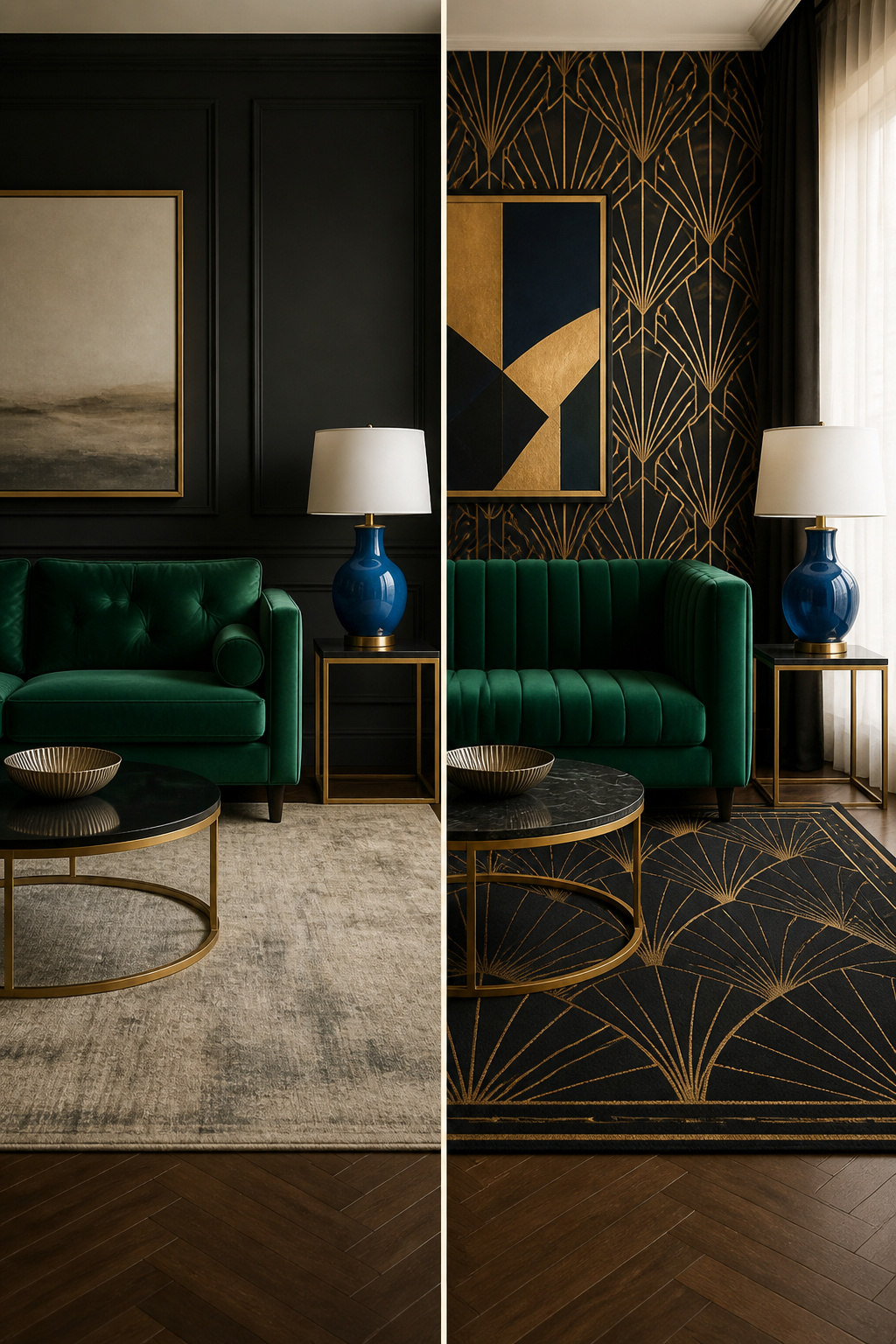
Emerald green, sapphire blue, and deep amethyst sit at the center of most Art Deco color stories, though the sources rarely map out a full palette beyond naming these jewel tones. What I find more useful is how consistently they pair with metallics: greys, golds, and silvers carried the prosperity of the era, while black and white formed the most popular combination of the period for a sleek, streamlined look. The tension between saturated color and restraint is worth planning for. A lacquered side table in deep green or a silk lampshade in sapphire channels the mood without flooding the room. For a modern adaptation, muted jewel tones on clean-lined velvet furniture keep the luxury tactile but controlled. Jewel tones work best as intentional moments against neutral backgrounds, not as wall-to-wall saturation. Canary yellow, bright red, and peacock blue also appeared, though less often in the sources I read; if you want optimism without the heaviness, those energetic accents on small surfaces read as period-appropriate without overwhelming a weekend project.
Sleek Lines
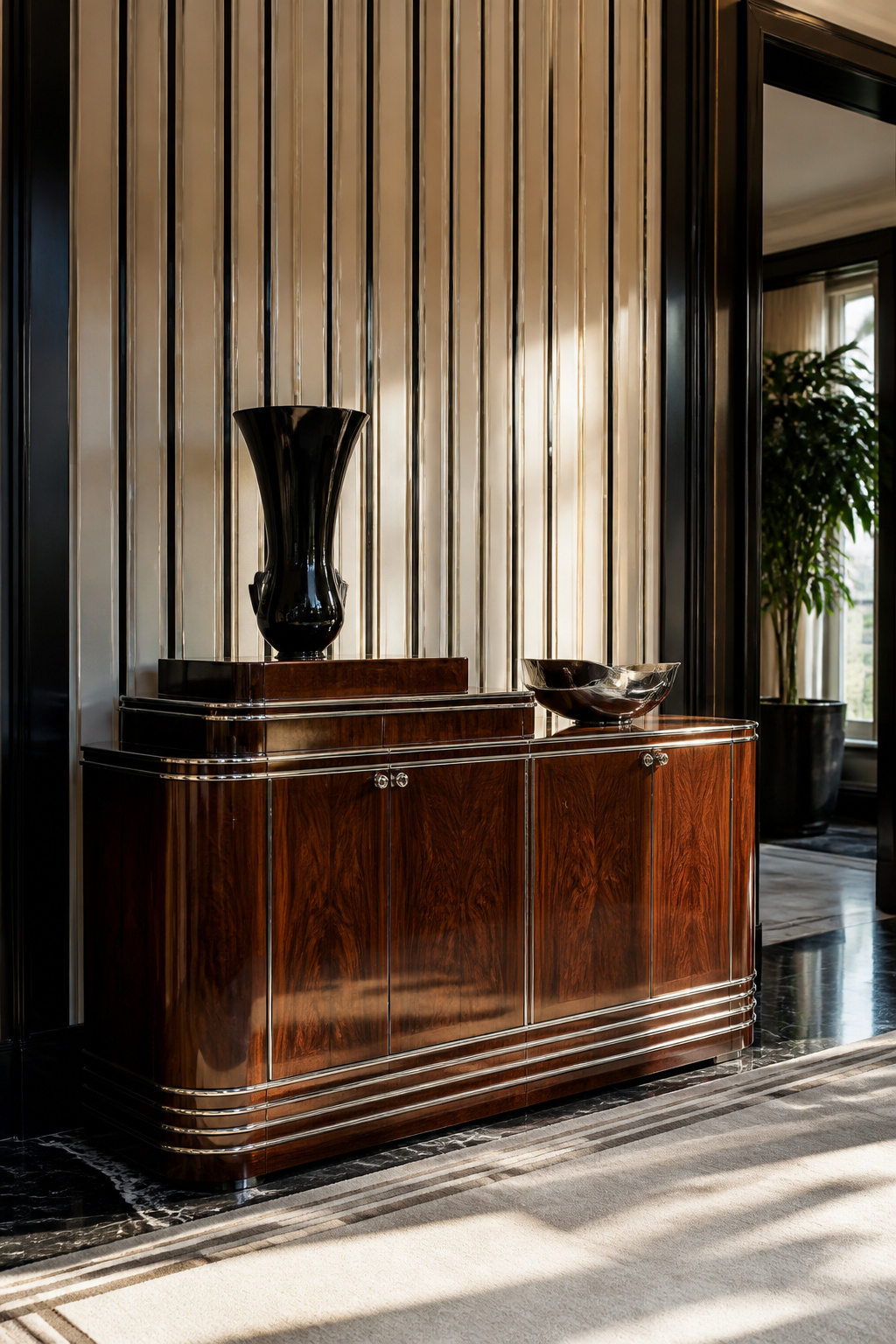
Clean, streamlined shapes are what keep Art Deco from dissolving into mere decoration. The style leans on symmetry and restraint, not excess. Zigzags, triangles, and sunburst motifs repeat with machine-age precision, giving rooms their sense of order rather than clutter. I notice this most in furniture silhouettes: the stepped "skyscraper" profile on a sideboard or console table reads as glamour only because the line itself stays so controlled.
This discipline came from a deliberate break with Art Nouveau. Where the earlier style let curves run organic and free, Art Deco answered with geometry that celebrated manufactured progress. Chrome and Bakelite suited these shapes better than carved wood ever could. The result feels theatrical, yes, but never fussy. A single stepped form or chevron pattern carries the whole wall; you do not need to layer more on top.
For a weekend project on a real budget, this restraint is your friend. One strong symmetrical piece, a mirror with a thin stepped frame or a cabinet with that skyscraper edge, does more than a roomful of themed accessories. The line does the work.
Ornamental Lighting
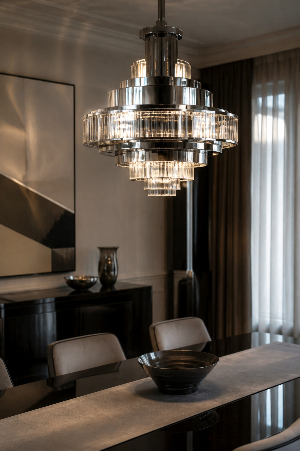
The fixtures that define art deco interior design do not hang quietly in a corner. They command the room.
Donald Deskey’s lighting for Radio City Music Hall, completed in 1932, shows how far designers pushed this idea. The lobby fixtures combine glass, aluminum, and chrome into pieces that read as sculpture first, function second. Walking through, the eye keeps catching on vertical shafts and stepped forms that echo the architecture around them.
William Van Alen took a different approach in the Chrysler Building’s triangular lobby. There, lights sit against walls clad in red granite and Belgian blue marble, their stainless-steel details picking up the chrome elsewhere in the space. The effect is cumulative: each material amplifies the others.
American skyscraper-style floor lamps carry this logic into domestic settings. Their vertical lines borrow directly from the towers going up across Manhattan in the late 1920s and early 1930s.
For a weekend project, one dramatic fixture changes a room faster than repainting. A chrome-and-glass pendant over a dining table or a stepped torchiere in a reading corner supplies the geometry and material mix that signals the style. The rest of the scheme can stay quiet.
Art Deco Against Art Nouveau
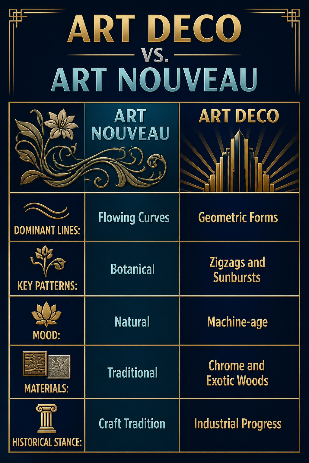
Art Nouveau’s whiplash curves and botanical ornament were the look Art Deco designers set out to leave behind. Where one style grows tendrils and lilies, the other builds ziggurats and sunbursts. The shift was deliberate: the 1925 Paris exhibition that launched Art Deco positioned it as a clean break from organic, curvilinear design toward something mechanistic and modern.
The differences run deeper than motif.
| Attribute | Art Nouveau | Art Deco |
|---|---|---|
| Dominant lines | Flowing, organic curves | Geometric, symmetrical forms |
| Key patterns | Botanical motifs, tendrils | Zigzags, triangles, chevrons, sunbursts |
| Mood | Natural, handcrafted | Machine-age, theatrical |
| Materials | Traditional, rustic finishes | Chrome, brass, lacquer, exotic woods |
| Historical stance | Celebrated craft tradition | Embraced industrial progress |
Both movements used expensive materials and prized craftsmanship, but Art Deco added chrome plating, stainless steel, and early plastics to the palette. The result feels less grown than built: stepped forms and polished surfaces that announce human intention rather than natural process.
Pre-War and Post-War Art Deco
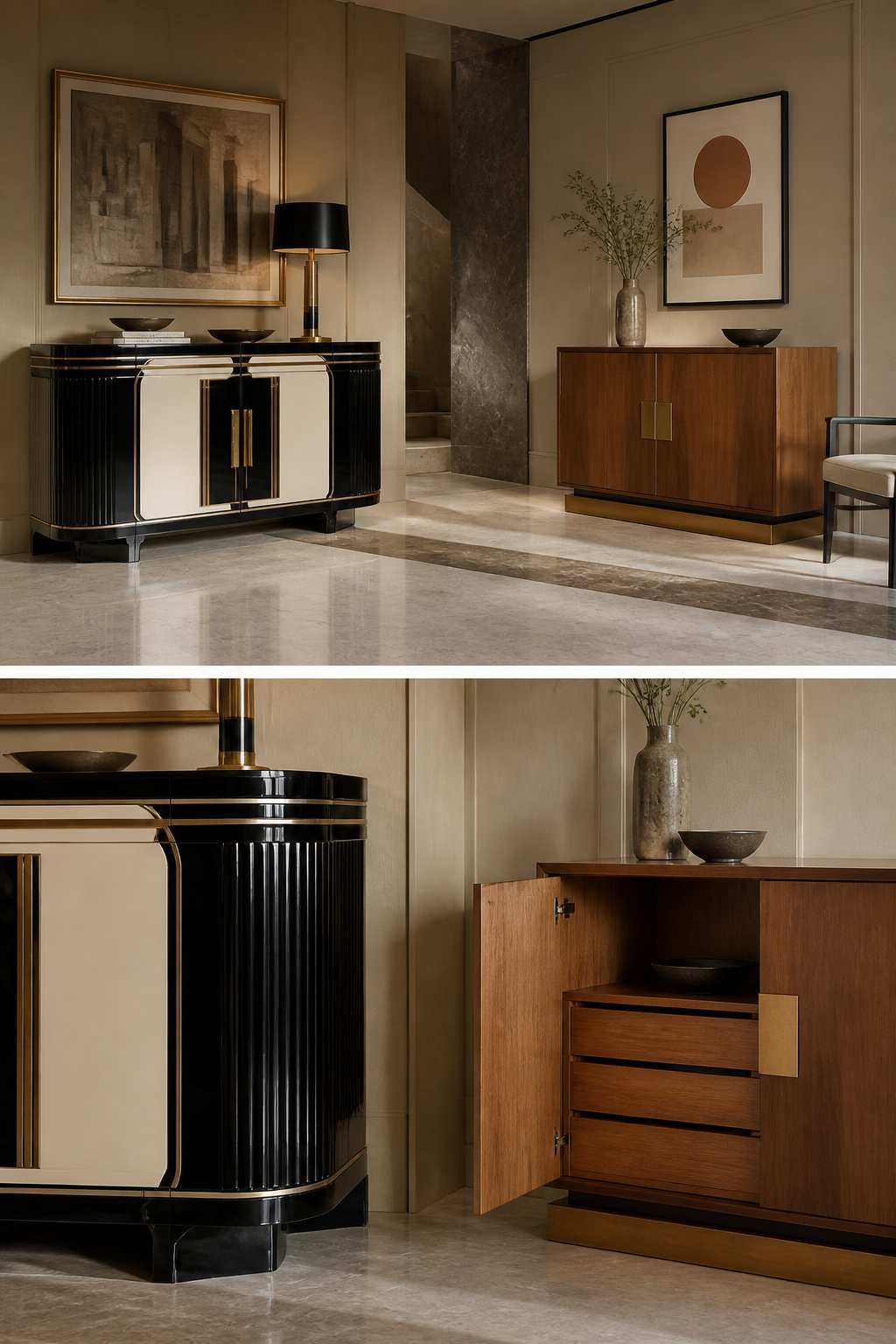
The Art Deco that filled 1920s interiors looked nothing like what survived the 1940s. Pre-war Art Deco ran on ebony, ivory, chrome plating, and the kind of ornamentation that cost serious money. It was built for glamour and exuberance, the aesthetic payoff of a boom decade. Then the Great Depression arrived. Streamline Moderne, the sleeker offshoot that followed, kept the curves and polished surfaces but stripped away the excess. By the time World War II ended, the style had lost its dominance entirely to the International Style and midcentury modern, both of which prized function over decoration.
Post-war reproductions tend to borrow that later, quieter mood. A brass fixture or a geometric rug today channels Art Deco’s spirit without recreating its pre-war opulence, which is why so many pieces labeled "Art Deco" feel more restrained than the originals. For anyone shopping secondhand or buying new, the date matters: 1920s exuberance costs more and reads louder than the 1930s adaptation, and neither matches the pared-back look that gets called Art Deco now.
Bringing Art Deco Home Now
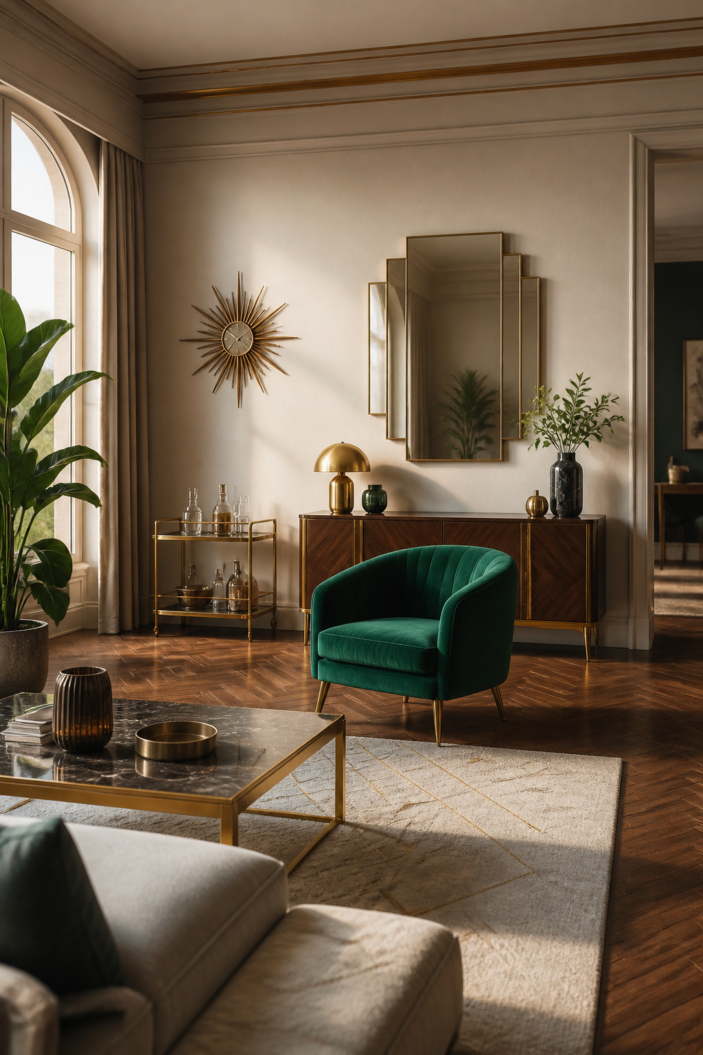
Geometric patterns do the heavy lifting when Art Deco meets a modern interior. A single sunburst mirror or chevron rug carries enough visual weight that the rest of the room can stay pared back, which matters when the budget only stretches to one or two statement pieces. I have watched friends try to layer multiple bold patterns at once, and the room always ends up shouting at itself. One strong shape, repeated, reads as intentional; three competing ones read as a theme park.
Rich colors work the same way. The passages point to bold, vibrant choices, but in a contemporary space that usually means one saturated piece against neutrals. A deep emerald velvet chair, a sapphire ceramic lamp, the kind of thing that would have felt at home in a 1920s salon. The velvet, the heavy silk, the burled wood, these tactile materials are what separate Art Deco pastiche from the real atmosphere. A chrome frame with a cheap laminate top looks like a stage set; the same frame with a veined marble surface feels like a room someone lives in.
The blend of old and new is where the style proves its stamina. A sleek, streamlined light fixture above a farmhouse table, a geometric mirror hung on shiplap, the contrast is the point. Art Deco was always about the new, the machine age, the forward glance. It does not need a period room to make sense. It needs confidence and one good material choice you can actually touch.
Frequently Asked Questions
What is Art Deco interior design?
Art Deco interior design is a style that pairs bold geometric patterns with streamlined, symmetrical forms, using luxurious materials like chrome, glass, lacquer, velvet, marble, and gold. It emerged in the early 20th century and reached its height during the 1920s and 1930s, characterized by a machine-age polish that feels both modern and opulent. The style distinguishes itself through its manufactured quality, the sense that precision and glamour were built rather than grown.
How can I incorporate Art Deco into my home?
Start with one strong geometric statement, such as a sunburst mirror, chevron rug, or herringbone floor, and let the rest of the room stay quiet. Add a single saturated piece in jewel tones, like an emerald velvet chair or sapphire ceramic lamp, against neutral backgrounds. Choose real materials you can touch, such as veined marble, burled wood, or heavy silk, rather than laminates or plastics.
What are the key characteristics of Art Deco?
The four defining characteristics are geometric shapes, including zigzags, triangles, and sunbursts; luxurious materials like chrome, glass, lacquer, and exotic woods; bold jewel tones such as emerald, sapphire, and amethyst paired with metallics; and sleek, symmetrical lines that favor restraint over excess. These elements work together to create a theatrical but controlled atmosphere.