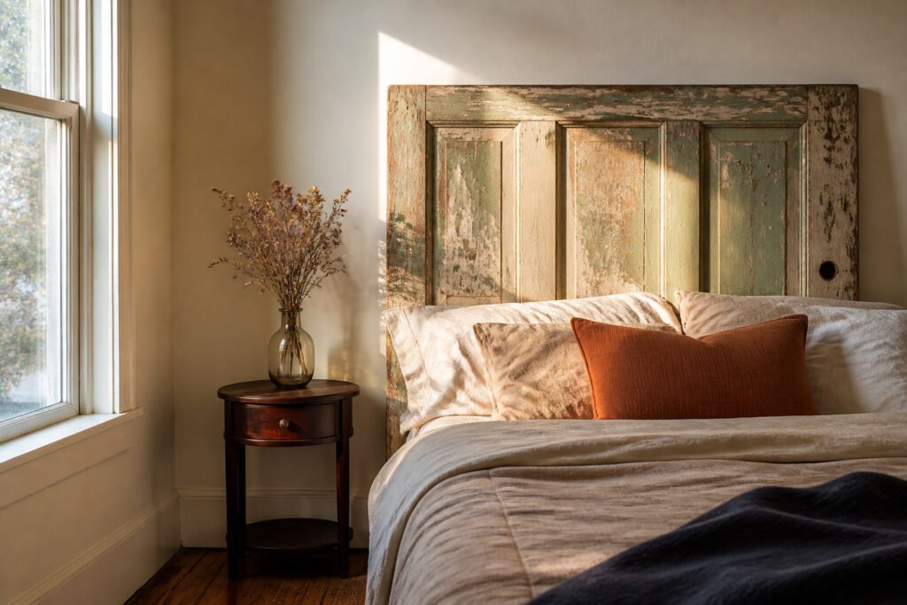
Room decor ideas span from a $30 salvage door slab turned headboard to built-in dormer storage that follows the angle of the ceiling. What decides which one belongs in your space is not budget or skill level but the specific condition the room imposes: a rental lease, plaster that crumbles, humidity that swells MDF joints, or fourteen inches of clearance beside the bed.
The French cleat that saved my first headboard from pulling out of drywall within a month is the same bracket system used for heavy cabinets. Weight distributed every sixteen inches across studs means even a door slab from the salvage yard holds secure, and the narrow rail left behind patches faster than a grid of toggle holes when the lease ends.
1. Statement Headboard
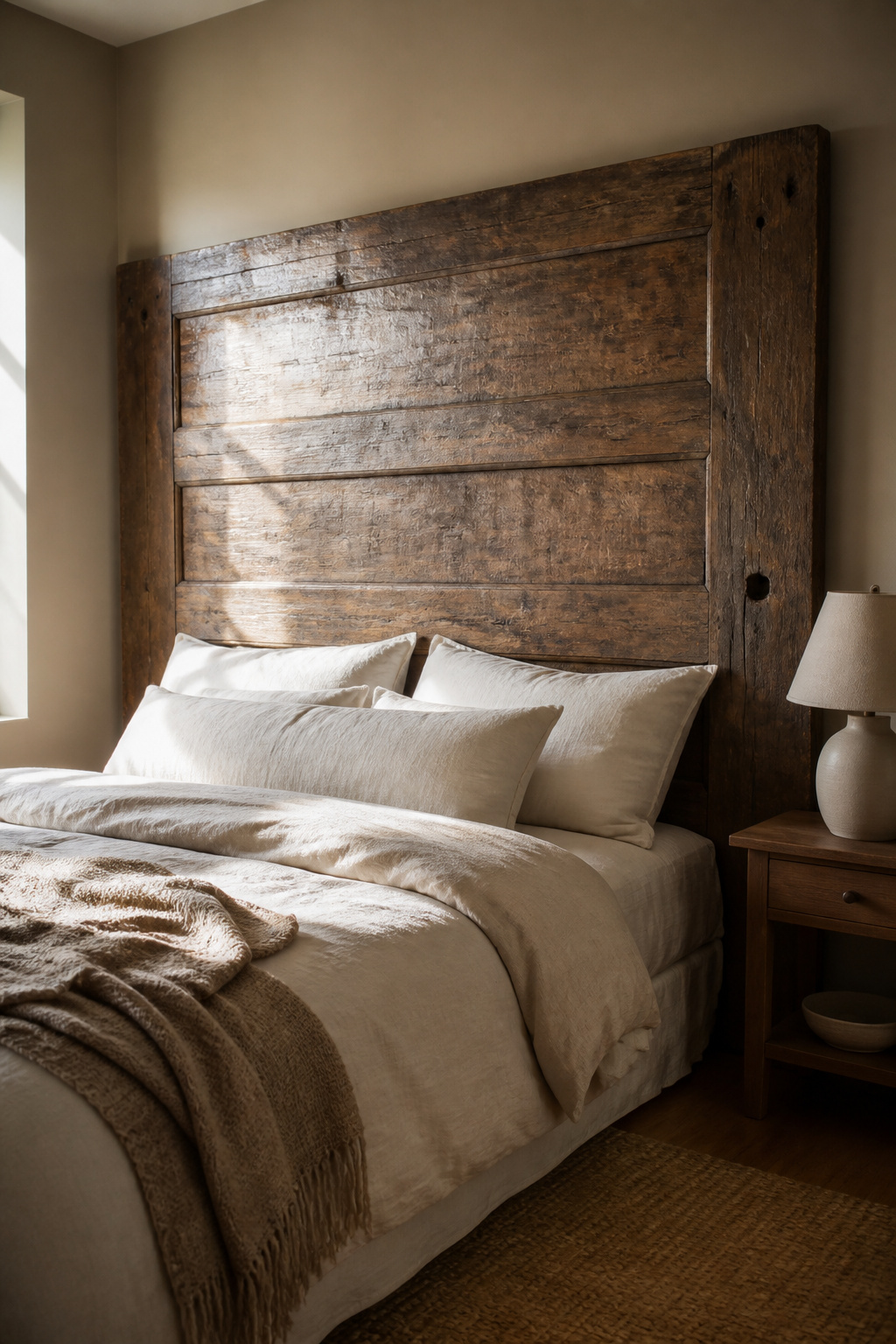
A headboard that reaches wall to wall turns the bed into architecture instead of furniture. I learned that the hard way after my first attempt, a plywood rectangle painted navy, started to pull its anchors out of drywall within a month. The fix was switching to a French cleat, the same interlocking bracket system used for heavy cabinets. One strip screws into studs across the full width, the other gets screwed to the back of the board, and the whole thing drops into place with weight distributed every sixteen inches. A cleated headboard will hold even a door slab from a salvage yard, which runs about thirty dollars if you have the patience to strip hardware holes and fill them.
Painted plywood cutouts work the same way. A jigsaw and a printed template from any free vector site will give you a scalloped or arched silhouette that reads custom for the cost of a half sheet and primer. What wobbles is skipping the cross brace on anything over four feet wide. Without a horizontal rail behind the face, seasonal humidity will bow the front like a sail over a single winter. Upholstered panels look richer, but the foam, batting, and fabric to cover even a queen footprint run past two hundred dollars fast. For renters, the cleat system leaves only a narrow rail to patch, not a grid of toggle holes.
2. Layered Bedding
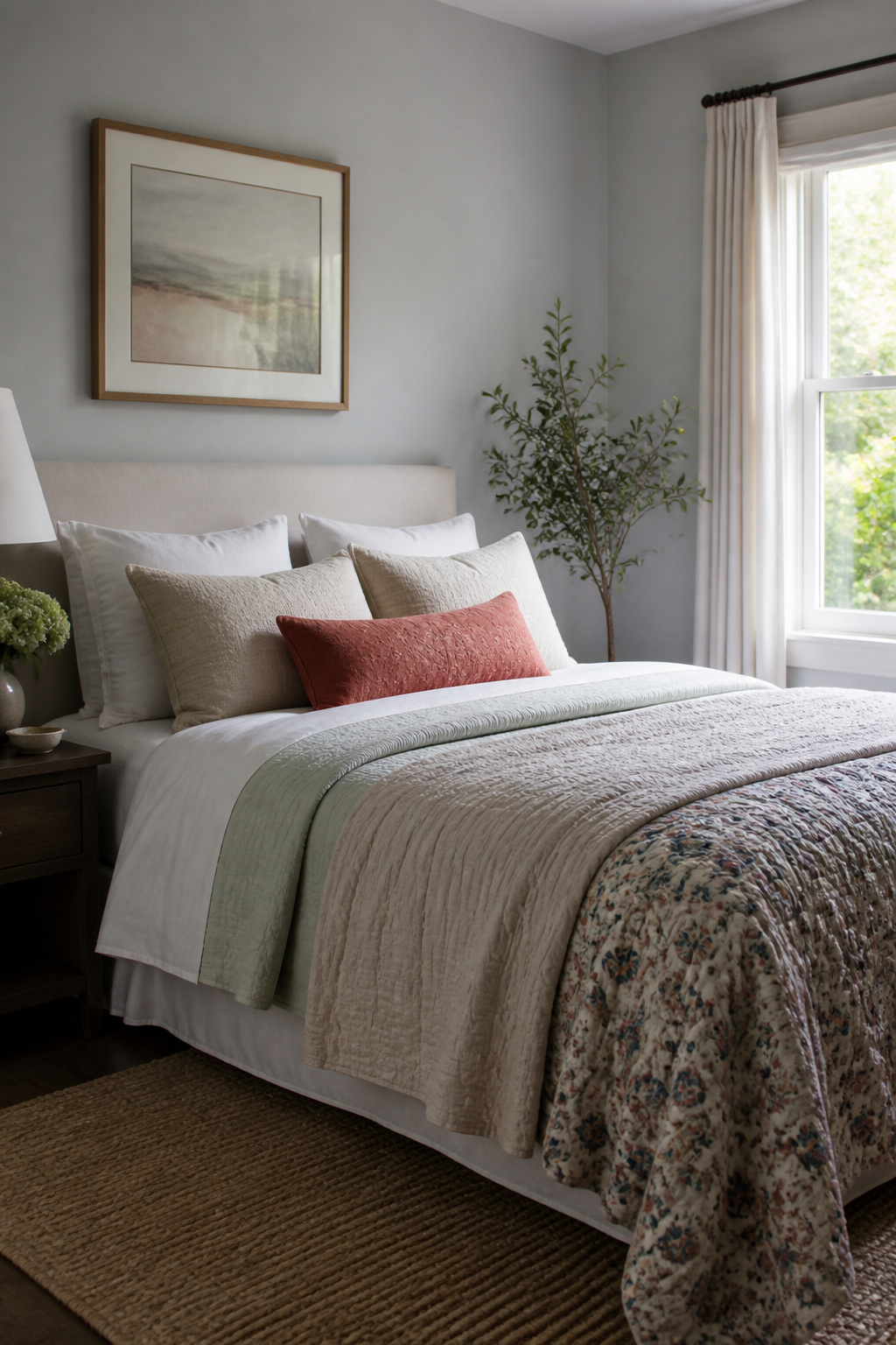
Layered bedding reads expensive even when every piece came from a big-box sale. The trick is stacking textures in the right order so the bed looks finished by day and actually functions by night. I start with a crisp flat sheet, add a light cotton blanket for weight without heat, then fold a heavier quilt across the foot. That third layer is what photographs well and pulls the whole look together.
Three layers is the ceiling for sleeping comfort, not the floor for style. I learned this after building what I thought was the perfect four-layer stack, only to wake up at 2 a.m. kicking off the whole pile onto the floor. The quilt now stays folded at the bottom until morning, when I spread it up for the visual. For renters or anyone swapping dorm rooms, this order also packs flat: sheet, blanket, quilt, done. No bulk to wrestle into a plastic bin come May.
3. Space-Saving Lighting
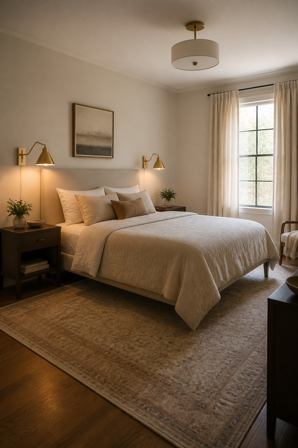
Wall-mounted sconces beside the bed cut the need for a bedside table entirely, which matters more than most people guess until they try to fit a queen frame into a room with two doors. I ran into this in a rental where the only wall for the headboard sat between the closet entry and the bathroom, leaving maybe fourteen inches on either side. Sconces with a swing arm solved both the reading light problem and the surface problem; the one on my side held a phone cord fine, and the switch sat where I could find it half-asleep.
Pendants hung from the ceiling do the same job with a different look. Where a sconce reads as fitted furniture, a pendant drops a pool of light onto the mattress edge and leaves the wall itself open. The trick is height: too low and you knock it sitting up, too high and it glares from the bulb instead of lighting the page. In that same room I aimed for roughly the same height as a bedside lamp shade would sit, maybe twenty inches above the mattress, and adjusted once the box spring compressed. The wire stayed visible, which I minded less than I expected, though a ceiling hook and a small canopy would hide it in a space where that matters more.
4. Multipurpose Furniture
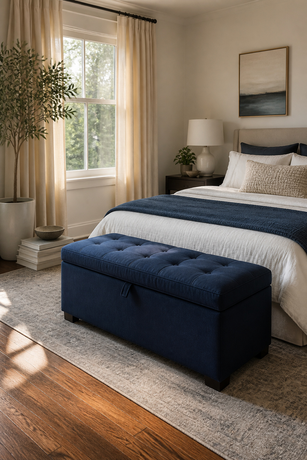
A storage ottoman I bought three moves ago still gets used daily. The lid lifts on a hinge, so the blankets inside stay dust-free, and the padded top means it works as extra seating when someone pulls up a chair. That dual use is what makes multipurpose furniture worth the floor space it takes: if a piece only stores, a plastic bin under the bed does the same job for less money.
Daybeds sound clever on paper, especially for rooms that double as guest spaces. The one I considered had a trundle underneath, but the mattress sat low enough that an adult’s knees would fold at an awkward angle. For a dorm or a first apartment where guests are rare, a regular sofa with a decent throw works more of the time.
Wall-mounted desks that fold flat look tidy in product photos. The catch is what lives on them: a monitor, a lamp, a cup of pens. Folding it means clearing all of that away every evening. A small desk on castors, one that rolls into a closet when company comes, has proven the more honest solution for tight rooms.
5. Feature Wall
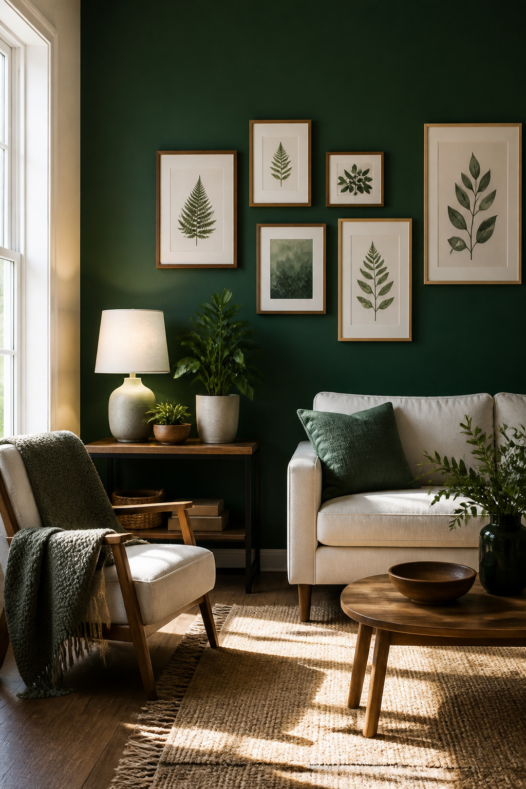
A feature wall carries the visual weight so the rest of the room can breathe. Bold wallpaper, textured paint, wood panelling, or decorative moulding each add character without the space feeling crowded. The trick is choosing one wall and committing.
In my last rental, I picked the wall opposite the door, the one your eye hits first when you walk in. The others stayed a quiet off-white, which meant I only bought one roll of removable paper and one afternoon of patience. Paint works the same way: a single saturated wall reads as intentional, four read like a box. Removable wallpaper was worth the slight premium for the deposit I got back. Frames in a loose grid need less commitment still, though the measuring takes longer than the hanging.
6. Curated Bookshelf
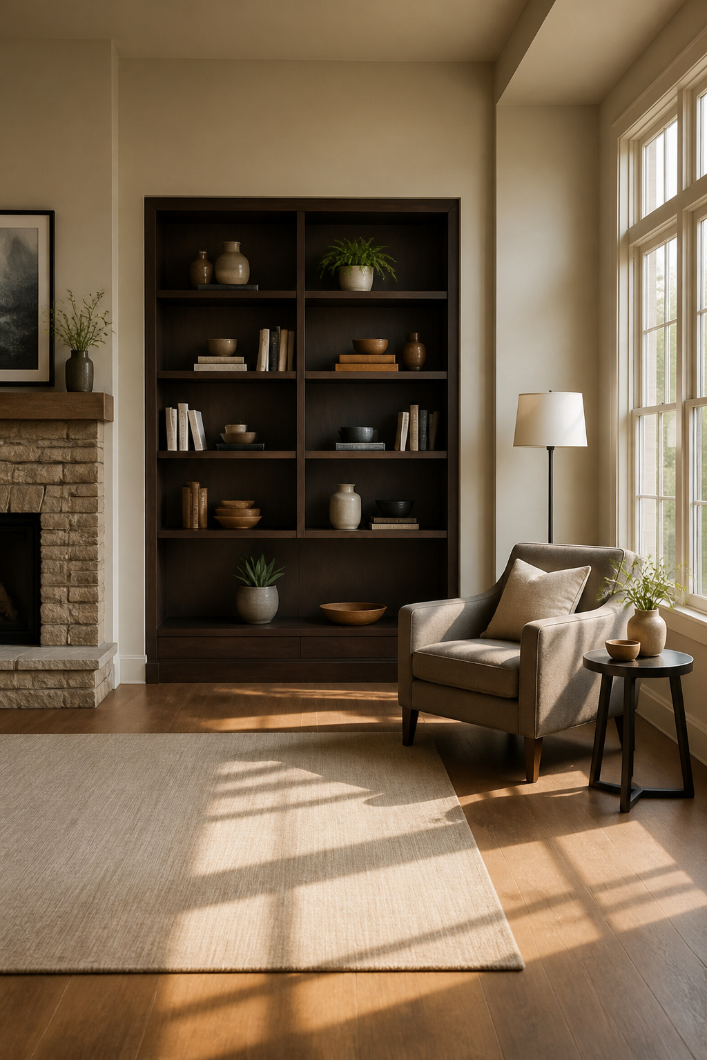
A shelf stuffed edge to edge with books reads like a storage unit, not a room. The first time I tried the half-empty method, I pulled every third book off a six-foot case and felt certain I’d regret it. Three months later I couldn’t name a single title I had removed.
Remove half the books, then set one object on each shelf and nothing else. The object can be a small plant, a ceramic bowl, a framed photograph, but the rule is one per horizontal surface. The negative space does the work; your eye registers intention rather than accumulation.
The books I thought I loved were mostly thick spines I’d kept to signal taste, paperbacks I’d already read and wouldn’t reread, and a full run of a series where three would have looked better than twelve. They went to a Little Free Library and I have never once gone looking for them.
Stepping back is the step people skip. The arrangement looks different from six feet away than it does with your nose at the shelf edge. What reads as balanced up close often clusters heavy to one side from across the room. Give it a day, adjust, then leave it alone.
7. Oversized Mirror
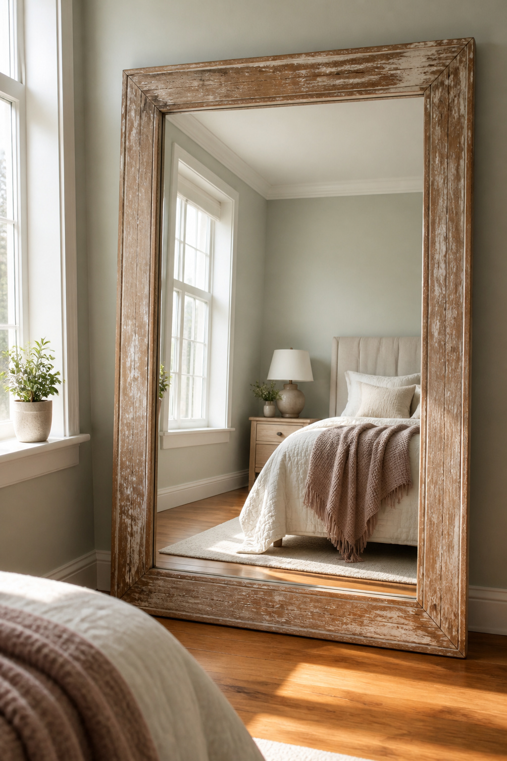
A single oversized mirror does more to open up a cramped bedroom than almost anything else in the room decor ideas category. Light bounces off it, walls seem to step back, and the whole space breathes a little easier. I found mine at a salvage yard for $42, a beat-up gilt frame with cloudy glass that cleaned up fine with vinegar and newspaper. The trick is placement: mine went opposite the window, not adjacent to it, so it catches direct sun and throws it deep into the room rather than just shifting it sideways.
Stud finders lie on plaster walls, or at least mine did, cheerfully beeping where no stud existed and staying silent where one surely did. I drilled twice. The first hole hit nothing but crumbling horsehair and dust. The second, two inches left of the beep, found solid wood. The first hole stayed there, patched with joint compound, for six months because I kept meaning to sand it smooth and never did. The mirror stayed up, at least.
8. Canopy Bed
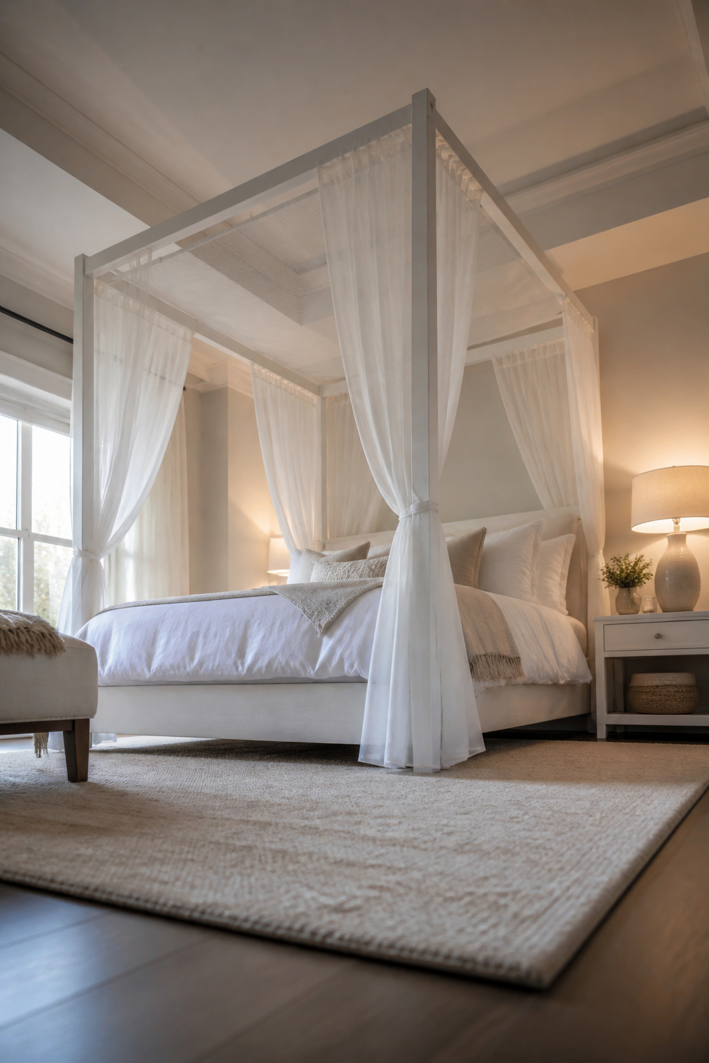
A canopy bed draws the eye upward and makes a low ceiling feel intentional rather than cramped. The classic build needs four posts and fabric overhead, but most frames sold today skip the posts entirely.
I faked the look in a rented apartment by mounting curtain rods directly to the ceiling, tracing the footprint of the mattress. Lightweight shears looked romantic for about a week. The fabric had to come down once the center sagged to head height; I had used voile that looked airy but pooled like a tent without tension. A heavier cotton-linen blend with some body to it would have held the plane, or a single panel draped from a ring at each corner rather than a full swag. Renter-friendly damage-free hooks exist now that hold more weight than the adhesive strips I had then, though a stud or joist still beats drywall for anything wider than a twin.
9. Botanical Elements
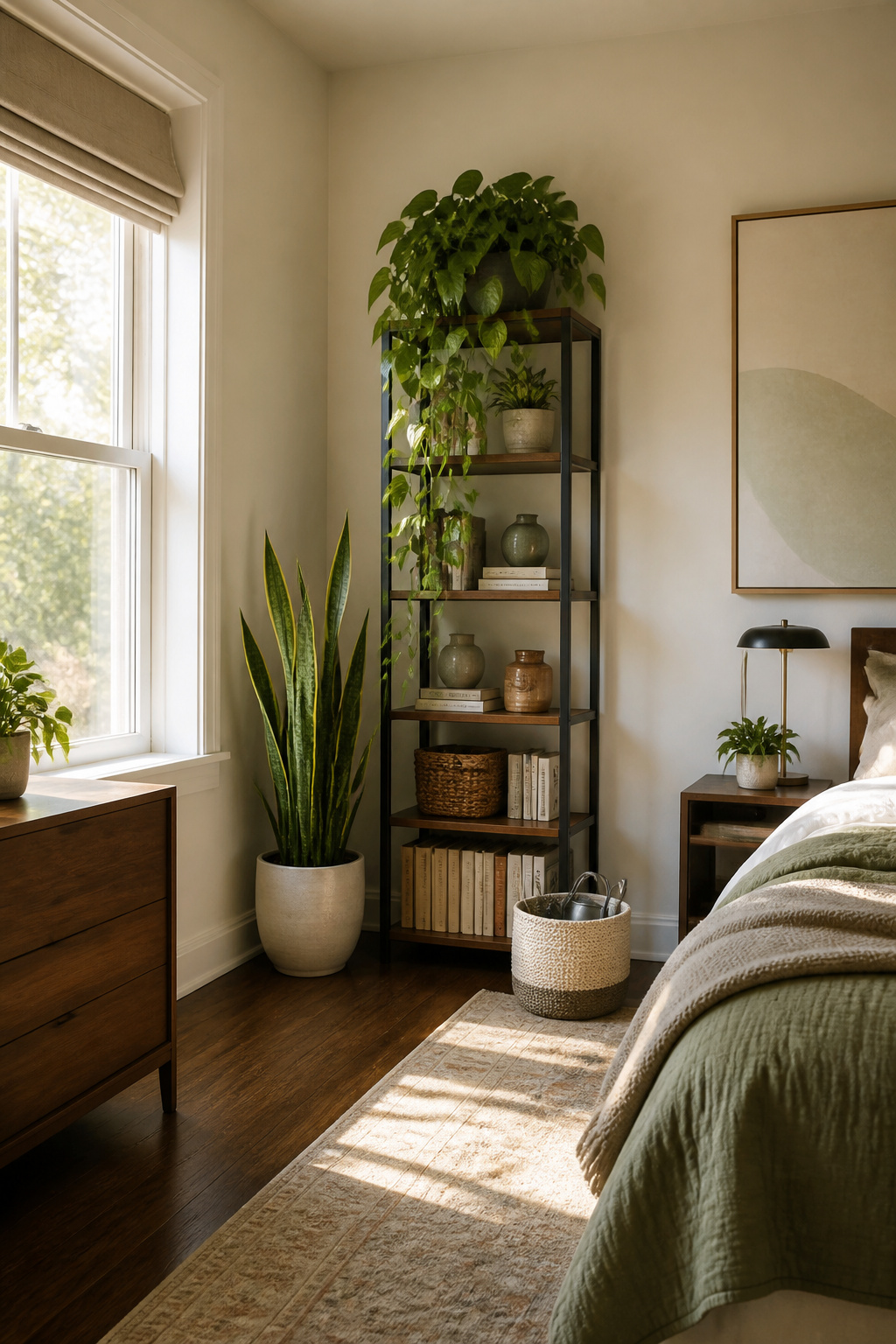
A pothos on the windowsill and a snake plant in the corner do more than fill space. They pull carbon dioxide and the occasional off-gas from paint or carpet out of the air while you sleep, which is why I started keeping them in bedrooms to begin with.
The snake plant and ZZ plant both survived my worst stretches, weeks where travel or plain inattention left the soil dust-dry. A small fern and what the tag called a "high-humidity" calathea did not; they crisped or rotted depending on which mistake I made first. The pothos is the one I still have three years later, partly because it droops dramatically to remind me before real damage sets in, then perks within hours of water.
For renters, a heavy ceramic pot risks the deposit. I keep mine in lightweight nursery pots slipped into cheap cachepots from the hardware store. That setup also makes it easy to lift the plant to the sink for watering, rather than dripping across carpet or wood floors that aren’t mine to stain.
Scale matters more than variety. A six-inch pot reads as clutter on a small nightstand; the same plant on the floor beside a dresser looks intentional. Two or three sizes spread through a room, from a four-inch succulent on a desk to a three-foot dracaena in a corner, give the layered height that makes the space feel finished rather than random.
10. Artful Arrangement
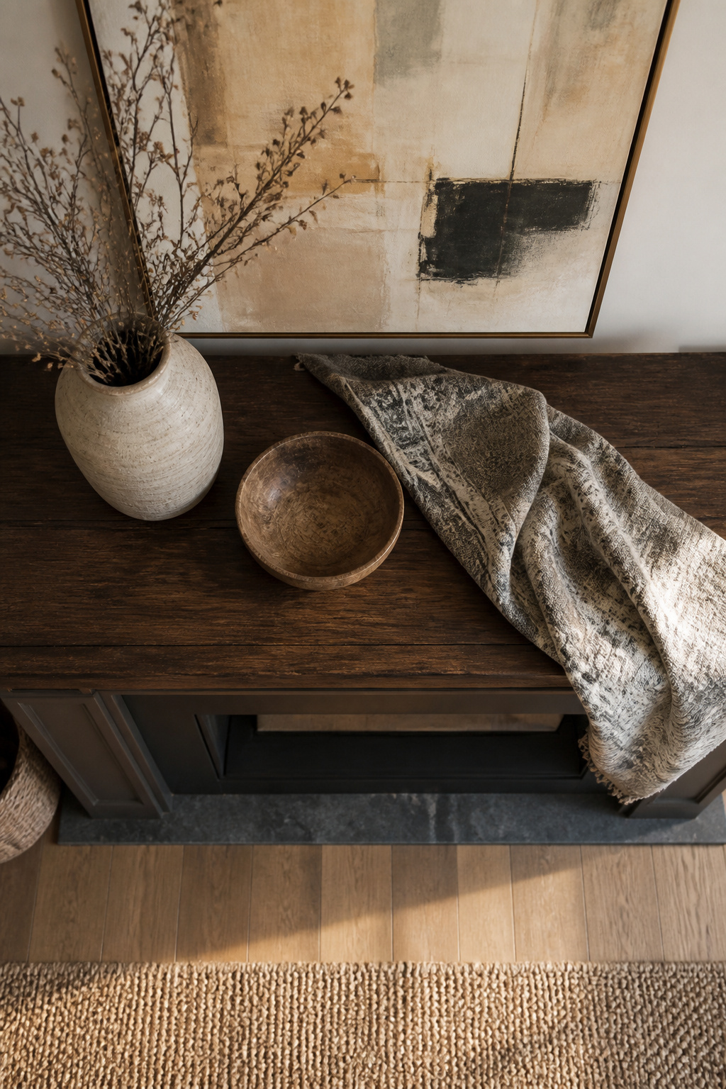
Grouping objects in threes, fives, or sevens holds a surface better than pairs do. The eye keeps moving instead of locking into a flat symmetry, and odd numbers force the brain to read the arrangement as a single gesture rather than a lineup. Height variation matters just as much: a tall vase, a mid-sized bowl, and something low and heavy read as a conversation instead of a fence.
I keep one color threading through the whole cluster, even if the materials fight each other. Brass, weathered wood, and glazed ceramic all settle down when something like slate blue or warm amber repeats across each piece.
Last fall I styled my mantel this way, stepped back to photograph it, and hated the result. Every object sat at its perfect angle; nothing looked breathed on. The next morning I knocked one frame slightly askew and swapped a tall candle for a shorter one that had been in a drawer. That version stayed. The rule gets you started; the lived-in adjustment is what makes it survive a real room.
11. Hidden Technology
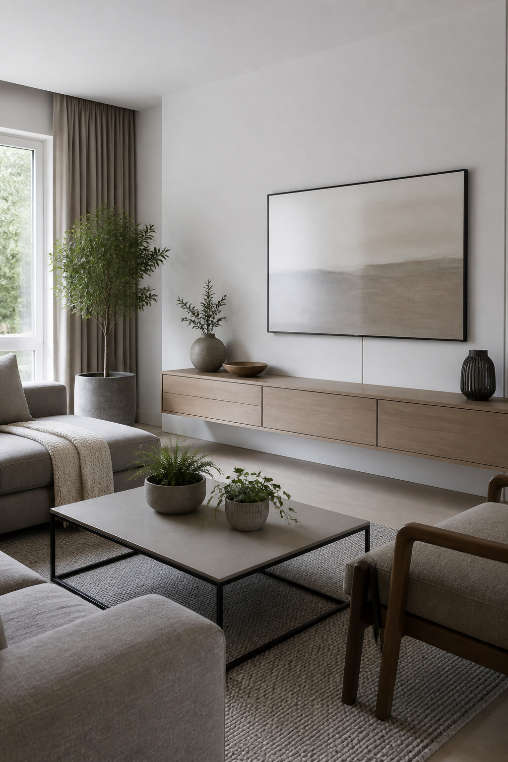
A cable running up the wall to a wall-mounted screen is the first thing the eye lands on, no matter what color the room is painted. Paint the cable channel the same sheen as your baseboard and it quits reading as technology and starts reading as trim. Matte latex on a matte wall, semi-gloss where the baseboards already carry it. I spent an hour taping and brushing a six-foot run, and the channel has not drawn a second glance in two years.
Routers are harder. The woven basket I slid ours into looked tidy for about forty minutes before the modem dropped signal and baked itself quiet. Ventilation is not a suggestion in the manual; it is the difference between hardware that lasts and hardware that gets replaced. A lidded box with a hole saw taken to the back panel works, or a shallow drawer left cracked open. The goal is air moving across the body of the thing, not just hiding the LEDs from the couch.
Screens that fold flat against the wall still read as black rectangles when off. A Samsung Frame or similar display-with-art-mode costs more than a standard TV, but the difference is whether your living room wall holds a television or a print. For renter budgets, a pull-down projector screen in a light gray case mounted above the window frame disappears against white ceiling paint and comes down only for movies.
12. Textured Ceiling
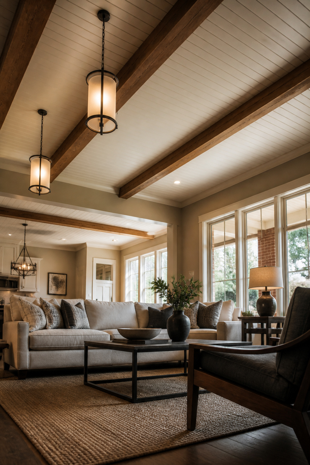
Ceilings collect more attention than they used to, and the options are better than popcorn. Beadboard adds a cottage weight that works in bedrooms where the walls stay quiet. Tin tiles bounce light around and suit a living room with some age to it, though the real metal runs past what most weekend budgets want.
I once tried peel-and-stick tin in a bathroom, thinking the moisture would stay on the walls where it belonged. Three months in, the adhesive softened and the corners started sagging. The fix was a ceiling paint with sand additive, rolled on thick enough to catch shadow and light without anything glued overhead. It held through the same humidity that ruined the tiles, and the texture hid the patchwork where I pulled the old ones down. For a rental or a first project, skip adhesive anything on a ceiling near water and test the sand mix on a board first; too heavy and it looks like cottage cheese, too light and you have painted sand.
13. Zoned Lighting
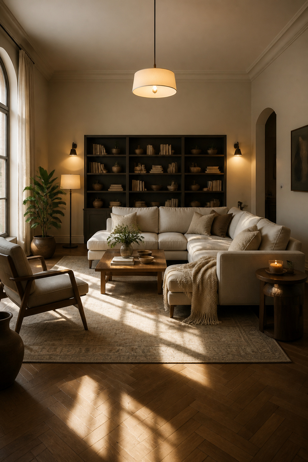
Three circuits in my old studio ran through dimmers: the overhead cans for ambient wash, a pair of wall sconces flanking the desk for task work, and LED strips tucked behind the headboard for evening wind-down. The fourth, a pendant I hung to mark the living area from the sleeping area, stayed on a simple switch. That was the one I came to regret. Without a dimmer, the pendant threw the same pool of light whether I was reading at midnight or trying to soften the room for guests on the couch. Dimmers on every layer you install matter more in a small space than almost any fixture choice, because the room’s job changes by the hour. Wall-mounted sconces or pendants free up the surfaces that a studio cannot spare, and a ceiling fixture on its own will always fight against that flexibility rather than work with it.
14. Floating Shelves
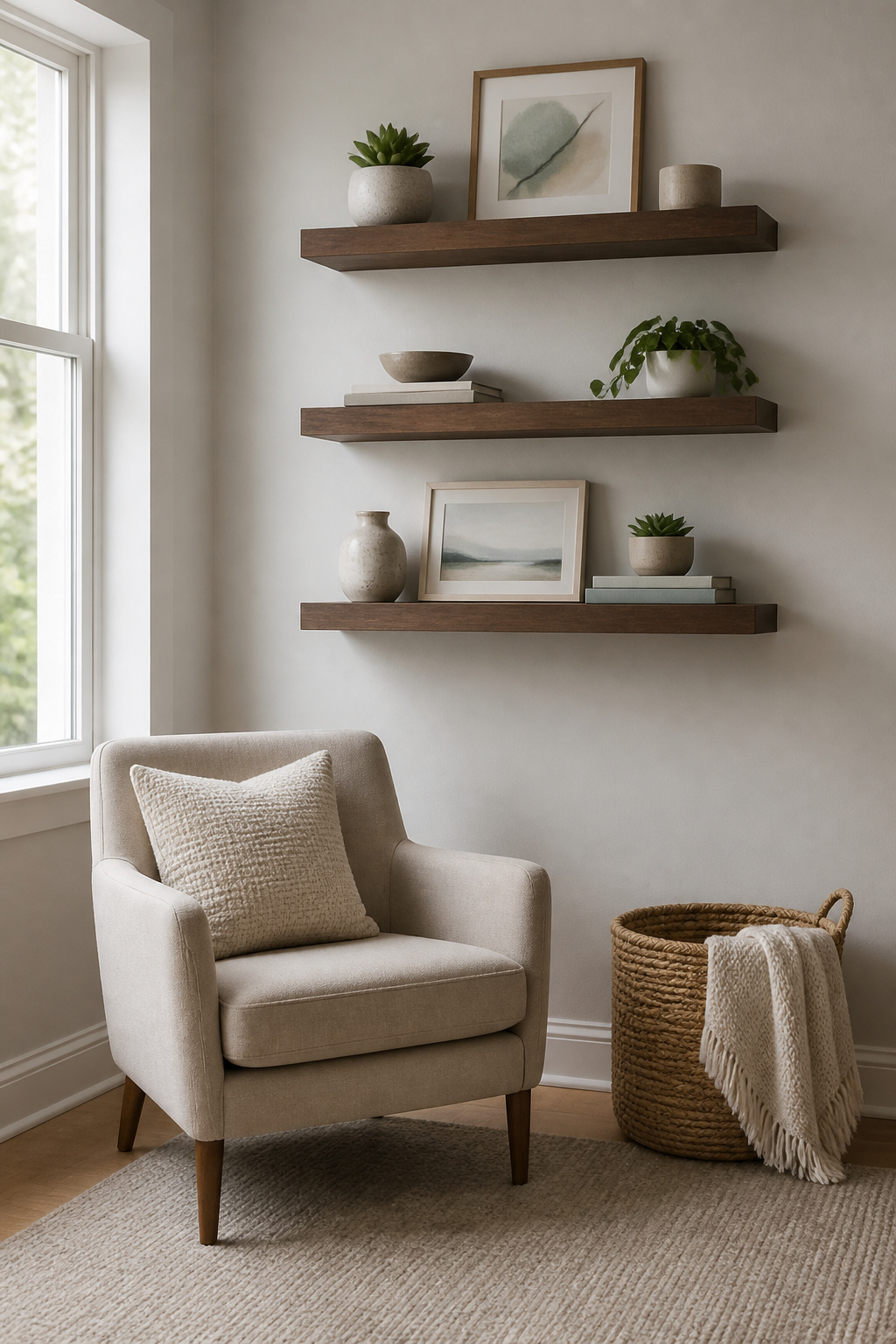
Floating shelves look clean because the brackets sit inside the wall, not underneath. That gap between shelf and bracket is what makes standard shelving feel hardware-store basic; hidden supports make the wall itself seem to carry the weight.
The first set I put up held picture frames fine. Then I loaded one with books in a bedroom corner, and the drywall anchors pulled out slowly over a week until the whole shelf tilted forward. The package weight limit is there because drywall alone grips the anchor like wet sand. I had ignored the printed number, figuring thin paperbacks did not count as "books" in the engineering sense. They do.
Toggle bolts fixed the second attempt. The wings fold flat to fit through a drilled hole, then open behind the drywall so the load spreads across the back of the wall instead of the crumbly face. Reading the package first, this time, meant measuring the wall thickness against the bolt length so the wings actually seated open instead of spinning uselessly in the cavity. The shelf has held for two years now, full of actual hardcovers.
15. Statement Rug
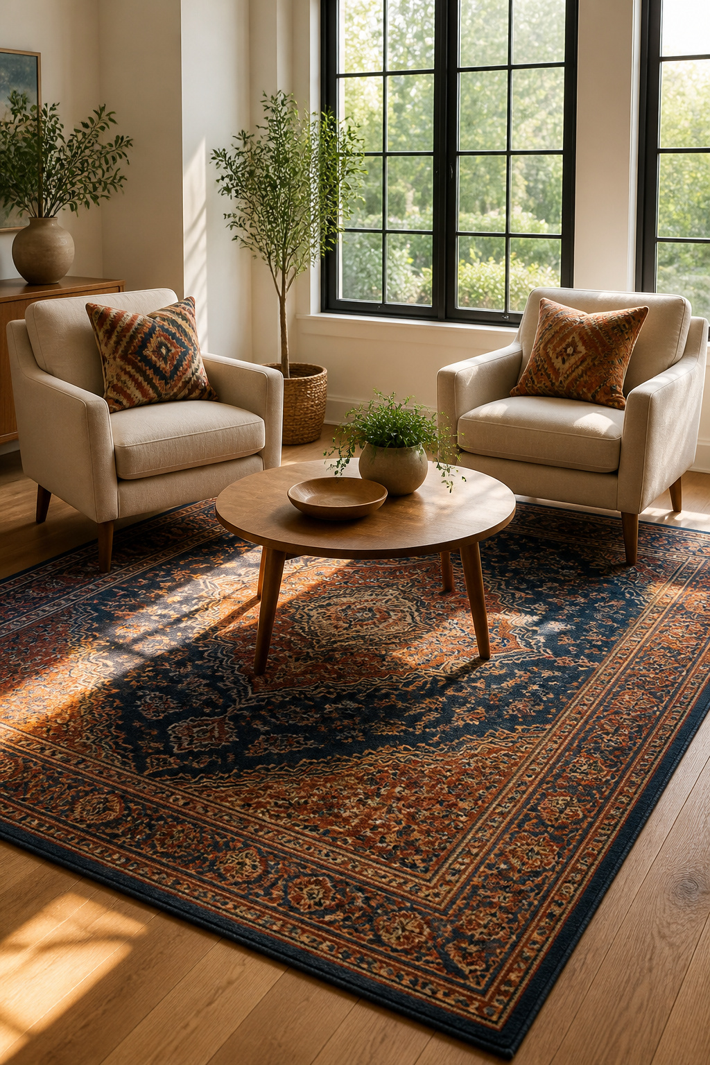
The right 8 by 10 rug will pin a seating area to the floor better than any wall color. I learned the two-inch lesson the hard way: the pad stops where the wall starts, but the rug can overhang. Cutting the pad saved the purchase, and the pattern I chose, busy enough to break up light, hid golden retriever hair through three shedding seasons without daily vacuuming. For renters, a rug this size covers the beige carpet or scratched hardwood you did not pick and rolls up when the lease ends. Expect to spend in the low hundreds for something with a tight weave that will survive a move; the thin, printed ones flatten in months and slide around like a throw blanket.
16. Window Treatments
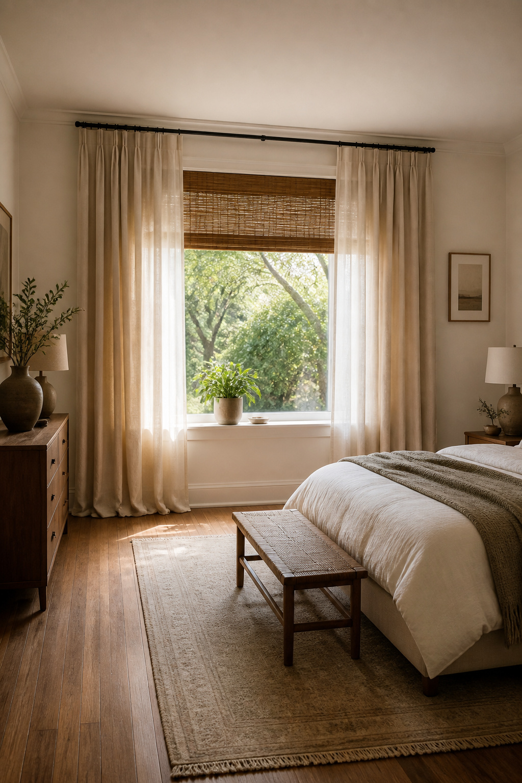
Window treatments are where a room either finishes or falls apart. The first set of floor-length panels I hung pooled on the carpet like a failed hemline until I learned that iron-on tape and a careful fold can rescue cheap curtains without a sewing machine. They hung straight after that, and the difference in how the wall looked was immediate.
Shades and blinds control what curtains cannot. I ordered a cellular shade once that measured a quarter inch narrow, and morning light slipped through the gap for months before I replaced it. That quarter inch taught me to measure the frame in three places, top to middle to bottom, and order to the smallest width if the numbers vary. Layering helps: a blind for blocking, panels for softness, and the combination reads as intentional even when the budget is tight. Floor-to-ceiling drapes draw the eye up and work especially well in bedrooms where height is the only architectural detail you’ve got.
17. Minimalist Approach
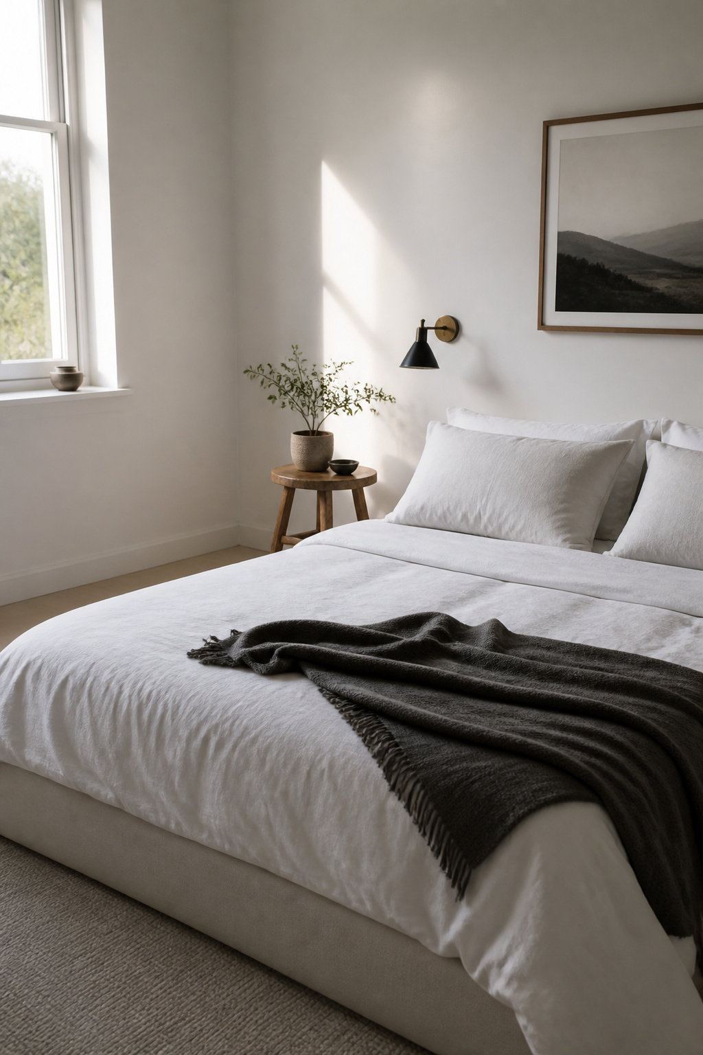
A bedroom with too little on the walls reads unfinished, not calm. I learned that the winter I stripped my own room down to a mattress, one lamp, and a single plant on the windowsill. The first week felt like a relief. By the third, walking in felt like entering a storage unit someone had forgotten to stock.
I started bringing things back one at a time, testing each piece. A small oak stool I found at a thrift store for twelve dollars. A cotton throw in a color I actually liked instead of whatever was on sale. The plant stayed, but I moved it off the windowsill to a corner where the light hit it differently and it became something I noticed instead of background noise.
The difference between spare and empty is about three objects chosen on purpose. Ten things left my room that month: the second lamp I never turned on, the stack of books I had read and would not re-read, the basket that collected nothing but dust. The one I brought back was a framed photograph, not because it was beautiful, but because I looked at it every time I passed.
A room needs at least one thing that rewards attention. Without that, minimalism is just a box with better lighting.
18. Accent Colour Pop
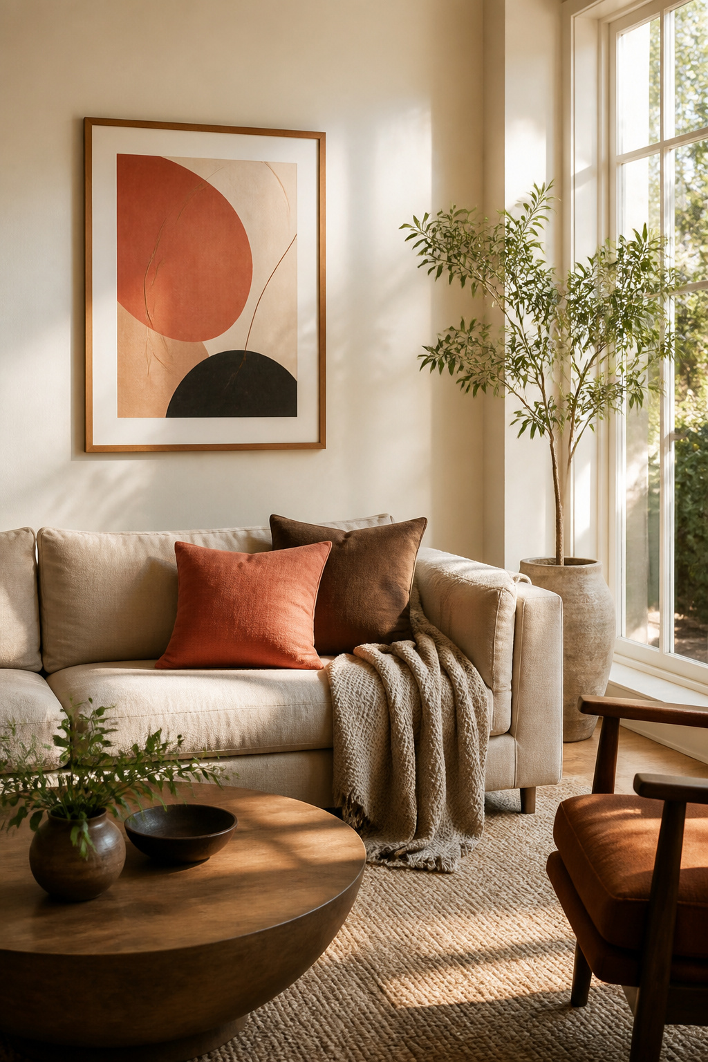
The 60-30-10 rule works because it gives your eye somewhere to land without starting a fight. Sixty percent of the room stays dominant, usually a quiet neutral, thirty percent goes to a secondary tone that still behaves, and ten percent carries the single accent that makes the space feel intentional instead of accidental.
I learned the hard way that one accent is a choice and two is a theme. A teal throw pillow against gray bedding looked like I had taste. The second teal thing, a ceramic dish I’d grabbed on sale, turned the whole bed into a color scheme I hadn’t signed up for. The pillow alone had been doing all the work; the dish just made it feel like a set.
Small, swappable pieces carry the ten percent best: a cushion, a lampshade, a folded throw. Change one out and the room shifts seasonally without repainting or reupholstering anything. The rule keeps the change cheap and the effect deliberate.
19. Built-In Storage
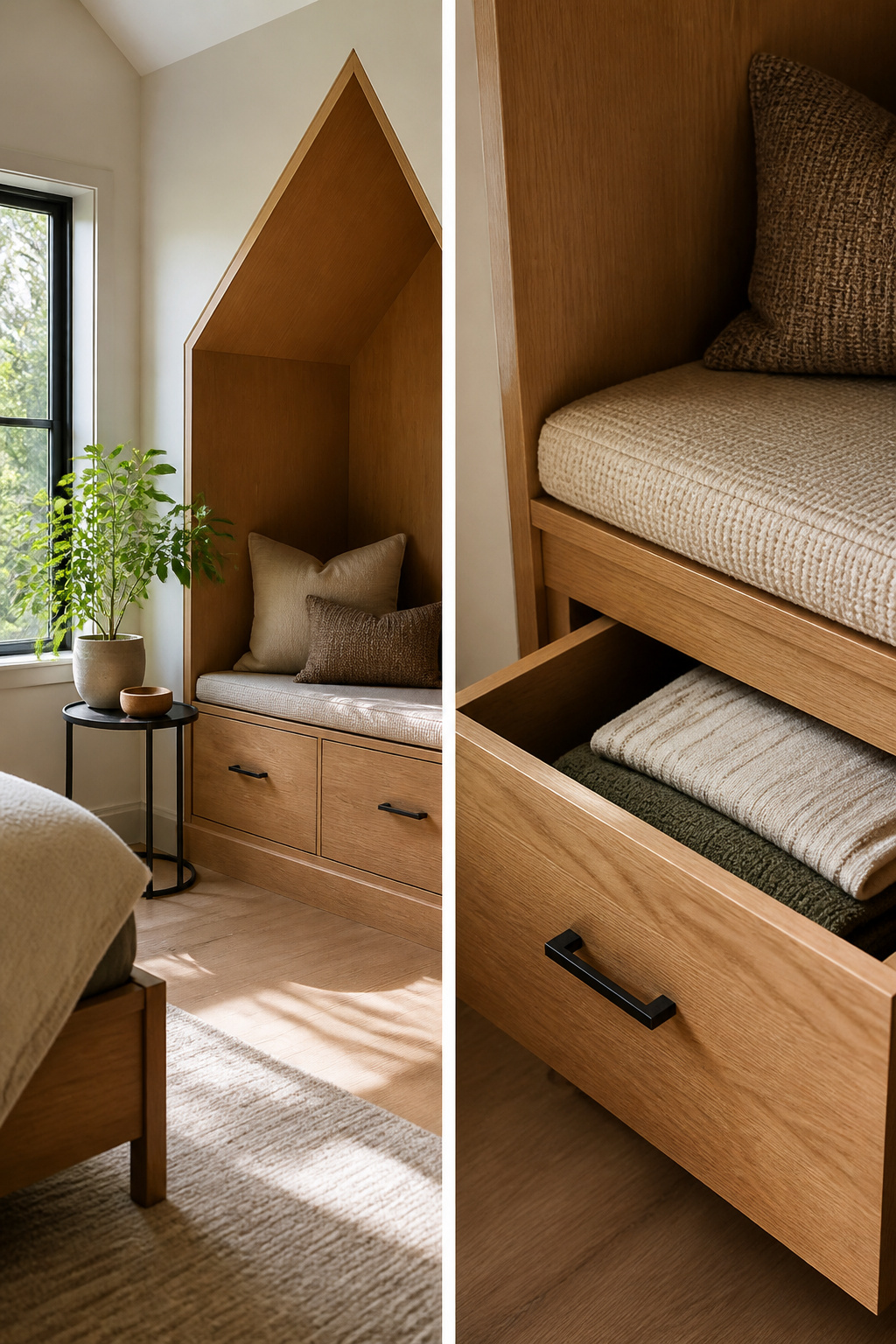
Built-in storage works best when it follows the shape of the room instead of fighting it. A dormer window that cuts into wall space becomes useful again with a bench fitted into the angled recess below it, drawers tucked into the knee wall beside it, or a wardrobe built to the slope of the ceiling. What convinced me, reading through enough of these projects, is that the material matters more than the design. MDF swells in humid months and the joints crack; the plywood replacement holds its shape because the glue lines run differently and the wood itself moves as one piece. Custom work costs more than flat-pack, but a window seat with a hinged lid turns a dead zone into the place where extra bedding lives. Drawers under a bed built into an alcove need stops so they do not roll out on sloped floors. renters should check whether the landlord counts fixed units as improvements they can take with them, because the answer changes what you build and how you attach it.
20. Multisensory Elements
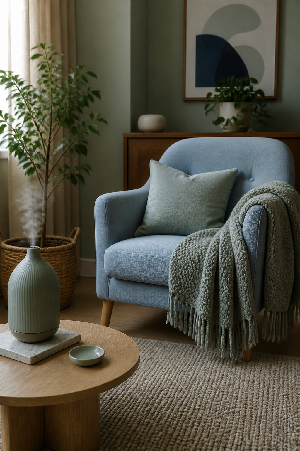
Most rooms stop at what you can see, but the ones that feel finished reach for what you smell, hear, and feel against your skin. A diffuser placed too close to a painted nightstand will leave a ring of oil that sinks in overnight; mine now sits on a ceramic tile I pulled from a salvage bin. White noise helps if your walls are thin, and the small machine I bought for the bedroom now travels in my suitcase because sleep in a hotel room without it feels borrowed. Textures matter too. The wool throw draped over my reading chair scratches the back of my neck every time, but the color and the weight are right for the space, so it stays. A cotton one would feel better and look worse, and in a small room you notice the visual wrongness more than the tactile one. Candles do the same work as a diffuser for less money, though the open flame means you cannot leave them running while you are out. Fairy lights add almost nothing to sound or scent or touch, but their faint warmth against a wall in winter counts for something if you are standing close. Plants, of course, change the air itself, and the room smells different with a pothos on the sill than without it. None of this is dramatic. The difference is in whether the room holds you or simply houses you.
Color Schemes That Hold
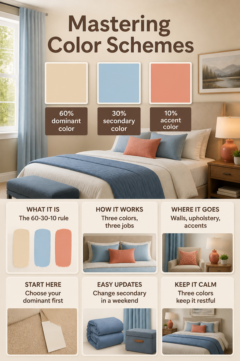
The 60-30-10 rule breaks a room into dominant, secondary, and accent colors: sixty percent on walls and large furniture, thirty on upholstery and bedding, ten on lamps, cushions, or a single throw. Working with three colors keeps the eye from bouncing around looking for somewhere to rest. I choose my dominant first, usually the neutral that the room already supplies through carpet or existing paint I cannot change. The secondary goes on the pieces I replace in a weekend: a duvet cover, curtain panels, a storage ottoman. The accent is one small item in a color I would not want to wear out.
The one time I used four colors in a bedroom, the space looked restless by the third day. The extra hue, a sage green I wedged between a navy secondary and a rust accent, kept drawing attention to itself wherever it landed. Swapping the green cushions back to navy cost nothing and fixed the problem in an afternoon.
Lighting Layers
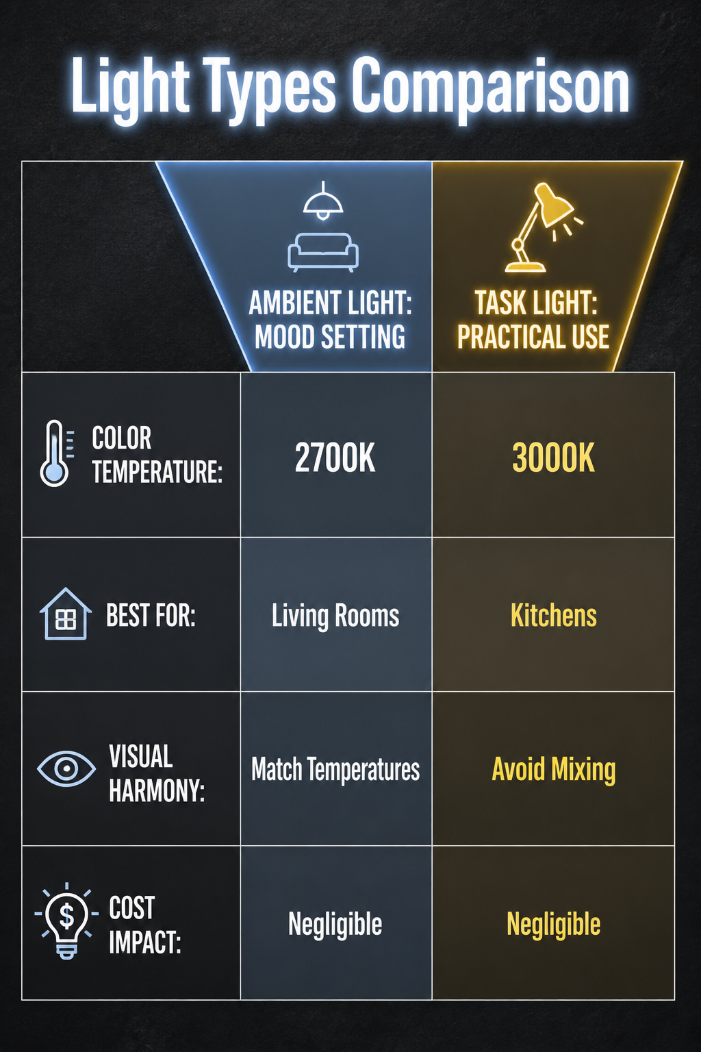
Three kinds of light in one room sounds like overkill until you try living with just one. Ambient light sets the mood, task light lets you read the label on a pill bottle, and accent light gives your eye somewhere pleasant to rest. The trick is keeping them from arguing with each other.
I settled on 2700K bulbs for lamps and overhead fixtures in living spaces and bedrooms. That warm glow reads as evening even at noon, which matters when your window faces a brick wall. For desks, bathroom mirrors, and the kitchen counter where I chop vegetables, 3000K works better. The light is still warm, but it shows edges and colors honestly enough that I stopped slicing my knuckles.
What I cannot stand is seeing both temperatures at once. A 3000K pendant over the kitchen island with 2700K cans in the same sightline makes the warmer bulbs look dirty and the cooler ones look clinical. My rule now: one temperature per visual field. In open-plan rooms, that means matching every bulb the eye can take in from a single standing position. The cost is negligible, maybe thirty dollars in bulbs for a small apartment. The difference is the room looking finished or looking like you moved in yesterday.
Furniture Spacing
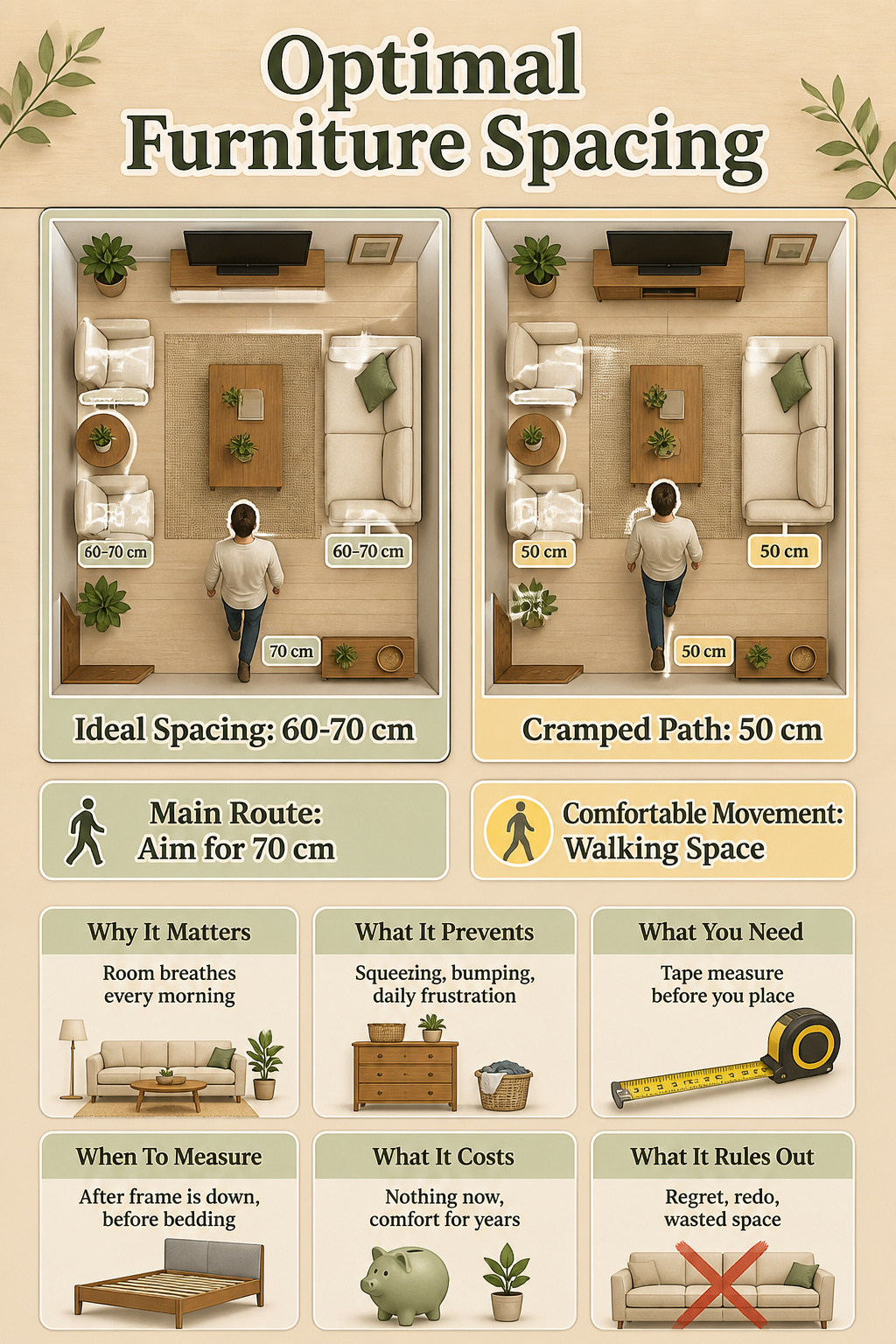
Furniture spacing is where a room either breathes or fights you every morning. The sources say 60–70 cm of walking space around key pieces, and that range exists for a reason: less than that, and you are sidling past your bed with laundry balanced on one hip, hoping you do not kick the dresser.
I learned to stop estimating with my foot after a few too-tight calls. A tape measure lives in my nightstand now, and I run it before anything gets dragged into place. In one bedroom I cheated a path down to 50 cm because the mattress I wanted left no other option. That squeeze lasted three years. Every morning I threaded through a gap barely wider than my shoulders, and every morning I regretted the choice. The bed was comfortable; the room was not.
The 60 cm end of the range works for secondary paths, the ones you use occasionally. For the main route from door to bed, or bed to closet, I aim for the full 70 cm. That extra ten centimeters is the difference between walking and maneuvering. Measure after the frame is down but before the bedding goes on, since a fluffy duvet or an overhanging blanket steals another few centimeters you already counted as yours.
Personal Touches
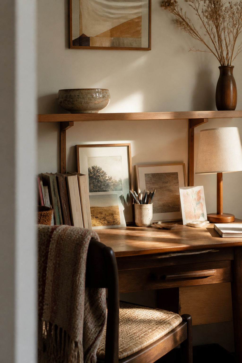
The bowl my grandmother gave me sits on the narrow shelf above my desk, and it has survived three apartments and two cities while store-bought frames rotate in and out of the same space. That steadiness is the point. A room starts to feel like yours when the objects in it carry weight beyond their shape, and weight does not come from a price tag.
A photograph I took in my own kitchen, badly framed and slightly crooked, holds the wall longer than any print I bought because I remember the afternoon the light fell that way. The handmade card from a friend stays propped against the lamp even when I change the bedding and the rug, because the connection it marks is not replaceable. These items do not need to match; in fact, the mismatch is often what keeps a room from looking assembled overnight.
The 60-30-10 rule for color works as a scaffold, but personal objects are what break the rule on purpose and make the result feel inhabited rather than staged. One meaningful piece on a shelf does more to warm a bedroom than a dozen coordinated accessories that arrived in the same shipping box.
Seasonal Decor

A single storage bin under the bed holds everything seasonal I rotate through. One cubic foot, four swaps a year, and the room changes without buying new furniture or finding places for more stuff.
The throw blanket does most of the work. A heavy oatmeal weave for winter, something lighter and looser for summer, a faded rust or sage when the light outside shifts. Same couch, same corners, different weight in your hands when you sit down. The branches in the vase follow the same rule. Bare dogwood in January, forced forsythia in March, whatever drops from the yard in October. Water keeps them alive a week or two, then the compost.
I tried keeping seasonal pillows once. They ate the bin whole and still looked lumpy on the bed. The throw and branches give the same signal for a fraction of the space and none of the closet Tetris. The bin itself is nothing special, a fabric cube with a zipper lid from a big-box store. But knowing exactly where March ends and June begins, physically, keeps me from buying something new out of restlessness.
DIY Projects

Handmade pieces carry the weight of time you spent on them, and that usually shows. The concrete planter I tried last spring cracked clean through the base before I even potted anything; the mix was too thin, and I had poured it on a humid afternoon without checking. Six hours of macrame later, the wall hanging looked decent enough, but the rope alone cost more than a finished piece from a craft market, and the fringe never hung straight. Those two projects sit in the back of my closet now, reminders that personal does not always mean practical.
Painted terracotta pots are the exception I keep coming back to. A dollar or two per pot, a $4 can of spray paint, and an hour on the porch while something else dries. The clay breathes better than plastic for most plants, and when the paint chips after a season, it chips in a way that looks intentional. I still make them because the failure rate is low, the cleanup is minimal, and a shelf of mismatched colors looks like someone lives there on purpose.
Frequently Asked Questions
What are some good room decor ideas?
Statement headboards mounted with a French cleat system, layered bedding stacked in three textures, wall-mounted swing-arm sconces, multipurpose furniture like storage ottomans, feature walls with removable wallpaper or bold paint, and curated bookshelves kept half-empty with one object per shelf all make strong starting points. Each idea scales to rentals and dorms with minimal permanent damage. The article covers twenty total, from oversized mirrors to hidden cable channels painted to match baseboards.
How can I make my room more aesthetic?
Group objects in odd numbers with varying heights and one repeating color thread, use the 60-30-10 rule for color with only one accent tone, and add at least one thing that rewards attention rather than stripping down to empty minimalism. A single teal throw pillow reads as taste; a matching dish turns it into an unintended theme. The lived-in adjustment matters more than perfect symmetry.
What are some tips for decorating a small room?
Wall-mounted sconces or pendants beside the bed eliminate the need for bedside tables, multipurpose furniture earns its floor space only if it truly doubles functions, and an 8 by 10 rug pins a seating area while covering flooring you did not choose. Light colors, effective dimmers on every layer, and floating shelves with toggle bolts rather than drywall anchors keep small spaces functional and visually open.